Do you have value-packed content on your blog but not getting enough pageviews? Bounce rate too high? Then it’s time to look at one of the primary reasons - your blog design.
Building an engaging blog requires much more than interactive content. It also requires a user-centric design, as a study found that 94% of first impressions of a brand’s website relate to its design.
User experience plays a critical role in making or breaking your blog. However, building a perfect blog UX isn’t easy unless you know what UX design mistakes to avoid.
And, that’s what we are here for.
9 Blog Design Mistakes To Avoid
A report by Forrester says that better UX design can increase conversions by up to 400%. While a poor blog UX can increase bounce rates and reduce conversions, a delightful blog UX design can increase customer engagement, improve user satisfaction, and increase customer retention.
Let’s discuss the nine most common but serious blog UX design mistakes that could ruin your users’ reading experience.
1. Unclear Navigation
Do you think your user knows how to engage with your blog?
The belief that your user would know how to engage with your blog is a common mistake, and we are here for you to ensure you don’t make this mistake. What unclear navigation does is give your user a fair chance to leave your blog and visit another.
Putting multiple links, menu tabs, and CTAs can confuse users like this blog. Too much is happening at the same time.
When you have minimal items, your users can explore better. The clearer the navigation, the easier it is to meet your users' needs.
Like this blog here. Clean and clear.
So, how do you improve the navigation of your blog?
Limit your navigation. This will enhance the visibility of your blog page and guide your users to the action you want them to take.
- Establish a consistent layout
- Clearly define categories and subcategories
- Make sure navigation elements are easily accessible
2. Poor Line Spacing
You are mistaken if you think line spacing is only a font thing. It’s also a UX design thing.
- Too large line spacing - too much white space, and the text looks awkward
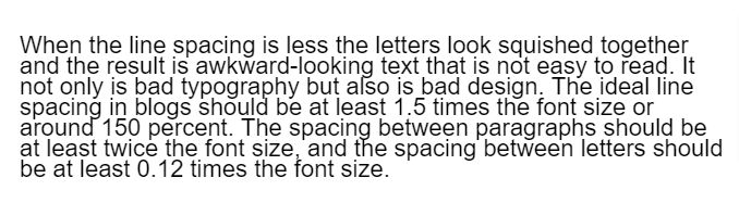
- Too small line spacing - the letters appear squished together, and the text seems awkward
Good line spacing can make or break your blog's success, as line height has an enormous impact on readability. If your users cannot read your content, they’ll go back.
How do you feel when you read this text?
And what about this text?
Which do you feel is better?
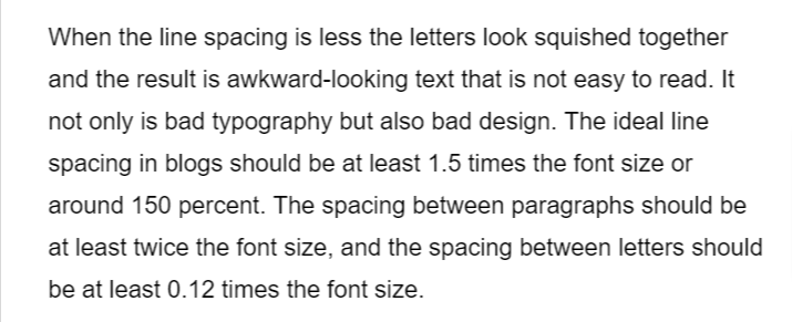
- Line spacing - around 150 percent or 1.5 times the font size
- Spacing following paragraphs - at least two times the font size
- Spacing between letters - at least 0.12 times the font size
- Spacing between words - at least 0.16 times the font size
3. Non-responsive Design
Tell us honestly: When you started designing your blog, did you only think of desktop computers? You are not the only one; most blogs are designed for desktops and overlook mobile devices. This is a big mistake, as mobile devices account for over
50% of web traffic.
So, you must adopt a mobile-first design approach to design your blog. Your UX design only becomes good if it is responsive, no matter the device on which it is viewed. If you are still unconvinced, here are the stats to prove it.
- 80% of the top-ranked websites are mobile-friendly
- 70% of the searches made on mobile phones lead to clicks
- 61% of users will never return to a website that is not mobile-friendly
Medium is the best example, as it is optimized for all screen sizes.

4. Unreadable Fonts and Colors
Bad typography is confusing. If you consider typography a minor factor, know that it greatly impacts your blog’s experience. Well, if you put content on your blog, it might as well be readable. For example, if you visit Zara's website, they have used very tiny fonts, which are hard to read even on bigger screens.

The font and colors you choose should:
- Look good
- Be legible
- Match your brand’s personality
Remember, it impacts readability and plays a part in the design element. Strive for the optimum combination considering the size, weight, and color. Do not forget to test it on various devices and screen sizes.
5. Cluttered or Busy Layout
A crowded layout adds to a busy interface. When you overburden your design with unessential components, it can overwhelm your readers and make it difficult for them to navigate or find the information they came looking for.

Just like the design process, decluttering is iterative. Declutter your design. Prioritize clarity and simplicity.
- Provide dynamic links
- Use subtle visual elements
- Avoid nested cards and boxes
- Use familiar navigation controls
- Reduce the amount of information displayed
Look at this simple and minimal blog design by
Mailchimp.
A creative and simple blog layout. You can see good usage of negative space and images. Also, their content is well-formatted, accessible, and visually appealing at the same time.
6. Lack of Quality Images and Visuals
It’s a common and accepted fact that humans perceive images faster than text. And they make content more engaging.
But if the blog has shoddy graphics or low-res images, it sends negative signals about the brand's credibility. Users are more likely to trust content that is supported by high-quality visuals.
For example, take a look at this snippet of the blog of one of the websites:
Now, let’s compare it with a well-established brand, like
Semrush:
Which graphic do you think is more appealing?
You’d say: “This is a no-brainer, obviously, the second one!”
But why? Because they have judiciously used white space, maintained visual hierarchy, and used appealing colors and proper contrast.
This is a custom-designed graphic. What about photos?
Well, if you want to add original or stock photos, then you need to ensure that they are sharp, clear, and relevant.
If you are a solopreneur or single-person business, and want to shoot photos of your own, you need to take care of lightning and contrast. This makes all the difference.
For instance, take a look at these two product images:

Which image do you think people would prefer? The one on the right.
The reason is simple. The left one has poor exposure, and the brand name is not visible due to improper flash settings, which adds a glare. If you tend to shoot lots of product photos, consider hiring a photographer instead.
High-quality photos and images will eventually help your blog and brand build authority, credibility, and brand loyalty.
7. Unexpected Intrusive Pop-ups
Most users hate pop-ups. Even we do. Simply because they disrupt the flow.
However, when used appropriately, pop-ups can serve a purpose. But when misused, they can have a negative impact on your website.
This popup just appears right after you open this webpage. It doesn’t give the user time to even read the first few lines, setting a bad user experience.
Popups can convert but with a better design and better timing. We all know that pop-ups are a valuable tool. They can help in lead generation and boost your blog subscriptions.
But how do you use them to your advantage?
- Avoid showing a popup before your user can gain value from your blog
- When your visitor scrolls down 80% of your blog post
- When your reader spends 50-60% of the average time on your page
8. Unclear Call-to-Action
One of the most essential parts of your blog page, a strong call to action (CTA) can add success to your blog. If you are wondering why your readers are not converting, the reason might be you have:
- A poorly placed CTA
- Too many CTAs
- CTA is not aligned with your message

Like this CTA of
Verve Coffee blog that redirects users to the blog page. When you want the right information to the user after piquing their interest, you might as well ask them to buy it.
Now take a look at this big header and form near the top of the blog.
That’s the right example of a compelling call to action. The blogger is asking readers to join the email list if they’re interested in learning how to start a blog and grow a side business.
Your CTA is your first step towards converting your blog reader to your subscriber or customer. Make sure to create it right - polite, enticing, and offer-focused.
- Call to action can direct user behavior
- They can create a sense of urgency
- It encourages user engagement
9. Ignoring Accessibility
According to research by WebAIM, there were over 50,000,000 accessibility errors across 1 million home pages. Accessibility errors make people feel marginalized and stop them from interacting with your blog.
The Internet has become an essential part of our daily life. As a blog owner, you must take the required steps to make sure people can access it equally. Also, complying with UX accessibility design trends can:
- Bolster your blog’s reputation
- Shows your user you care about all of them
- Encourage potential customers to do more business
Look at how NPR serves users of all backgrounds and abilities.

The articles on the website make navigation easily tabbable and understandable as they:
- Provide alternative text when necessary
- Include keyboard controls for its audio player to allow accessible listening
- Offer a ‘text only’ feature so users can check out the listed articles without any images
Successful design isn’t only about how aesthetically pleasing your blog is. It’s about creating an efficient and inclusive experience. You need to understand that designing with accessibility in mind doesn’t only improve the user experience for people with disabilities, it improves the UX for everyone.
Wrapping Up
The blog you are creating is for your readers, and not just for yourself. Make sure to stay away from outrageous designs that you see as concepts on Dribbble or Behance.
Make your blog unique - don’t go overboard by spicing it up too much.
Minimalism is the key - simple UI/UX stands out unexpectedly.
Choose subtle colors - they can be a game-changer in your blog UX.
Use soothing graphics - justify your brand feel and message.
Clear CTA - it encourages readers to take the desired action.
Remember, user experience is not a one-time thing. UX design mistakes are a common part of the blog design process. It requires constant attention and continuous improvement. Instead of making these design blunders, understand and avoid them before they become the reason for your user frustration. But before you begin, it’s important to take into account the interests of your target audience, as designing an exceptional blog starts with knowing your user.
If you want to check out how top companies design their blogs, head over to our
blog designs section.