Design Specs
Typeface
Headings
PwC ITC CharterParagraph
PwC Helvetica NeueColor
Heading
2D2D2DParagraph
2D2D2DLink Hover
D93954Article Hero
PwC's article hero section is bit contemporary, where the title and its background overlay on the featured image.
Below the title, there is name of the author, their designation and location of country divisional office.
Article Body
The article body section is quite simple yet focused. The choice of the most popular sans serif font, Helevtica, ensures excellent readability of the text.
Blog Imagery
Featured Image
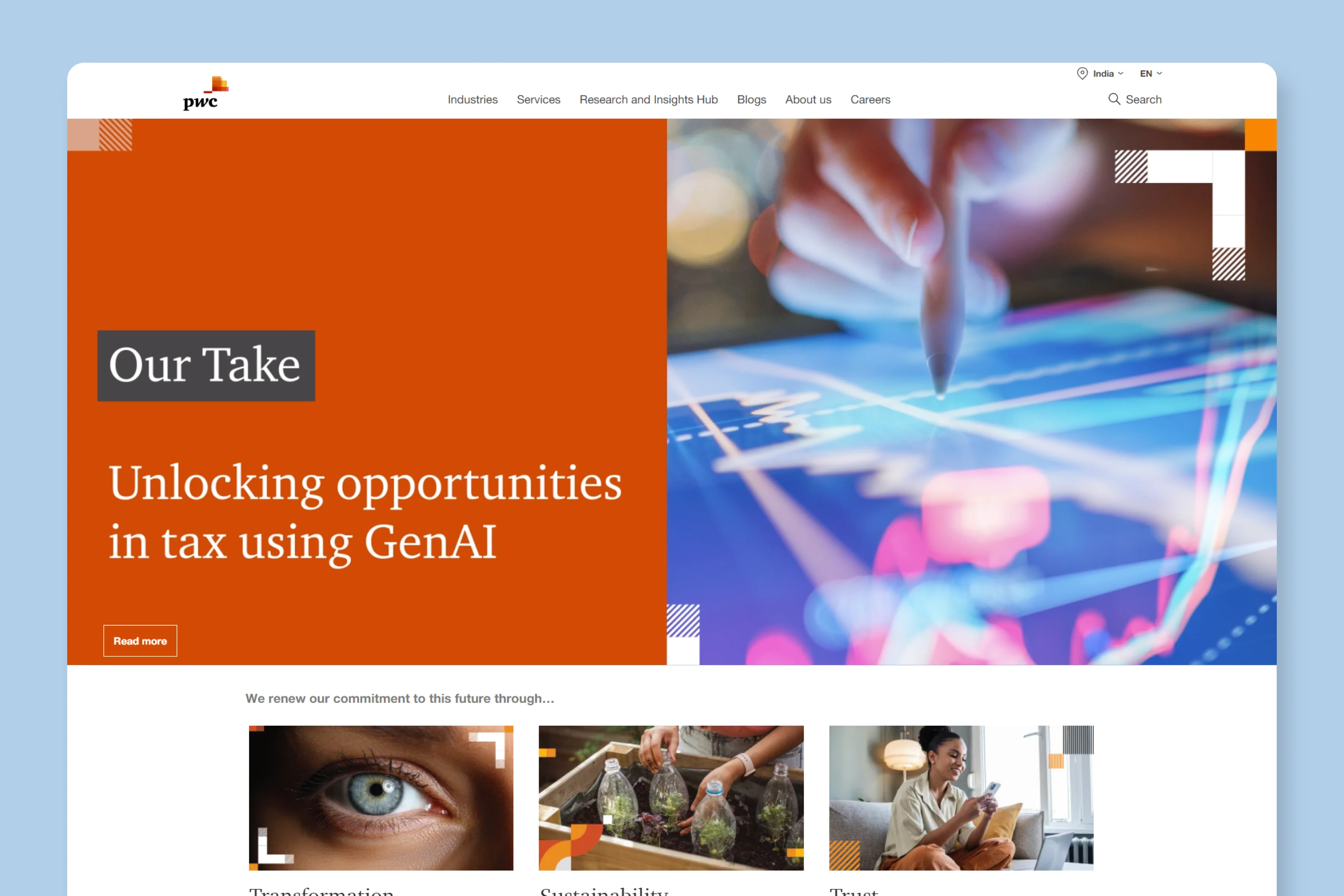
PwC uses mostly stock images for their articles.
Have a look at the blog hub of PwC:
In-content Images
We didn't find any additional images in blog articles' content.
What We Like
PwC is a highly reputable corporate, and it has done full justice in projecting that image via it's blog design - which is simple, focused and perfectly caters to their target audience.


