Design Specs
Typeface
Headings
Regola Pro (H1), Merriweather (H2s to H6)Paragraph
MerriweatherColor
Heading
1D1E22Paragraph
1D1E22Link Hover
FF8E5EArticle Hero
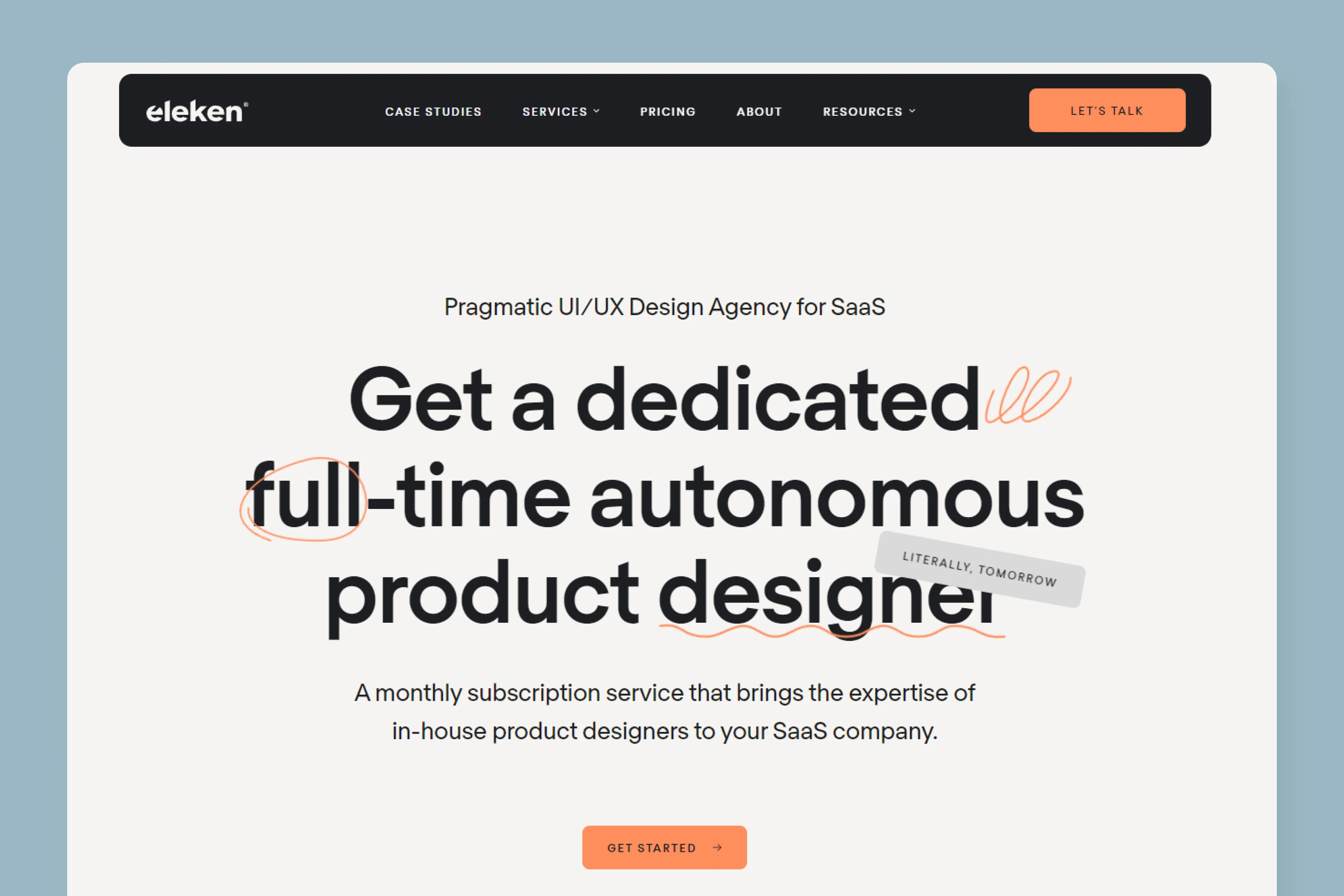
Eleken has opted for a highly minimal hero design, with just the title and a simple hand-drawn custom illustration. If you remember Slite's blog design, it is pretty much similar to it.
The only difference is Eleken's featured illustration seamlessly blends with the title, which is a great example of design done well.
Article Body
The article body is designed by keeping mobile-first design in mind. The maximum width of the content is just ~604 pixels which is pretty tight wrapping. But it is offset by a humongous line spacing of 40 px, which provides an enjoyable reading experience.
On the left, there is a navigation to browse all topics and sub topics within. On the right, there is a fixed table of contents, which provides for a smooth navigation throughout.
Eleken has completely done away with the CTAs here. That's pretty amazing since most service-based companies heavily promote their services even in their articles.
Blog Imagery
Featured Image
Eleken uses a series of custom-designed illustrations with consistent styling. Every featured image captures the essence of the article in a really subtle, enjoyable but powerful way.
When you visit at their blog hub page, it just looks beautiful.
In-content Images
Eleken's content and design team use a variety of images in their content. Screenshots and images from third-party sources are pretty common. They also design some custom images to explain a particular concept, statistics or contextually relevant illustrations that just make the content more enjoyable.
Email Subscription
Eleken's content game is top-notch and they leverage the power of email marketing and newsletters by providing an option for users to subscribe to their newsletters.
What We Like
Eleken being a SaaS focused UX/UI design agency knows how to make their website and blog's UX outstanding.
Their blog design is clean, focused and stands out from other blogs of design agencies in a way that you won't find any astronomical creativity or floating elements around. It seems like keeping their designs clean, simple and elegant is their motto.
However, one key thing that we really like is the fixed navigation to browse all their topics, which is rare especially for a design agency.


