Design Specs
Typeface
Headings
Proxima Nova CondensedParagraph
Proxima NovaColor
Heading
1A1A1AParagraph
1A1A1ALink Hover
1A1A1AArticle Hero
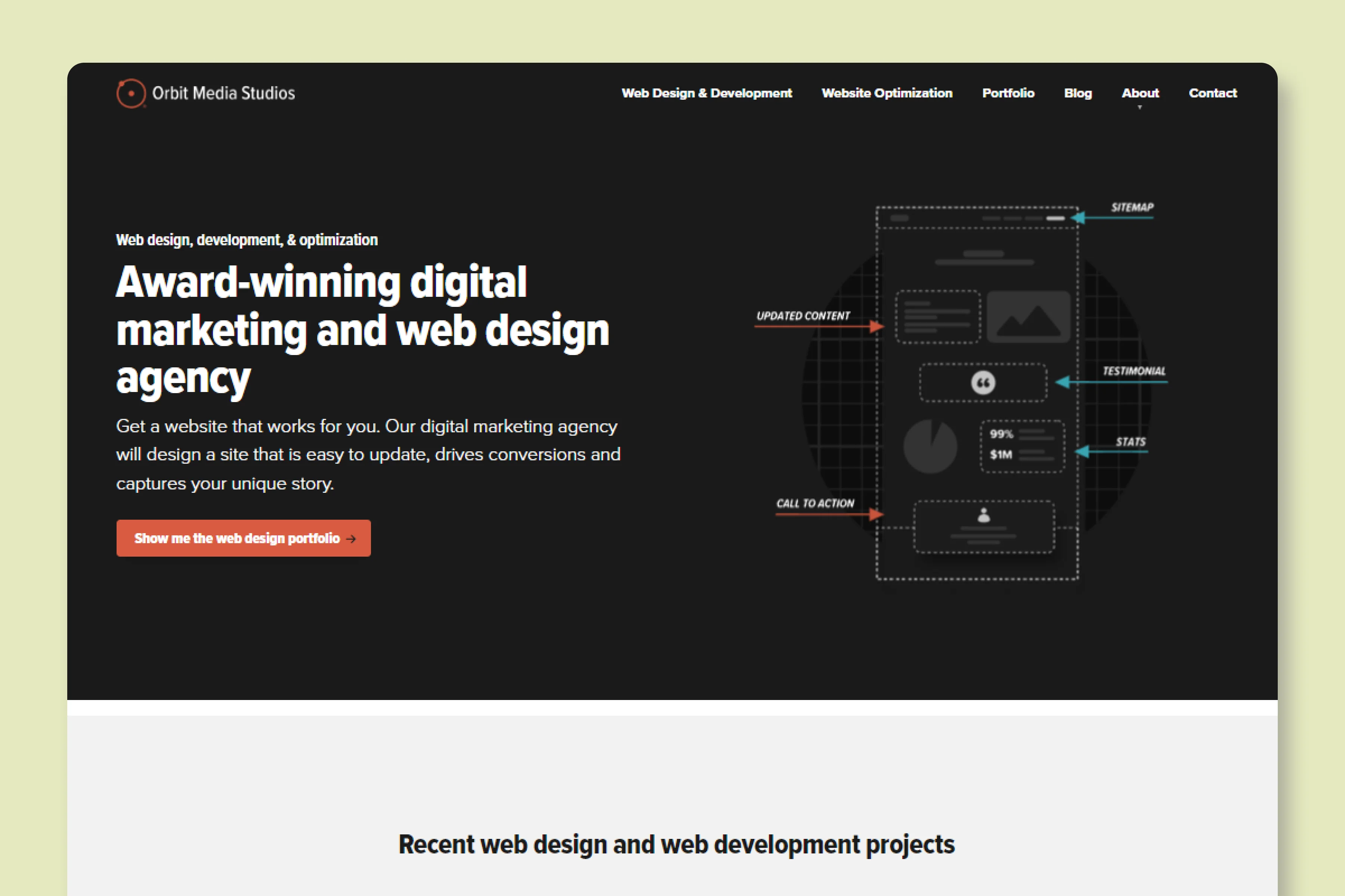
The article hero section is carries a distinct background color (#F2F2F3), a bold and loud title and no featured image.
Article Body
Orbit Media have heavily focused on the readability aspect. They have kept ample line spacing, and used sans serif fonts, which provide a great reading experience on both - big and small screen devices.
Blog Imagery
Featured Image
They mostly use stock images, but in some cases, they also put up screenshots for titles that better fit the context.
In-content Images
Orbit Media have done a great job of leveraging images to explain a particular concept.
They create custom images and edit screenshots that gives reader an immediate understanding of what's going on.
Email Subscription
This is probably one of the smartest footer space - making the email subscription box sticky. This way the readers don't get distracted and also, they don't have to scroll up and down to find an option to subscribe to their email.
What We Like
Orbit Media Solutions being a digital marketing agency certainly know how to optimize their blog user experience and for the search engines too.
The best part about them is the email subscription box that is fixed at the bottom.


