Design Specs
Typeface
Headings
Open SansParagraph
Open SansColor
Heading
000000Paragraph
000000Link Hover
007CB0Article Hero
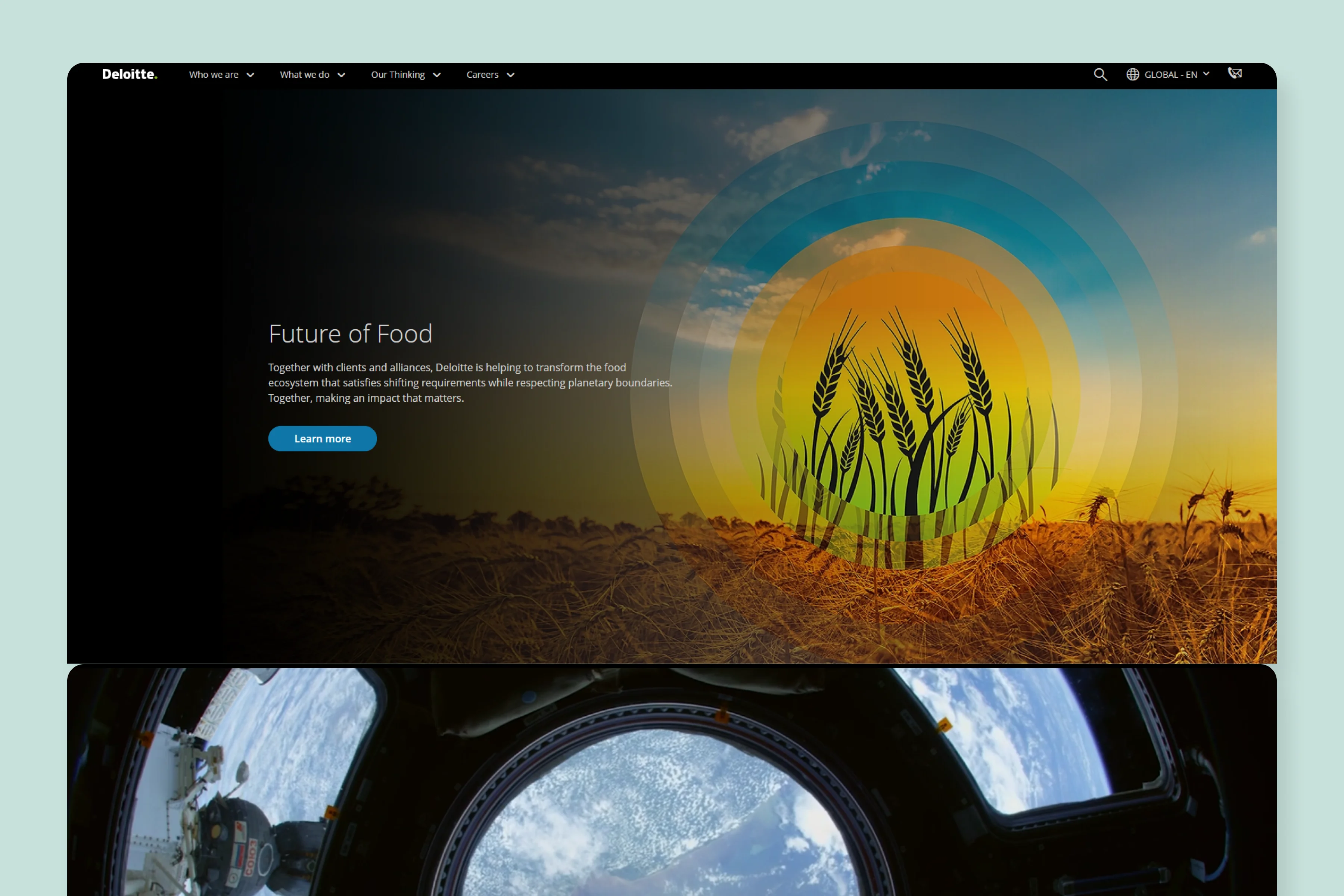
Deloitte has a pretty simple article hero, with just a thin weighted title and no featured image.
Article Body
The article body is also kept very simple with no side bars or navigation.
Blog Imagery
Featured Image
The featured image is pushed down after the introduction.
By navigating to their blog hub, we find that they have used a standardized featured image designs for all of their articles.
In-content Images
Most of the articles contain just text, some articles have stock photos.
What We Like
Deloitte is a highly regarded accounting and consultancy firm across the globe.
They have maintained a level of simplicity when it comes to publishing articles on their website. They aren't too long or loaded with fancy images or elements.
We believe that's the mark of a prime multinational company and this simple design honors its stature.


