Design Specs
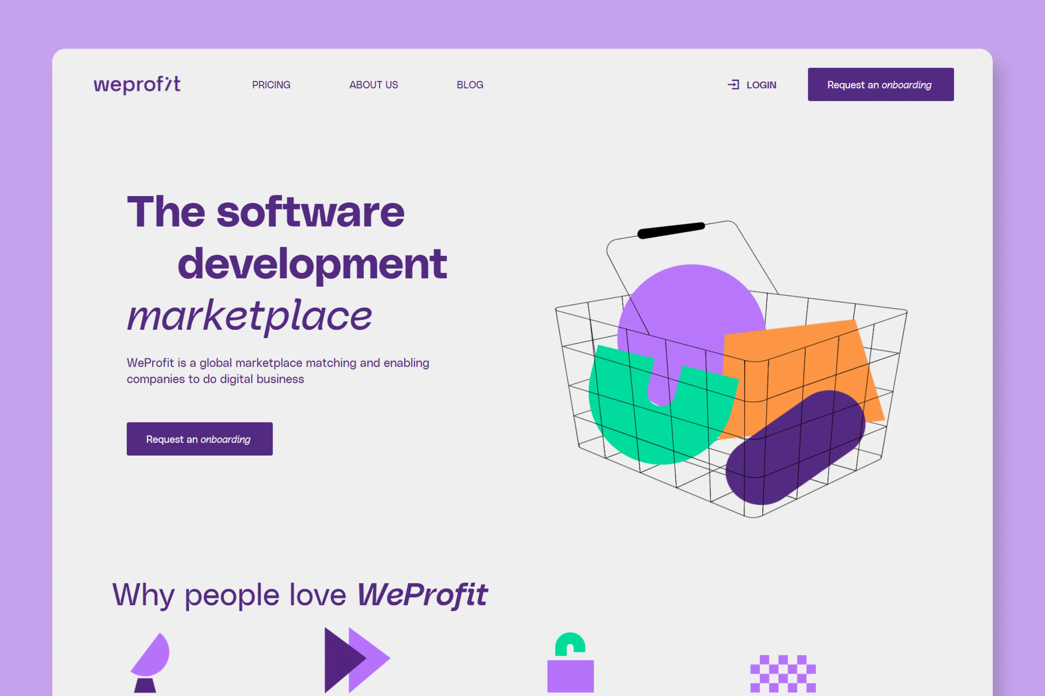
Typeface
Headings
Polysans MedianParagraph
Polysans NeutralColor
Heading
532980Paragraph
532980Link Hover
NoneArticle Hero
Weprofit's article hero is huge. It utilizes all the design real estate. The title is left aligned, and below that category, author info and social share buttons are featured.
On the right, there's a stock photo used as a featured image.
Article Body
The font colors are consistent with the brand and the same color (532980) is used for headings as well as paragraphs.
Thought the text is legible, a huge side bar on the right that shows related articles seems highly distracting.
Blog Imagery
Featured Image
They use stock photos for featured images.
In-content Images
We scoured every blog article but couldn't find any images used within the content.
What We Like
The only thing that's good about their blog is the Hero section.
It's simple, bold, and loud. And it really stands out from other blog hero section designs.


