Design Specs
Typeface
Headings
GraphikParagraph
GraphikColor
Heading
242938Paragraph
242938Link Hover
NoneArticle Hero
Fibery's blog hero section feels quite modern and clean.
Above the title, category, author and published date are mentioned.
After the title, there is table contents. But this not just ordinary TOC, it sports a unique style.
Article Body
Fibery's article body uses white space wisely but caps the content width to 750 px.
The line height is also significant (1.8 times the font size).
Blog Imagery
Featured Image
Fibery team has created a design template for their featured images, in which they use a relevant emoji along with fixed design elements.
It also carries the category, title and company logo, which is ideal when used for sharing on social media.
Since they have a set the template, their blog hub looks highly consistent and projects a strong brand image.
In-content Images
In some articles, Fibery uses screenshots of its own products, custom designed/created images
What We Like
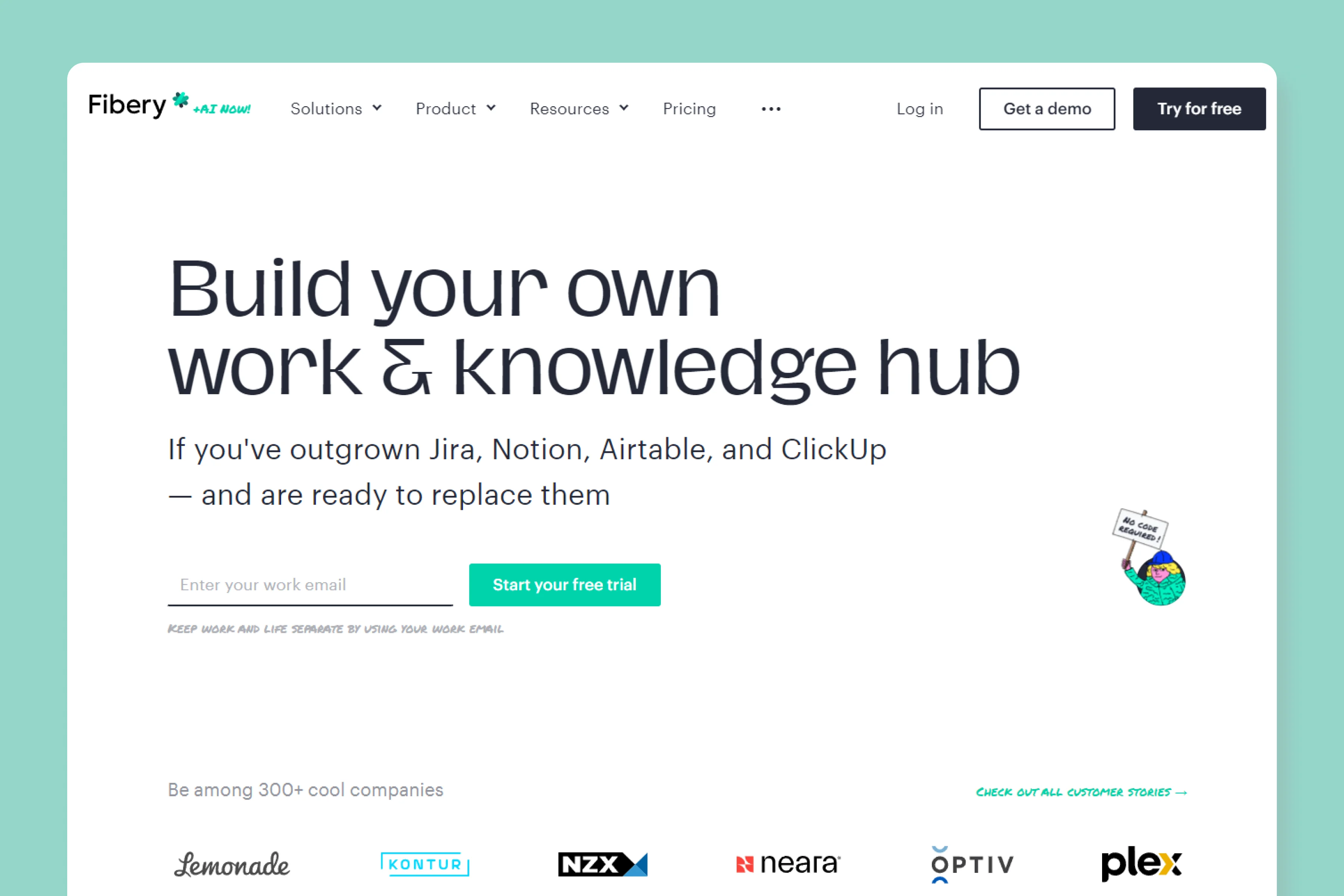
Fibery's website and blog both feels highly modern, clean and focused.
What's more exciting is their copywriting, and it perfectly complements their visual style. 10/10 from our side.


