Design Specs
Scandiweb's blog covers eCommerce strategy, conversion optimization, Magento development, digital growth, and UX and design. The content targets eCommerce managers, digital marketing leads, and technical decision-makers at mid-to-enterprise retail and B2B businesses.
Blog hub page
Scandiweb's blog hub is structured more like a content portal than a standard post index. Rather than a single uniform post grid, the page is divided into three clearly labelled content zones stacked vertically: a featured posts section at the top, a "Learn from our webinars" row below it, and a "Recommended free eBooks" section before the general post feed begins. This layered architecture makes the hub feel resource-rich before the reader has scrolled past the first screen.
The featured posts section pairs a large hero card on the left (thumbnail plus title plus excerpt plus author and date) with three smaller cards in a row beneath it. Each smaller card shows a thumbnail, title, author name, and publish date. A "Browse all featured posts" link sits below this group, acting as a quiet but clear navigational invitation. The webinars and eBooks rows each display three items in a three-column grid, with titles and author or editor attribution below each thumbnail. Both sections close with a "See all" link that mirrors the featured posts pattern, giving the hub a consistent browsing grammar across content types.
The general post feed below opens under the heading "Scroll down for the latest stories..." and displays posts in a two-column grid, each card showing a thumbnail, title, author name, and publish date. There's no category tag visible at card level in this section, though a horizontal category navigation bar sits at the top of the page (Blog Home, Resources, Case Studies, Magento, Hyvä, Technology, AI, Digital Growth, UX & Design, News). This top nav is the primary filtering mechanism and covers the full breadth of Scandiweb's content pillars. A "Load more" button at the base of the feed handles pagination.
Typeface
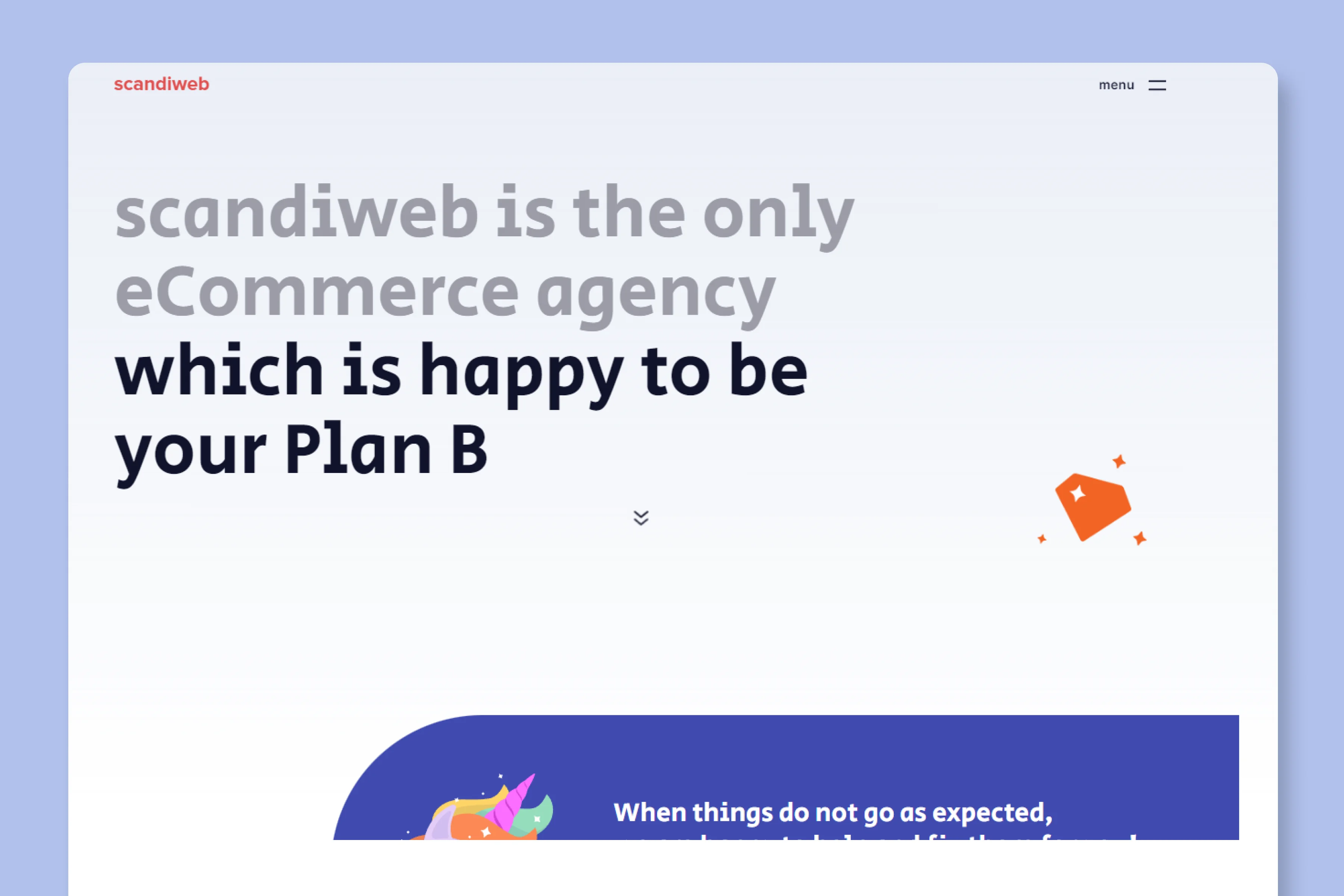
Article Hero
The article hero is built around a dark navy-background featured image that spans the full content width. For the evaluated post, the featured image is a custom-designed graphic with bold white and green typography, an illustrative icon, and clear article branding. It reads less like a decorative thumbnail and more like a content cover, with the article title partially embedded in the image design itself.
Below the featured image, the title appears again in large bold type on a white background, followed by a metadata row with the author name, publish date, and read time. The category tags (here "Best Practice" and "UX") appear above the title as small coloured labels, positioned to give the reader context before they engage with the headline. The overall hero structure is conventional but well-executed, and the custom featured image design is the element that lifts it above a standard template setup.
Article Body
Scandiweb's article body is single-column, centered on the page at approximately ~700 pixels wide. There is no sidebar. The reading experience is clean and uncluttered, with body text at ~15px and comfortable line spacing that keeps long-form content digestible. The absence of any sidebar element, whether for TOC, CTAs, or related content, means the full reading column belongs to the article.
The article uses a numbered heading structure that maps directly to the post's content promise. H2s are large and bold, functioning as chapter titles for each distinct recommendation. H3s beneath them handle sub-points, and the hierarchy is visually clear throughout. For a listicle-format post, this structure works well: the reader always knows where they are in the article.
Inline imagery is used purposefully. The article includes product screenshots (of eCommerce add-to-cart UI examples) and one notable piece of in-article video content at the close of the post: an embedded autoplay video showing an example of the UX principle being discussed. This is placed near the article's end as a summary or proof point rather than mid-article interruption.
A notable inline content block appears early in the article: a styled box labeled "Actionable ideas" sits to the right of the body text, presenting a compact list of quick takeaways. This element is the most distinctive content design choice in the body. It gives time-poor readers a scannable summary at the very top of the article without disrupting the flow for those reading the full piece.
Internal links appear throughout the body text, directing readers to related Scandiweb blog posts and service pages. There are no visible inline CTA banners or product promotion blocks within the article body itself. The only explicit CTA appears at the article's conclusion: a short paragraph directing readers to contact Scandiweb, followed by a "Get a free consultation" link. The conversion ask is saved for the end, after the value has been delivered.
The author bio appears below the article close, above the related posts section, and includes a small headshot, name, and a one-to-two line description. Social sharing buttons for Facebook, X, and LinkedIn sit just above the bio, aligned to the right, in a simple icon-only treatment.
The "If you enjoyed this post, you may also like" section surfaces three related posts as thumbnail cards in a three-column row, consistent with the hub page card grid. Each card shows a thumbnail, title, author name, and date.
Blog Imagery
Scandiweb's blog imagery is cohesive, branded, and immediately recognizable. The consistent use of dark navy backgrounds, bold white typography, and the Scandiweb wordmark across thumbnails creates a visual system that holds the hub grid together even as individual post topics vary widely. The overall impression is professional and agency-confident, with enough variation at the illustration and logo level to keep the grid from feeling repetitive.
Featured Image
Scandiweb's featured images are custom-designed branded graphics. Each follows a consistent visual template: a dark navy or dark-toned background, the Scandiweb wordmark in the top-left corner, bold white typography for the article title or topic, and supporting illustration or iconography. Partner or technology logos (Shopify, Hyvä, Adobe Commerce) appear on cards relevant to those platforms, adding immediate topical context at thumbnail size. The consistency across the grid makes the hub feel cohesive, and the dark backgrounds create strong contrast against the white hub page, making thumbnails easy to scan.
In-content Images
Within the article body, images are functional and directly tied to the surrounding content. Product UI screenshots are placed immediately after the text point they illustrate, so the reader doesn't have to work to connect image to argument. The screenshots appear to be lightly annotated or cropped for clarity rather than dropped in raw, which adds a small but meaningful layer of editorial intention. The embedded video near the article's close is the most visually commanding in-content element on the page.
What We Like
Scandiweb, as a full-service eCommerce agency, brings a structured and content-rich sensibility to their blog design. The hub page in particular stands out from typical agency blogs by functioning as a content portal rather than a post index: webinars, eBooks, and featured articles each get their own dedicated section, giving the page genuine depth before the main feed even begins.
The "Actionable ideas" callout box at the top of the article body is one of the more thoughtful content design decisions we've seen in an agency blog. Placing a styled summary box at the start of a long-form post, rather than at the end as a recap, respects the reader's time from the first scroll and serves both skimmers and deep readers without compromising either experience.
The custom featured image system deserves recognition too. The consistent dark-background branded template, with the Scandiweb wordmark and bold topic typography, gives the hub grid a visual coherence that most agency blogs don't achieve. When partner or technology logos appear on relevant cards, they add specificity without breaking the template. It's a scalable system that still leaves room for content-level differentiation, which is exactly what a high-volume blog needs.