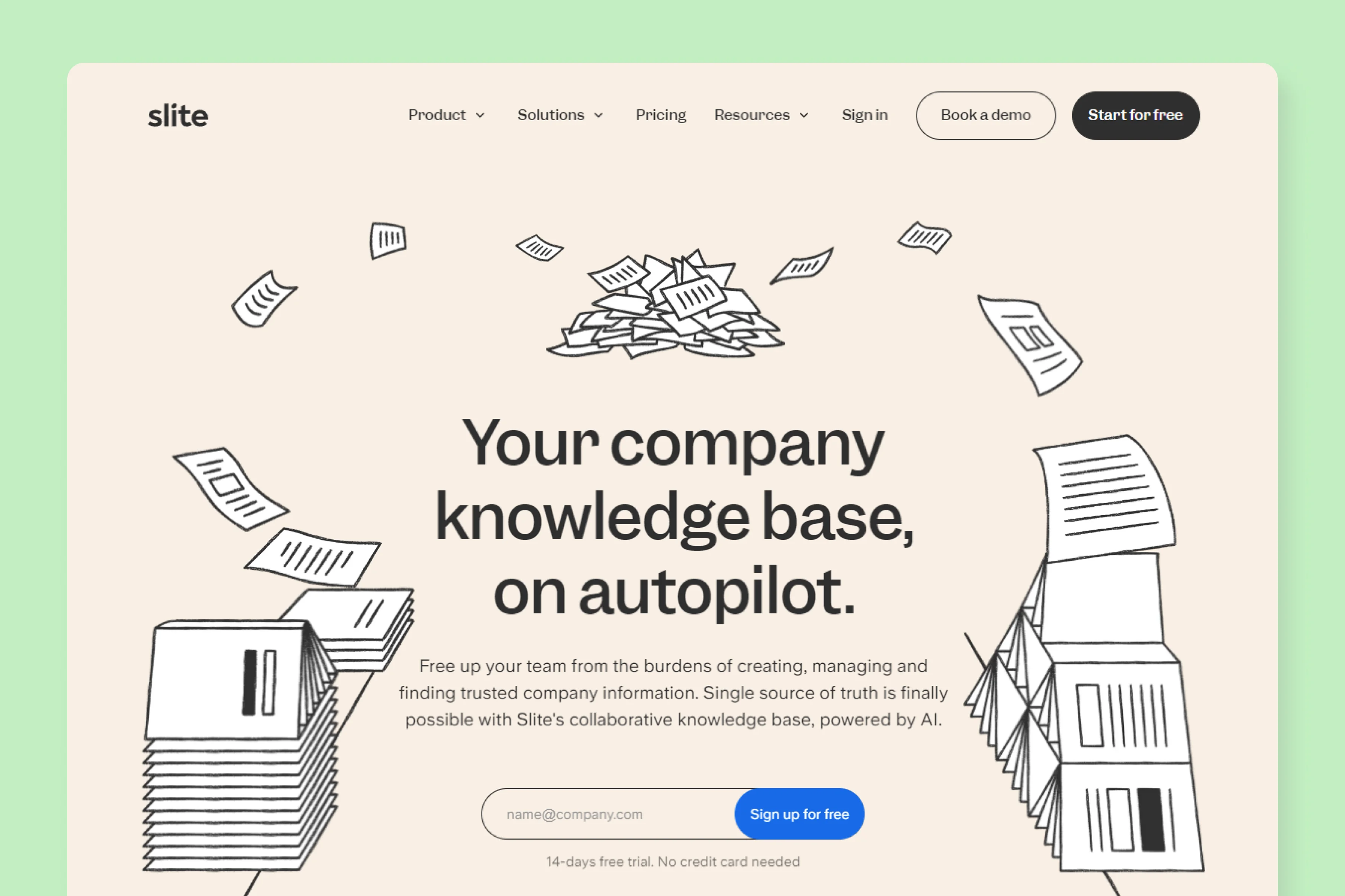
Slite has a clean, focused article hero section.
The headline feels loud and clear, supported by a humongous featured image.
They use the article's meta as the lede, which gives the gist of the article in a really, really crisp manner.

Last updated: April 9, 2026
Slite is an AI powered knowledge base for quick access to trusted company info. You simply ask Slite and get the answers you need.
Slite has a clean, focused article hero section.
The headline feels loud and clear, supported by a humongous featured image.
They use the article's meta as the lede, which gives the gist of the article in a really, really crisp manner.
Slite has a minimal article body design, with content aligned to the left and a sidebar sporting a mail signup box.

For this article, Slite has used a combination of illustration and text for their featured image.

If you browse through their content library, you'd find that they use a variety of featured images. They don't stick to a particular template.

The only thing that is consistent here is the use of hand-drawn styled illustrations.
Slite heavily uses their product's images to demonstrate its features that sync with the content.
They either use static images or GIFs.


For third party content or screenshots, they add those images in their templates with a logo at the right corner to maintain consistency.

Slite has done an excellent job with email subscription box. They have chosen to keep it non-intrusive, minimal and focused. The best part? There are no annoying pop-ups that scream to sign up for their newsletter.

The best part about Slite's blog design is it is highly focused. Zero distractions.
All of the other stuff like related articles, call to action, social sharing buttons (which appear only at top) have been pushed down.