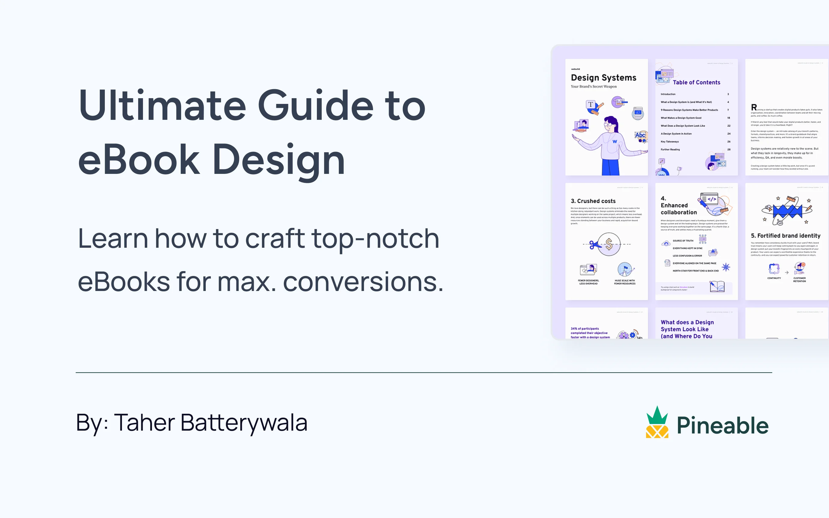
Most B2B eBooks follow the same formula: a branded cover, a wall of copy, a few stock photos dropped in to break the monotony, and a gated form at the end. Then marketers wonder why the asset gets downloaded once and never opened again.
Here's the uncomfortable truth: the download was never the problem. The design was.
According to a 2024 Netline report on content consumption, eBooks account for nearly 40% of B2B demand generation. That's a lot of eBooks competing for the same pair of eyes. When your buyer downloads three eBooks in a week, design is what determines which one they actually read.
I've spent time studying the B2B eBook examples that consistently show up in content marketing conversations, and the ones that work aren't always the most elaborate. What they share is something more specific: every design decision has a reason. The cover, the interior layout, the data callouts, and the whitespace are all doing deliberate jobs.
This article breaks down the real-world eBook design examples worth learning from, the patterns behind them, and what you can take straight into your next eBook.
- Most B2B eBooks fail not because the content is weak, but because the design makes it hard to trust or consume
- The best eBook examples treat every page as a visual decision: cover, chapter openers, data displays, and whitespace all do specific jobs.
- Five design patterns separate high-performing B2B eBooks from forgettable PDFs
- Real-world examples from Pardot, Optimizely, Vend, Search Engine Journal, LinkedIn, HubSpot, and Copyhackers show these patterns in action
What Makes a B2B eBook Well-Designed?
Most people equate good eBook design with polish: a clean font, consistent brand colors, maybe a few icons. That's not wrong, but it's incomplete.
In a B2B context, the real function of eBook design is trust and readability at speed. Your reader is a marketing manager or a senior buyer who will make a "worth reading" decision in the first 30 seconds. Design either earns that decision or kills it.
A well-designed B2B eBook needs to do three things:
- Signal credibility immediately: the cover sets a tone about the organization's attention to detail before a single word is read
- Make content skimmable: your reader needs to find the section relevant to them without hunting through dense paragraphs
- Reinforce authority through consistency: every page should feel like it belongs to the same document
The five real-world eBook design examples below each illustrate one or more of these jobs. Some are well-known names, some are industry publications, but all of them have had their design decisions analyzed and documented by multiple credible sources.
The Cover Does More Work Than You Think
The cover is the only part of your eBook a prospect sees before they decide to download. That makes it a conversion asset, not just a design element. Yet most B2B eBook covers are just a logo, a title, and a color block.
The examples below show what a deliberate cover design actually looks like in practice.
Pardot's "Field Guide to Lead Generation"
Pardot (now Salesforce Marketing Cloud Account Engagement) built their B2B lead generation eBook around a consistent outdoor and adventure theme. The cover features illustrated characters dressed as explorers, and those same characters appear throughout every chapter of the eBook.
The design choice here isn't cosmetic. According to Brafton's breakdown of best eBook design examples, Pardot uses the illustrated characters to take "a more narrative approach" to a topic (lead generation) that could easily have been treated as a dry, statistics-heavy whitepaper. The characters signal from the cover: this will be accessible, not intimidating.
What's worth noticing: the thematic device isn't just decorative. It creates visual continuity from cover to final page, so the reader always feels like they're inside the same world. That's a design system decision, not a styling one.
What to steal: Instead of just placing your logo on a color block, give your cover a thematic device that reflects the tone of the content. If your eBook is about scaling sales teams, could the visual metaphor be growth? Exploration? Construction? The best eBook cover examples commit to a concept.
LinkedIn's "Secret Sauce" Marketing eBook
LinkedIn took their content theme literally. Their marketing eBook about amplifying campaigns features sauce bottles, chilis, and flame illustrations in brand blue, as documented in Piktochart's analysis of real-world eBook design examples.
The brand color dominates the cover, but the unexpected illustrative style makes it stand out in a content feed full of generic marketing PDFs. More importantly, the cover communicates what kind of document this is: an inside look at how a major brand actually runs its marketing, not a standard best-practices guide.
The pattern across both examples: The best B2B eBook covers aren't just branded. They're characterized. They give the document a personality that tells the reader what they're about to experience.
Looking Inside: Sections That Hold Attention
A strong cover earns the download. Interior layout determines whether the eBook actually gets read. This is where most B2B eBooks lose the reader, and where the strongest marketing eBook design examples separate themselves.
Optimizely's Website Redesign eBook
Right from the opening pages, Optimizely draws the reader in through visual structure, not just visual appeal. The eBook uses geometric shapes and near-pastel colors to frame each page, giving every spread a clear visual entry point.
Brafton's analysis of Optimizely's eBook notes that the design uses shape-based containers to separate key insights from supporting explanation. The shapes don't compete with the copy. They frame it, so the reader always knows where to look first.
This matters especially for a technically complex topic like website redesign. Dense subject matter needs strong visual scaffolding to stay approachable.
What to steal: Use shapes or containers to create structure on complex pages, not just lines or dividers. The goal is to give the reader a visual roadmap of what's important on each spread before they start reading.
Vend's Retail Predictions eBook
Vend's approach is almost the opposite of Optimizely's, and it works just as well. Their retail predictions eBook is light on custom illustration. Instead, it leans on generous whitespace, human photography, and pull quotes from industry voices.
As Brafton's eBook design breakdown puts it: "What Vend tones down in illustrations, it makes up for in personalized quotations, human imagery and logical flow of chapters, with each section highlighting a new retail prediction."
The consistent use of green on white creates breathing room. Every page feels easy to enter. The pull quotes are the most important element on each page, and the design supports that by giving them space and weight.
What to steal: Decide what the single most important element on each page is. Then design everything else to support it, not compete with it. Whitespace isn't emptiness. It's framing.
Pro tip: Brafton recommends capping body copy per eBook page at roughly 125 words. Not because readers can't handle more, but because every word above that threshold competes with the design elements that are doing the persuasion work.
How The Best B2B Ebook Examples Handle Data And Statistics
Most B2B eBooks drop in a bar chart or a bold callout number and treat that as "visual content." That's not data design. That's data dumping.
The difference matters: data design tells a story. Data dumping reports a fact. The reader can tell which one they're looking at.
Search Engine Journal's Link-building eBook
SEJ's eBook on link-building tactics is one of the most cited examples of structured data presentation in B2B eBook design. Each chapter follows a consistent format: an explanation of the tactic, a practical breakdown of benefits, and a set of recommended tools. The eBook closes with a 12-month link-building checklist.
According to Brafton's analysis, "readers who provided their contact info probably received more value than they bargained for" because the design structure converted data and advice into a usable deliverable rather than just a document to read once.
The design insight here is structural, not just visual. SEJ used a repeating template for chapter endings so readers develop a reading rhythm. The checklist at the end turns information into action, which is what makes a B2B lead magnet actually useful to the prospect.
What to steal: Give your data a consistent home in the eBook's structure. A repeating stats callout block, a standardized data table format, or a chapter-end summary card creates visual rhythm while making the numbers feel intentional rather than decorative.
LinkedIn's Recruiting eBooks
LinkedIn's recruiting-focused eBooks use people-centric imagery throughout, not stock photography of laptops and handshakes, but photography that directly reflects the subject matter. Data is displayed in clean, branded visualizations with enough whitespace around each chart that the numbers don't crowd each other.
Column Five's roundup of 75 eBook design examples highlights how LinkedIn matches color-coded data categories to the eBook's cover palette, keeping the visual system coherent from first page to last.
The pattern: In the best B2B eBook examples, every data point has been given a visual decision. Not just formatted, but placed, weighted, and colored in a way that reflects its importance relative to everything else on the page.
Brand Consistency: Make Your eBooks Instantly Recognizable
Most B2B eBooks have a strong cover and then quietly lose the visual system two pages in. Heading sizes drift. Fonts change. Chart styles don't match the color palette from the opening section. The reader notices, even if they can't name exactly what's wrong.
A visual system isn't just a style guide. It's a signal to the reader: we were paying attention the whole way through. In B2B, that signal matters because eBook quality is a proxy for company quality in the mind of a buyer.
HubSpot's eBook Library
HubSpot created an InDesign eBook template used across their entire resource library, regardless of author or team. The result: every HubSpot eBook uses the same cover format (bold color block, title, subtitle, resource type label), the same typographic hierarchy, and the same chapter structure.
HubSpot's own guidance on eBook design elements puts it plainly: "Creating easy-to-follow guides and templates for your various marketing assets like eBooks, presentations, etc. will make it easy for you and your team to implement a consistent branding style throughout your marketing collateral."
The eBook feels like one document, not a collaboration between three different designers on a deadline.
What to steal: Define your eBook's visual system before you start designing. That means nailing down the cover grid, body type hierarchy, callout block style, data visualization palette, and chapter opener format. Do that once, build a template, and every eBook you produce after that will look intentional.
Copyhackers' Conversion Copywriting eBook
Copyhackers produced a free eBook specifically about the intersection of copy and design. For an asset making that argument, the visual execution is the argument.
The eBook uses clean typographic hierarchy, deliberate color accents for emphasis, and zero decorative elements that don't serve a persuasion function. There are no stock photos. Typography does the design work entirely.
The approach reinforces the content's core premise: design decisions should be driven by persuasion principles, not decoration. Every visual choice in the eBook demonstrates that principle in action.
The pattern: Consistency isn't about playing it safe. It's about proving to the reader that you were in control of every design decision, from the cover through to the last page.
The Cost of Poor eBook Designs
The failure mode in most B2B eBooks isn't poor aesthetics. It's the absence of a design system. Each page makes local decisions that don't add up to a coherent document, and the reader feels that friction even if they can't articulate it.
A badly designed eBook doesn't just underperform as a lead magnet. It sends a signal to the prospect: if this is how they present ideas, what does their product or service look like?
Three patterns show up consistently in forgettable B2B eBook design examples:
- Dense body text with no visual entry point. No callouts, no pull quotes, no data callouts. Just paragraphs running edge to edge. The reader has no way to skim, so they don't read at all.
- Decorative imagery. Photos that illustrate the general topic but not the specific point on that page. A photo of a laptop next to a section about marketing automation tells the reader nothing about the argument being made. It just fills space.
- Inconsistent type hierarchy. Heading sizes that don't follow a clear progression, making it impossible to skim the document for structure. The reader can't tell what's important and what's supporting detail.
These aren't aesthetic failures. They're friction. And friction in a lead magnet is the fastest way to lose a prospect who already downloaded your content.
How To Use These eBook Design Examples In Your Own Work
You don't need Pardot's design budget or HubSpot's InDesign template library to apply these patterns. The underlying logic is accessible regardless of the tool you're using.
Here's a quick checklist for your next eBook, drawn directly from the examples above:
- Cover: Does it have a thematic device beyond a logo and a color block?
- Page structure: Is there one clear visual entry point per spread?
- Whitespace: Have you given your most important element on each page room to breathe, or is everything competing at the same visual weight?
- Data: Does every stat or chart have a visual treatment that reflects its importance in context?
- System: Is the same typographic hierarchy, color palette, and callout style applied consistently from cover to last page?
The fastest way to audit an existing eBook: open it in thumbnail view. Shrink every page down until you can see 6 to 8 spreads at once. Can you identify the most important element on each page in under 3 seconds? If not, the visual hierarchy isn't working, and no amount of good copy will compensate for that.
Closing the Page
The eBook examples worth learning from aren't always the flashiest or the most expensive to produce. They're the ones where every design decision has a reason. Pardot's illustrated characters, Vend's disciplined whitespace, SEJ's repeating chapter structure: none of those required a massive budget. They required a point of view about how the reader would move through the document.
That's the standard worth holding your own eBooks to.
Browse marketing eBook designs curated in Pineable's gallery to see how these design patterns show up across real B2B content. And if you want to see how the same principles apply to the page that gets people to download in the first place, take a look at our breakdown of eBook landing page design examples.
Summarize this article with AI:

Written by
Taher BatterywalaFounder & Chief Curator
Taher Batterywala is a creative marketer who loves to write & design content that organically drives conversions. He is the creator of Pineable, the world's first content marketing design inspiration hub. He regularly shares his thoughts about content design, SEO, and marketing. As a true cinephile, he admires movies above anything else.