On this page
Balance in design principles is the even distribution of visual weight across a layout, so no side feels heavier than the other. When a page is balanced, the eye settles and reads. When it isn't, readers feel something is off, even if they can't say what.
This guide explains how visual weight works, the three main types of balance, and four real examples from the Pineable gallery: Eleken, Slite, HubSpot, and Deloitte.
- Balance means visual weight feels evenly spread around an imaginary axis, usually a vertical line down the middle.
- Visual weight comes from size, color, contrast, density, and position, not from how many elements you place.
- Symmetrical balance feels calm and formal. Asymmetrical balance feels dynamic. Radial balance pulls the eye to a center point.
- One large element can balance several small ones, which is how most split hero sections work.
- Test balance by squinting at the layout or blurring a screenshot: heavy areas show up fast.
What Is Balance in Design?
Balance is a satisfying arrangement of design elements, where visual weight sits evenly on both sides of an imaginary axis. That's how Nielsen Norman Group's guide to visual design principles defines it. The axis is usually vertical, but it can be horizontal too.
Balanced doesn't mean identical. NN/g points out that a single large element can outweigh several small ones. So a layout with three icons on the left and one big photo on the right can still feel stable.
Here's what adds visual weight to an element:
- Size: Bigger elements feel heavier.
- Color: Saturated and warm colors feel heavier than pale or cool ones.
- Contrast: A dark shape on a light page pulls more attention than a mid-gray one.
- Density: Detailed illustrations and photos feel heavier than flat shapes.
- Position: Elements farther from the center act like a longer lever, so they carry more weight.
The tradeoff to remember: perfect balance can feel dull. Most good layouts keep overall balance but let one focal point carry extra weight, so the reader knows where to look first.
The 3 Types of Balance in Design
Pick the type by the mood and job of the piece. NN/g names three types, and they cover nearly every marketing layout you'll build.
| Type | How it works | How it feels | Best for |
|---|---|---|---|
| Symmetrical | Elements mirror each other across a central axis | Calm, formal, trustworthy | Centered hero sections, report covers, invitations |
| Asymmetrical | Different elements balance through size, color, and spacing | Dynamic, modern, energetic | Split hero sections, ebook landing pages, ads |
| Radial | Elements radiate out from one central point | Focused, circular, attention-grabbing | Event graphics, logos, feature diagrams |
Symmetrical balance is the safest choice. It's also the easiest to make boring, because nothing breaks the pattern.
Asymmetrical balance takes more skill. You're trading weight between unlike elements, such as a block of text on the left and a bold image on the right. When it works, the page feels alive. When it fails, one side looks empty.
Radial balance is the rarest on websites. It's powerful for a single hero image or a diagram, but it rarely works for a full page of content.
Some design courses also teach a fourth type, mosaic balance, where many elements of similar weight fill the space with no single focal point. Think of a photo grid or a logo wall.
Balance in Design Examples From the Pineable Gallery
Real layouts show balance better than diagrams. These four come from Pineable's curated gallery, with credit to each brand.
Eleken: Classic Symmetrical Balance
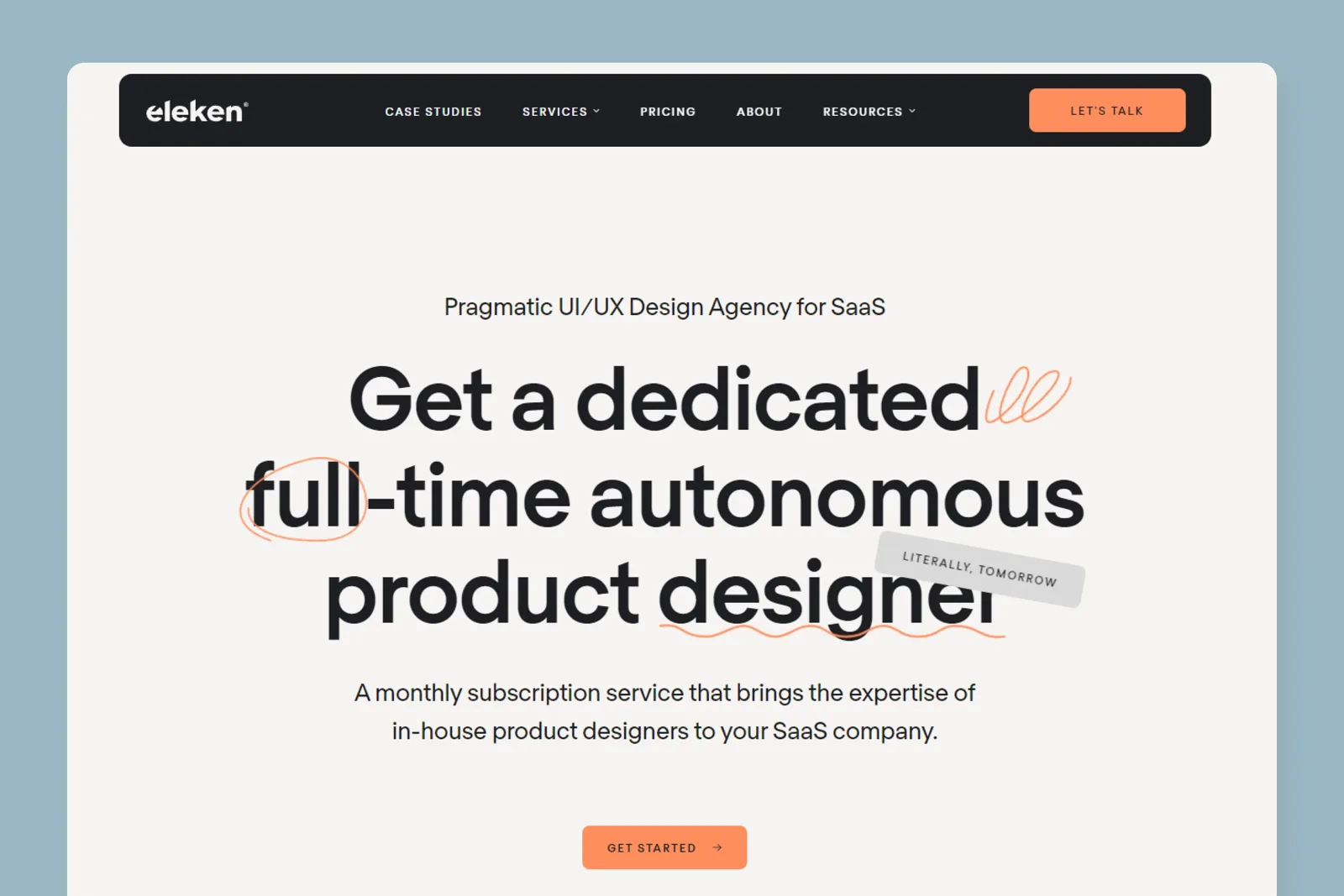
Eleken's hero stacks everything on one vertical axis: a small eyebrow line, a three-line headline, a two-line subhead, and one orange button. The dark navigation bar on top sits evenly across the full width. A hand-drawn underline and a tilted "literally, tomorrow" tag add a little play without tipping the balance.
The lesson: symmetry makes a single message feel confident. Eleken has one offer, so a centered layout with one button is the right call. A page with several competing offers would feel crowded in this format.
Slite: Approximate Symmetry With Illustration
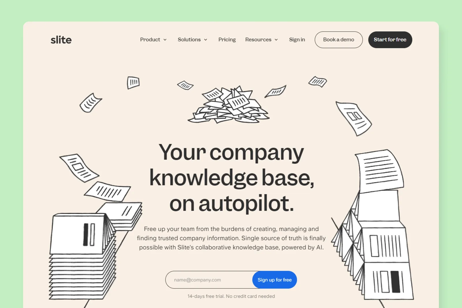
Slite's hero centers the headline, body copy, and email signup form. Line-art illustrations of flying papers and document stacks frame the text on both sides. The two sides aren't mirror images, but they carry similar weight, so the page still feels symmetrical.
This is approximate symmetry, and it's more interesting than a strict mirror. Use it when a centered layout feels too stiff. Keep the illustration in one style and one color, as Slite does, or the decoration will compete with the headline.
HubSpot: Asymmetrical Balance on an Ebook Page
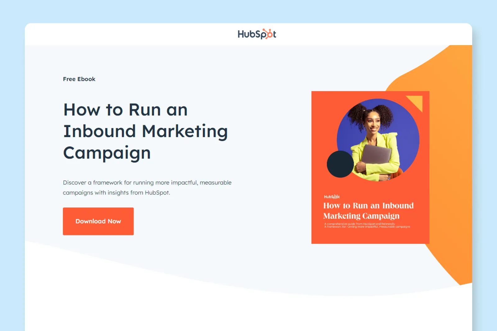
HubSpot's ebook page for "How to Run an Inbound Marketing Campaign" puts the headline, short description, and orange "Download Now" button on the left. On the right, a bright orange ebook cover with a portrait photo sits inside a curved orange shape.
The text block is wider, but the cover is far heavier in color and density. That trade is what balances the page. It also guides the eye: you see the cover first, then read left to the headline and button. If you build a split layout like this, make the heavy visual and the call to action share a color, as HubSpot's orange does.
Deloitte: Radial Balance in a Hero Image
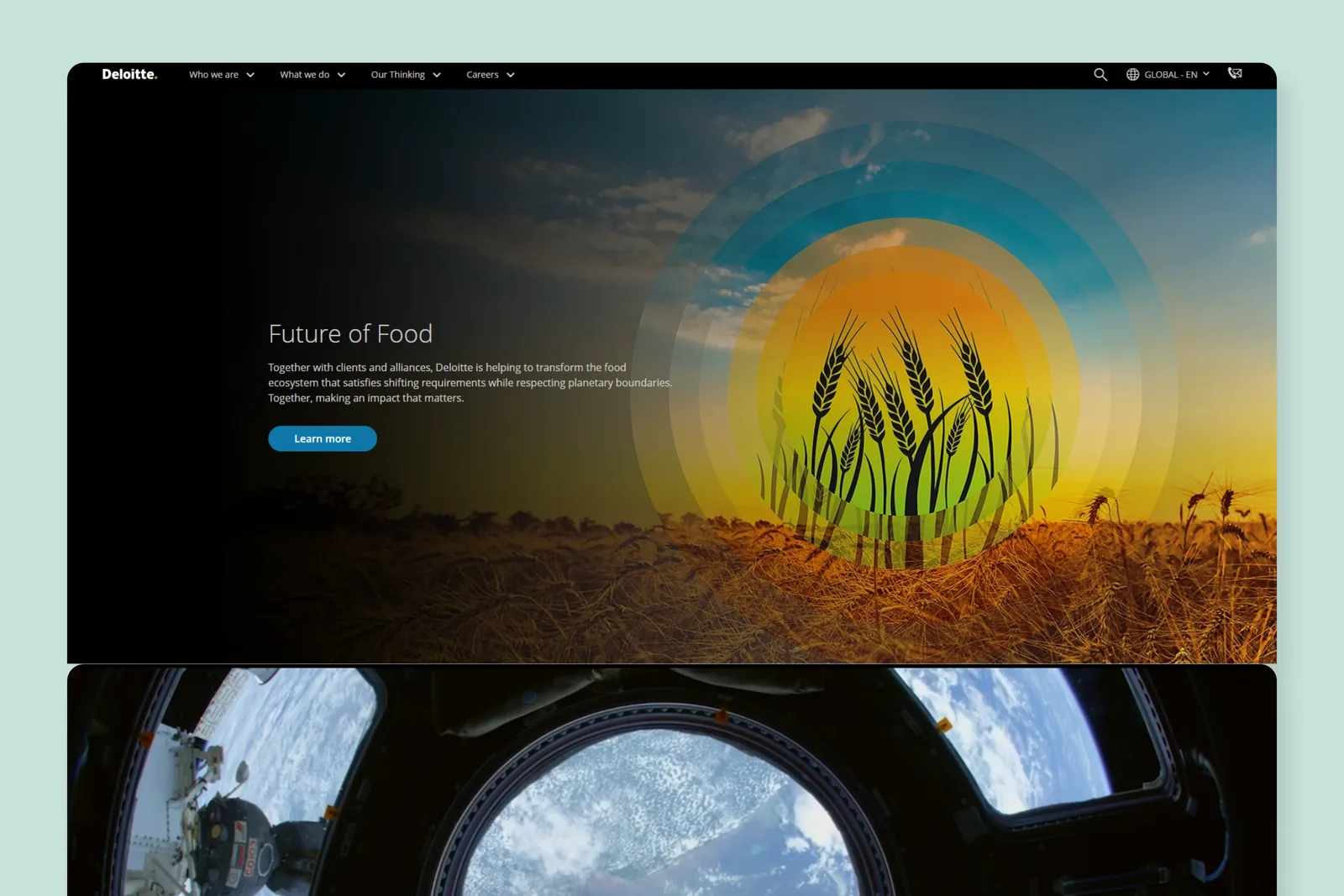
Deloitte's "Future of Food" feature uses a photo of wheat stalks in front of glowing concentric circles that radiate from a central sun. Every ring pulls your eye back to the center, which is classic radial balance.
The headline and "Learn more" button sit to the left on a darker area, so the radial image and the text don't fight for the same space. That's the main rule for radial balance on the web: let the circle own one zone, and keep your copy out of its center.
How to Create Balance in Your Designs
Start with the most important element, then balance everything else around it. These steps work for web pages, social graphics, and print.
- Pick one focal point. Decide what should be seen first: a headline, product shot, or number.
- Choose the balance type. Use symmetry for one clear message, and asymmetry for a message plus a strong visual.
- Counter heavy with heavy. A big photo on one side needs a dense text block, a strong color, or more white space on the other.
- Limit your colors. Bright colors add weight fast. Our color harmony tool helps you choose a palette that won't tip the layout.
- Balance type, too. A heavy display font next to a light body font changes weight on the page. Test combinations with the font pairing tool.
- Run the squint test. Blur a screenshot or squint at the screen. If one corner looks like a dark blob, move or shrink something.
The most common mistake is filling every gap. White space is part of balance. An empty area can offset a heavy element as well as another object can, and it's free.
What are the 3 types of balance in design?
The three main types are symmetrical, asymmetrical, and radial balance. Symmetrical mirrors elements across an axis, asymmetrical balances unlike elements through size and color, and radial arranges elements around a central point.
What is an example of asymmetrical balance?
A split hero section is the most common example. HubSpot's ebook page balances a left-aligned headline and button against a bright orange ebook cover on the right.
What is radial balance in design?
Radial balance arranges elements so they radiate from one central point, like rings or spokes. It pulls the eye to the center, which suits logos, event graphics, and hero images.
Why is balance important in design?
Balance makes a layout feel stable and easy to read. Unbalanced designs feel lopsided or chaotic, so readers struggle to find the main message and may leave.
What is visual weight in design?
Visual weight is how strongly an element pulls the eye. Size, color saturation, contrast, detail, and distance from the center all increase it.
Summarize this article with AI:
 ChatGPT
 Perplexity
 Claude
 Grok

Written by
Taher BatterywalaFounder & Chief Curator
Taher Batterywala is a creative marketer who loves to write & design content that organically drives conversions. He is the creator of Pineable, the world's first content marketing design inspiration hub. He regularly shares his thoughts about content design, SEO, and marketing. As a true cinephile, he admires movies above anything else.