On this page
Ad design is the process of turning one marketing message into a visual that stops the scroll, gets understood in a glance, and earns a click. Good ad design isn't about decoration. It's about removing everything that slows the viewer down. Here's the whole process in seven steps:
- Pick one goal and one message.
- Build a swipe file from real, live ads.
- Size the ad for its placement before you design anything.
- Set a clear visual hierarchy.
- Write a headline that survives a two-second glance.
- Check contrast and legibility on a phone.
- Make the call to action obvious, then test variants.
- Every ad should carry one message and one action; a second offer usually weakens both.
- Meta recommends 4:5 feed images at 1440 x 1800 pixels and headlines of about 27 characters.
- Google advises against overlaying text, logos, or fake buttons on responsive display ad images.
- Aim for at least 4.5:1 text contrast, the WCAG AA minimum for normal-size text.
- Study live competitor ads for free in the Meta Ad Library and Google Ads Transparency Center.
How we built this guide: we checked Google Ads and Meta's official ad specs, Google's ABCD creative framework, and the W3C contrast standard on November 11, 2026. The examples come from public ad libraries and Pineable's curated design gallery.
What Is Ad Design?
Ad design is the visual side of advertising: the layout, imagery, type, color, and call to action that carry a paid message. It covers static social ads, display banners, search-adjacent assets, print, and the opening frames of video ads.
The job is narrower than general graphic design. A brochure can ask for a few minutes of attention. An ad gets a fraction of a second while someone scrolls past it. So every design choice has to answer one question: does this help the viewer understand the offer faster?
That's why the same principles show up everywhere, from a 300-pixel banner to a full-screen Story. One focal point. A short headline. Strong contrast. A clear next step.
How to Design an Ad in 7 Steps
Follow these steps in order. Each one removes a decision from the next, so you spend less time pushing pixels around.
1. Pick One Goal and One Message
Decide what the ad must make someone do before you open a design tool. "Book a demo," "shop the sale," and "download the guide" are goals. "Build awareness and drive sign-ups" is two goals pretending to be one.
Then write the message as one sentence a stranger would understand. For example: "Payroll for 10-person teams, set up in a day." If you can't write that sentence, the design won't fix it.
This step matters most for small budgets. A single, clear message lets you see what worked when the results come in.
2. Build a Swipe File From Real Ads
A swipe file is a saved collection of real ads you can study for layouts, hooks, and offers. You don't copy them. You use them to see patterns that work in your category before you design your own.
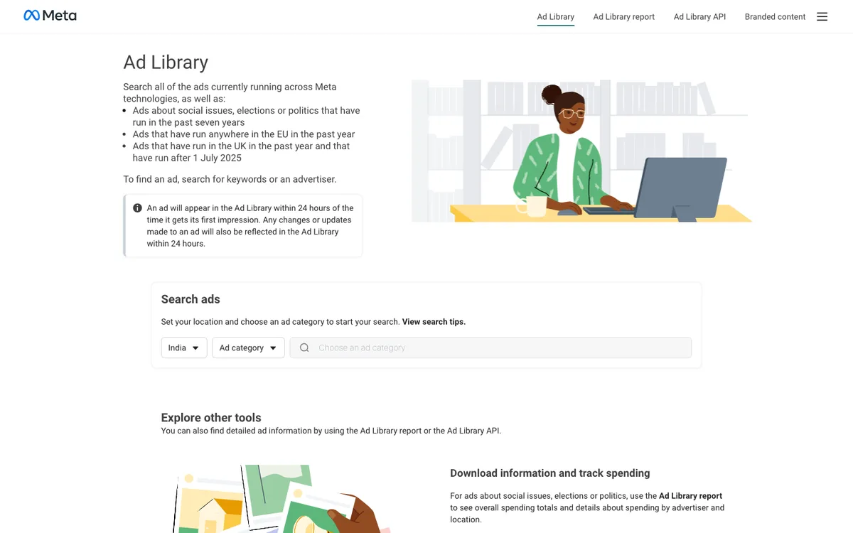
Two free tools make this easy. The Meta Ad Library lets you search ads currently running across Facebook, Instagram, and other Meta technologies by keyword or advertiser.
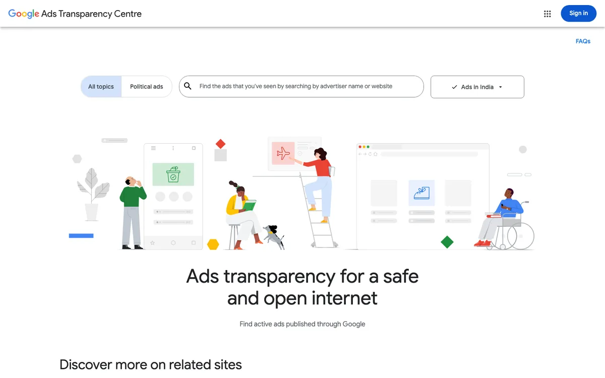
The Google Ads Transparency Center does the same for ads published through Google. Search a competitor's name or website to see its active search, display, and YouTube ads.
Save 10 to 20 ads from your category. Then note what repeats: the image style, headline length, where the logo sits, and how the CTA is phrased. Both libraries default to your own country, so switch the region if you sell elsewhere.
3. Size for the Placement First
Pick the placement and its specs before you sketch anything. A layout built for a square feed post breaks when it's cropped into a tall Story or a wide banner.
Here are the current official specs for two of the most common formats:
| Platform and format | Recommended size | Aspect ratio | Text guidance |
|---|---|---|---|
| Facebook Feed image ad | 1440 x 1800 px | 4:5 | Headline about 27 characters; primary text 50 to 150 characters |
| Google responsive display, landscape | 1200 x 628 px | 1.91:1 | Avoid text overlaid on images |
| Google responsive display, square | 1200 x 1200 px | 1:1 | Description up to 80 characters |
| Google responsive display, vertical | 900 x 1600 px | 9:16 | Upload 5 to 10 images per ratio |
Facebook figures come from Meta's Facebook Feed image ad specs. Google figures come from Google Ads' responsive display ad requirements, which also cap image files at 5,120 KB.
Need specs for organic posts too? Our social media image sizes guide covers every major platform in one place.
4. Set a Clear Visual Hierarchy
Visual hierarchy decides what people see first, second, and third. In an ad, the order should almost always be: the focal image or headline, then the supporting line, then the CTA and brand.
People skim. Nielsen Norman Group's eyetracking research first identified the F-shaped scanning pattern in 2006. Without strong visual cues, readers catch the top lines and the left edge and miss the rest. Ads aren't web pages, but the lesson carries over: put the most important words where the eye lands first, and make them the biggest thing on the canvas.
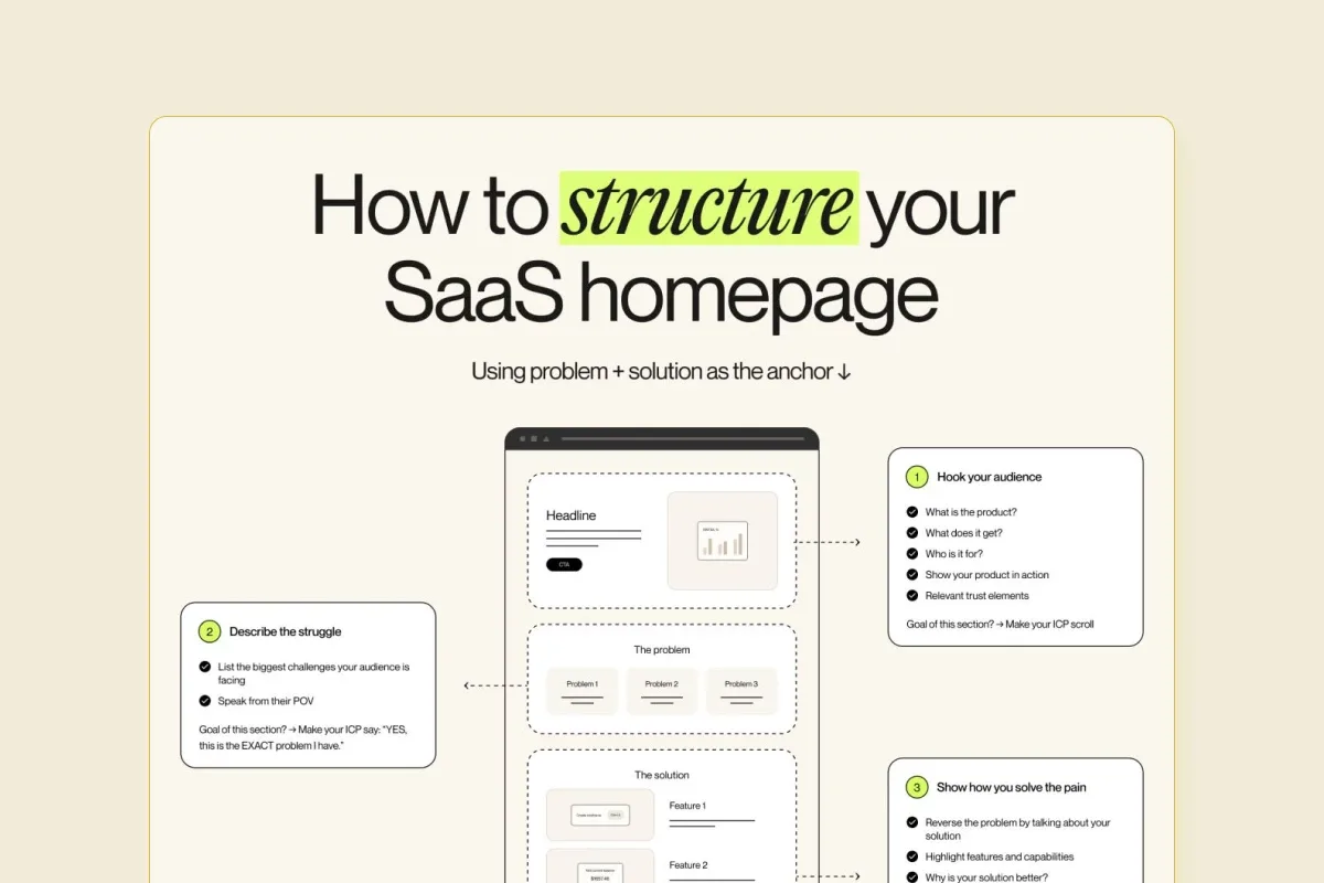
This social creative by Alrdy, curated in the Pineable gallery, shows the idea well. The headline is the largest element, one word gets a bright highlight, and the numbered callouts lead your eye in order. It's an organic post rather than a paid ad, but the hierarchy works the same way.
Use size, color, and white space to set the order. If two elements fight for attention, shrink one. Our guide to balance in design explains how to distribute visual weight so the layout feels stable.
5. Write a Headline That Survives a Glance
Your headline has to work in about two seconds. Lead with the benefit or the outcome, not your company name.
Keep it short. Meta suggests about 27 characters for a Facebook Feed headline, which is roughly four or five words. Google asks for clear, simple text in sentence case, not all caps.
Strong ad headlines usually do one of three things:
- State the outcome: "Close your books in 2 days."
- Name the pain: "Still chasing invoices by email?"
- Make the offer concrete: "Annual plans, a third off this week."
Read it out loud. If it needs a second line to make sense, cut words until it doesn't.
6. Check Contrast and Legibility
Most ads get seen on a phone, often in bright light. Text that looks fine on your monitor can disappear on a 6-inch screen.
Use the W3C's WCAG contrast minimum as your floor: a 4.5:1 ratio for normal text and 3:1 for large text (at least 18 point, or 14 point bold). WCAG was written for web content rather than ads, but the ratio is a reliable test for "can people read this."
Two quick checks catch most problems:
- Shrink the design to thumbnail size. If you can't read the headline, nobody in the feed can.
- Avoid placing text over busy photo areas. Add a solid shape or darken the image behind it.
7. Make the CTA Obvious, Then Test Variants
The call to action tells people exactly what to do next. Use a verb and the outcome: "Get the template," "Start free trial," "See pricing." Give the button or CTA line its own contrasting color, and keep it in the same spot across sizes.
Google's ABCD framework backs this up. Google's ABCDs of effective video ads are Attention, Branding, Connection, and Direction, where Direction means asking people to take action. Google says a 2021 study with Kantar linked these principles to a 30% lift in short-term sales likelihood and a 17% lift in long-term brand contribution. The framework was built for YouTube, but the four checks work for static ads too.
Then test. Change one thing per variant, such as the image or the headline, so you know what caused the difference. Two to four variants is plenty for a small budget.
Ad Design Principles That Work Across Formats
The seven steps tell you what to do. These principles tell you how to judge the result. Run every draft through this table before it goes live.
| Principle | What it looks like | Quick check |
|---|---|---|
| Attention | A focal image, face, or bold headline in the first glance | Does one thing clearly dominate? |
| Branding | Logo, colors, or product visible but not shouting | Could someone name the brand after one look? |
| Connection | A specific pain, outcome, or emotion the audience recognizes | Would your customer say "that's me"? |
| Direction | One CTA with a verb and an outcome | Is the next step obvious? |
| Simplicity | Few elements, plenty of white space | Can you remove anything without losing the message? |
| Consistency | Same message across sizes and placements | Does the banner match the feed ad? |
Ad Design Tools Compared
You don't need expensive software to design a good ad. Pick the tool that matches your skills and how many sizes you need to ship.
| Tool | Best for | Downside |
|---|---|---|
| Canva | Marketers who need fast ads from templates in many sizes | Templates are widely used, so ads can look generic |
| Adobe Express | Quick social ads with Adobe Fonts and stock assets | Fewer layout controls than full Adobe apps |
| Figma | Teams building reusable ad systems with components | Steeper learning curve for non-designers |
| Adobe Photoshop | Detailed photo editing and compositing | Slow for producing many sizes and variants |
A simple rule: if you're producing more than five sizes per campaign, use a tool with reusable components or templates. Resizing by hand eats the time you should spend on the message.
Common Ad Design Mistakes
Most weak ads fail for the same handful of reasons. Check your draft against this list.
- Too many messages. Two offers, three benefits, and a discount code compete, and the viewer gets none of them.
- Text baked into display images. Google may crop or repeat it in automated layouts.
- Tiny type. Body text that's readable on a laptop turns to mush on a phone.
- Low contrast. Light gray on white, or white on a busy photo, fails the glance test.
- A vague CTA. "Learn more" says nothing about the outcome.
- Designing for one size only. A square layout cropped into a 9:16 Story loses its headline.
- Brand hidden or overdone. Too small and nobody remembers you; too big and it looks like a billboard for your logo.
Where to Find Real Ad Design Examples
The best ad design examples are the ones running right now in your category. Live ads show you what competitors keep paying for, which is a stronger signal than a list of award winners.
Start with the two ad libraries from step 2. Search three competitors and one brand you admire outside your industry. Look at how long their ads have been running, since ads that stay live for months are usually working.
Then widen your reference set. Pineable's design gallery collects real marketing designs, including blog graphics, reports, eBooks, and social creatives, that you can study for layout, type, and color choices.
What does swipe mean in advertising?
A swipe file is a saved collection of real ads and copy you study for ideas. Marketers "swipe" proven layouts, hooks, and offers as reference, not to copy them. Free sources include the Meta Ad Library and the Google Ads Transparency Center.
What makes a good ad design?
A good ad design delivers one clear message, a focal visual, readable text, and an obvious call to action in a single glance. It's sized for its placement and tested against at least one variant.
What size should a Facebook image ad be?
Meta recommends a 4:5 aspect ratio at 1440 x 1800 pixels for Facebook Feed image ads. The minimum width is 600 pixels, and JPG or PNG files up to 30 MB are accepted.
Can I put text on Google display ad images?
Google advises against overlaying text on responsive display ad images. Overlaid text can repeat or become unreadable when Google combines your assets. Put your words in the headline and description fields instead.
What is the best free tool to design ads?
Canva is the easiest free option for most marketers because it has ad templates in many sizes. Figma's free plan suits teams that want reusable components and more layout control.
How many ad variants should I test?
Two to four variants is a practical start for a small budget. Change one element per variant, such as the image or headline, so you can tell what caused a difference in results.
Summarize this article with AI:
 ChatGPT
 Perplexity
 Claude
 Grok

Written by
Taher BatterywalaFounder & Chief Curator
Taher Batterywala is a creative marketer who loves to write & design content that organically drives conversions. He is the creator of Pineable, the world's first content marketing design inspiration hub. He regularly shares his thoughts about content design, SEO, and marketing. As a true cinephile, he admires movies above anything else.