On this page
For the past few weeks, I have traveled the vast world of the internet, picking only the best B2B SaaS case study design gems.
I've seen stiff and overpolished case studies that look like a school project report.
And fun and witty case studies that would make your grumpiest CFO smile.
I ranked each B2B case study based on a set of parameters so you can make the right case study design choices.
Let's take a look at the best B2B SaaS case study examples you can model for your next design.
The best B2B SaaS case study pages I reviewed had:
- Bold key result stats above the fold.
- A summary of the challenge, solution, and results before the body copy.
- Case study videos.
- Sticky CTA buttons that follow you down the page.
- Customer testimonials styled as cards.
- Product screenshots and screen recordings from client accounts.
- Studio-quality client photos as feature images and for breaking up the copy.
11 Best B2B SaaS Case Study Design Examples
Here are the best B2B SaaS case study designs that caught my attention and made me do a double take:
1. Notion Case Study
What to steal:
- Customer video thumbnail with a play button.
- Colorful drop cap at the beginning of case studies.
Visual hierarchy: 5/5
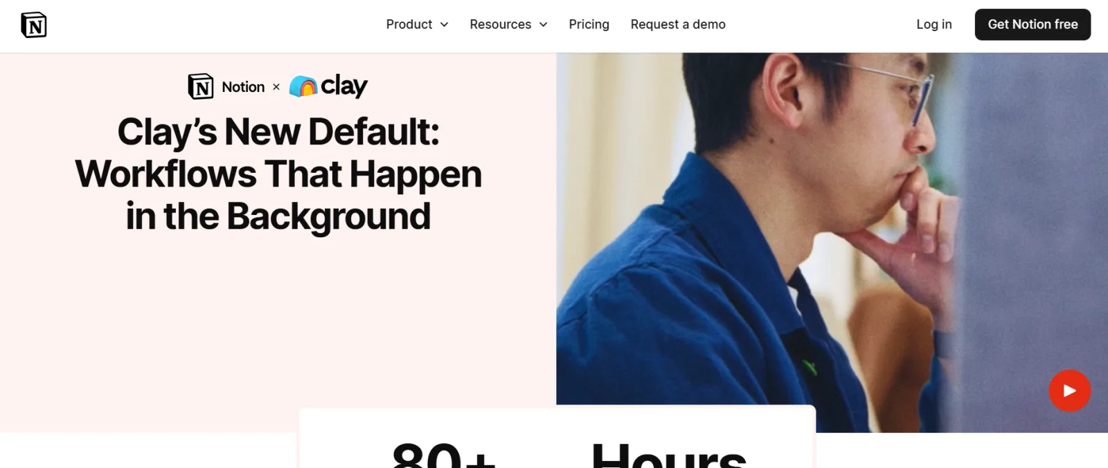
Most of Notion's case studies kick off with a video, which is a great way to engage prospects who are in a hurry or prefer visual content over text. The rest of the case study flows in a story format with product screenshots and customer quotes with headshots.
Results visibility: 4/5
Some Notion case studies have a large rectangular key stats box that slightly overlaps the video thumbnail. It's a good snapshot for users.
Scannability: 5/5
It's super easy to read through. The use of whitespace, headers, and bullet points is solid.
Branding and customer presence: 4/5
I loved the “Notion logo X customer logo” design at the top of the case study headlines. They also included the company staff headshots at the author bio spots and featured quotes.
Visual storytelling: 5/5
Notion's case studies also win on the visual storytelling end with videos and product screenshots. The colorful drop cap at the beginning of the case study makes the content feel more inviting.
CTA design: 4/5
Notion's CTA button design and color stand out, and the shaded box housing the CTA creates a little visual contrast.
Mobile experience: 5/5
The mobile experience is seamless and crisp.
2. Airtable Case Study
What to steal:
- Product screen recordings.
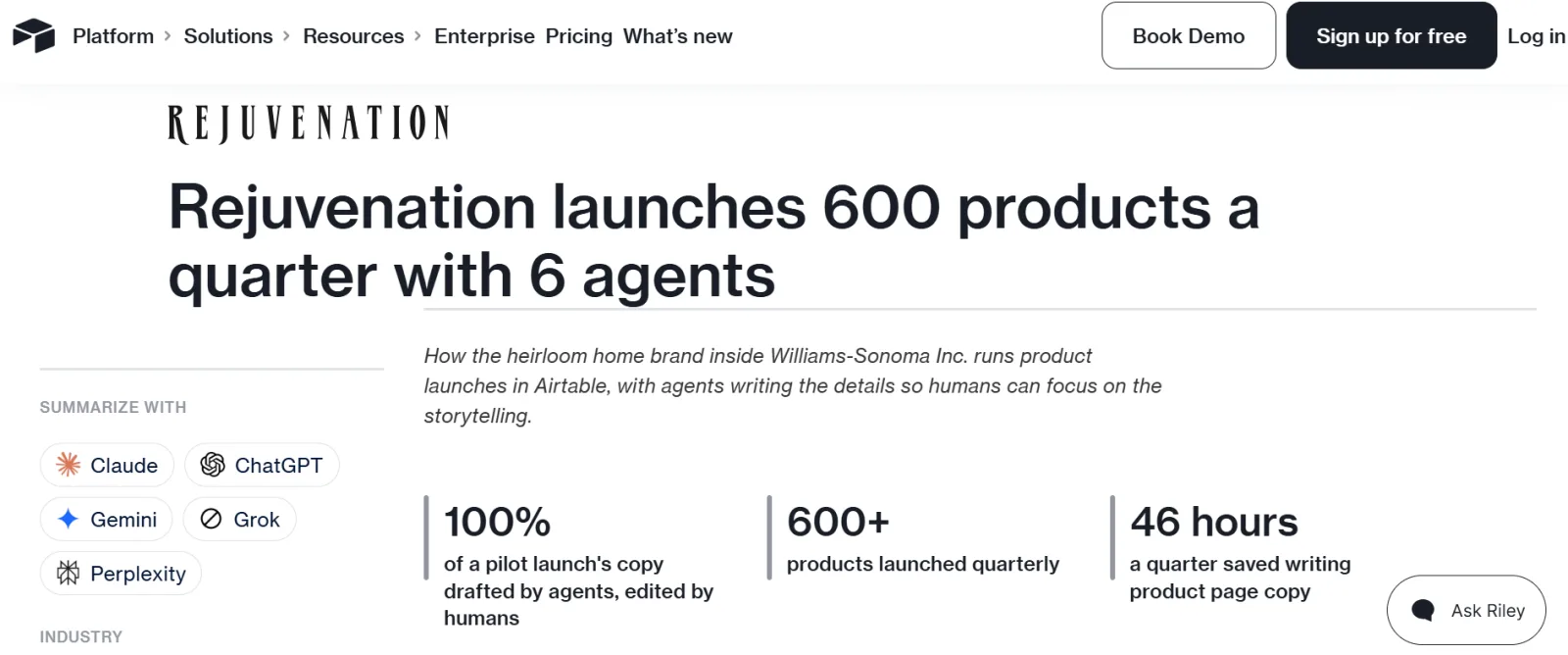
- AI summary buttons like Claude, ChatGPT, Gemini, Grok, and Perplexity.
Visual hierarchy: 4/5
The page organization is top-notch. I like the sparing use of bullet points in some sections.
Results visibility: 5/5
The results overview section is right near the top of the page, and they used featured customer quotes with headshots to add credibility.
Scannability: 5/5
Airtable's case study pages are built and optimized for busy professionals. There is enough room for the text, images, and user interface to breathe.
Branding and customer presence: 4/5
Customer branding is fairly used on their case study pages. Airtable used customer company images, logos, and headshots in pull quotes.
Visual storytelling: 5/5
The case study pages are on par with top-tier B2B SaaS case studies. They used videos, product screen recordings, and customer photos creatively.
CTA design: 4/5
They went for a single CTA below the page: Contact Us. The sign-up and login buttons are pinned at the top of all their web pages.
Mobile experience: 5/5
Excellent user experience on smaller screens.
3. Shopify Case Study
What to steal:
- List the previous products used in the company profile section.
- Different CTA designs for mobile and desktop.
Visual hierarchy: 5/5
Great visual layout from the header to the CTA link. You can find information easily.
Results visibility: 4/5
Shopify used bolded blue checkmarks in the results section and dropped several featured quotes in the body of the copy. The “results checkmarks” make the page quite different from other B2B SaaS case studies I reviewed.
Scannability: 5/5
Skimming, scanning, and scrolling through the page is simple and smooth. The case study fonts are also great.
Branding and customer presence: 4/5
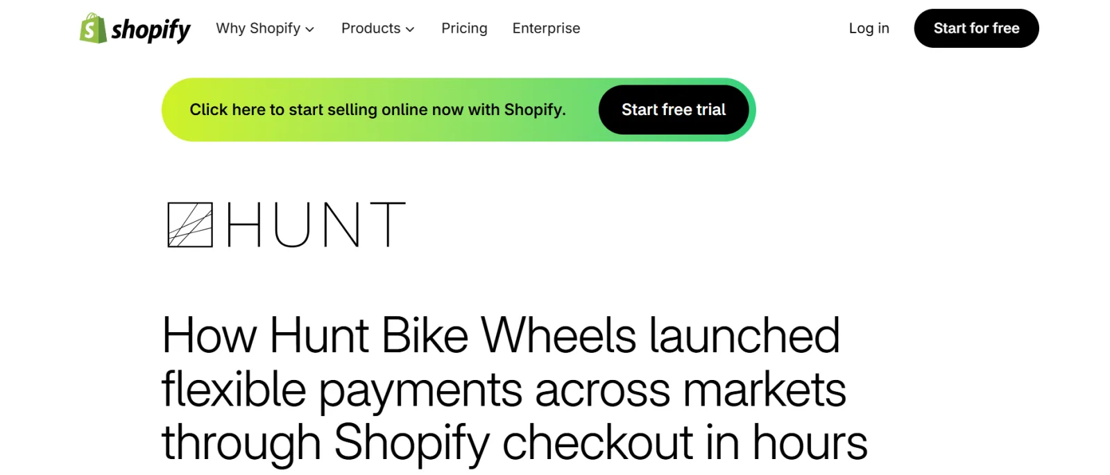
I love the branded customer photo in the featured image. The customer logo is placed above the header and is quite prominent.
Visual storytelling: 3/5
Shopify uses high-quality customer product photos, and it helps to increase page engagement. A downside is that some of their case studies don't have a featured image.
CTA design: 5/5
I love how Shopify uses the same CTA at the top and bottom of the page. In my little life of marketing, I have found that giving prospects only one CTA or option increases the likelihood of conversion.
Mobile experience: 5/5
The page loads fast and works as it should.
4. HubSpot Case Study
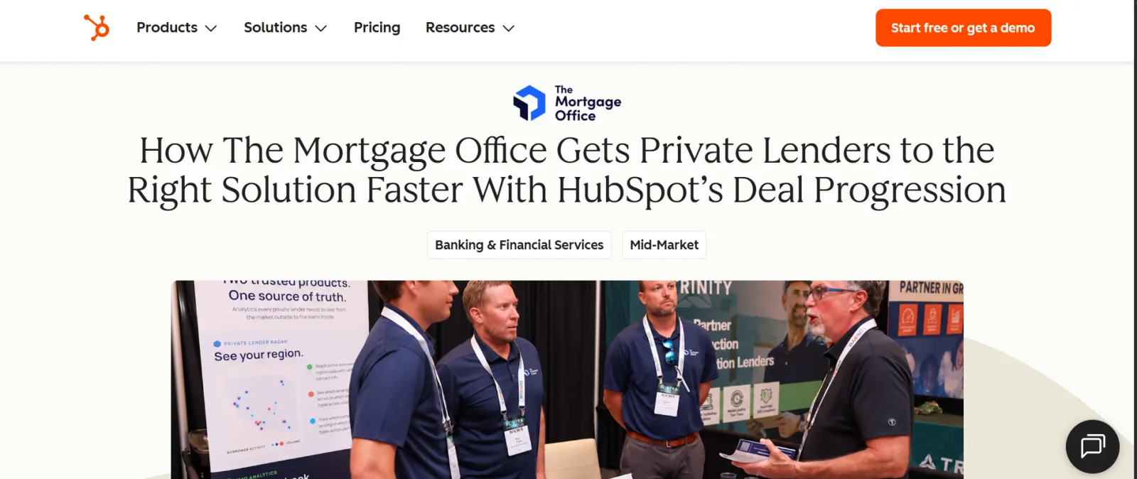
What to steal:
- High-quality client photos in the feature image and body text.
- At least one client account product screenshot in the case study. It could be a results dashboard.
- The table of contents is glued to the page on mobile and desktop.
Visual hierarchy: 4/5
The visual hierarchy is great. They used images and screenshots in the body of most of their case studies. Plus, they use a drop-down menu for the “story overview” and “about company” sections to reduce on-page text.
Results visibility: 5/5
The key stats are quite bold and above the fold.
Scannability: 3/5
Overall, the content is scannable, but the blocks of paragraphs can feel overwhelming or put readers off. Shorter paragraphs would work better.
Branding and customer presence: 5/5
The client photos on the feature image and body copy help to personalize the case study. They also used the customer headshot in the quote extract at the end of the case study.
Visual storytelling: 4/5
In the visuals, HubSpot leads with original client photos and key results screenshots. The client logo is also used at the top of the page, before the H1.
CTA design: 4/5
The CTA button and card follow their brand guide and are hard to miss at the end of the case study.
Mobile experience: 5/5
No issues here; it's a straight A.
5. Deel Case Study
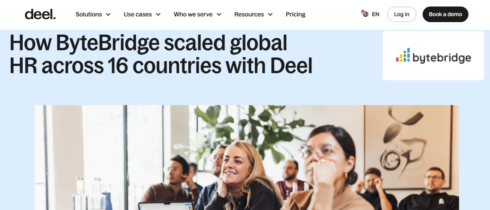
What to steal:
- CTA button that stays on screen as you scroll. It's clingier than a koala.
- Highlighted bold results after the feature image.
Visual hierarchy: 4/5
The visual hierarchy is straightforward, and I like the bolded results section right after the feature image.
Results visibility: 5/5
The results block is above the fold on desktop, but you'll have to scroll once to see it on mobile, which is understandable. The design outline doesn't pull away from what you'd expect from a B2B SaaS case study.
Scannability: 5/5
The page is easy to take in within seconds, and it's not text-heavy. But the headers like “Challenge, Solution, and Results” should be bigger for skimmers.
Branding and customer presence: 3/5
I would have preferred the customer logo to be in the company card rather than only beside the H1 or page headline.
Visual storytelling: 4/5
The visual narrative is sound, and the feature images are of good quality. It would have been better if the spotlighted customer quote were higher up the page to draw attention and send credibility signals early on.
CTA design: 4/5
The sticky CTA button is creative. It marks you like a defender once you scroll deep into the case study.
Mobile experience: 5/5
It has a good mobile experience.
6. Salesforce Case Study
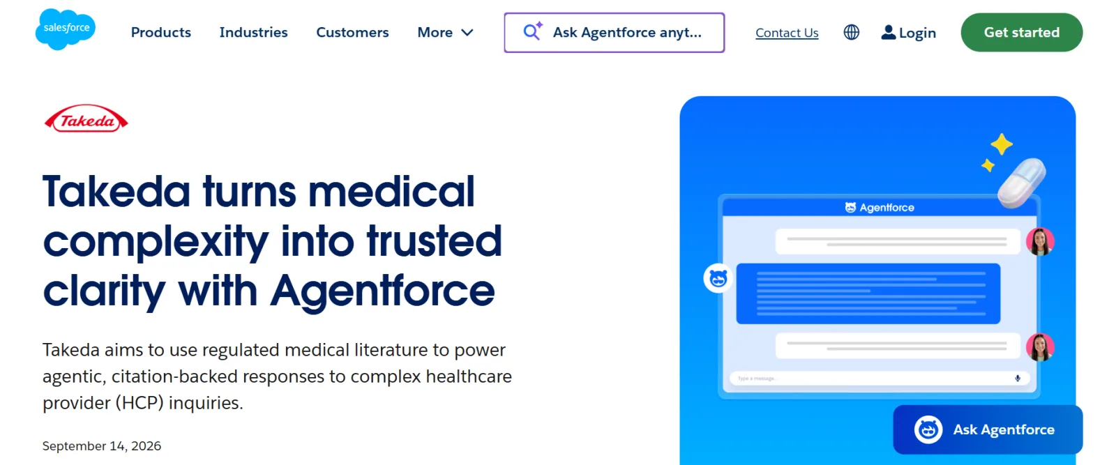
What to steal:
- Section with the logos of your software products used by the customer. Good for enterprise B2B software with many products.
Visual hierarchy: 4/5
The customer journey on the page is arranged accordingly. It gives you a clear summary of how Salesforce helped a customer and the products that were used to achieve the results.
Results visibility: 5/5
The key results section comes immediately after the featured image, rightly so. It also includes a quick summary after the H1, while the rest of the page offers a succinct explanation of the customer story.
Scannability: 4/5
The page is easy to scan. As always, the page looks prettier on desktop than mobile.
Branding and customer presence: 3/5
Salesforce opted for minimal customer branding. You'll find the customer logo on top of the H1 and in the “about company” section at the end of the case study. The images are mostly Salesforce-branded, not real customer photos or product screenshots.
Visual storytelling: 4/5
The visual organization is decent, and some of the case studies include video content.
CTA design: 3/5
They have a couple of CTAs on the page. As you know, I strongly believe in having one CTA per page. At the bottom of the page, they give users the option to start a free trial, request a product demo, or view pricing. On my phone, I spotted a sticky call button as I scrolled, which makes it the fourth CTA.
Mobile experience: 5/5
The mobile experience is okay. I didn't notice any glaring issues.
7. Asana Case Study
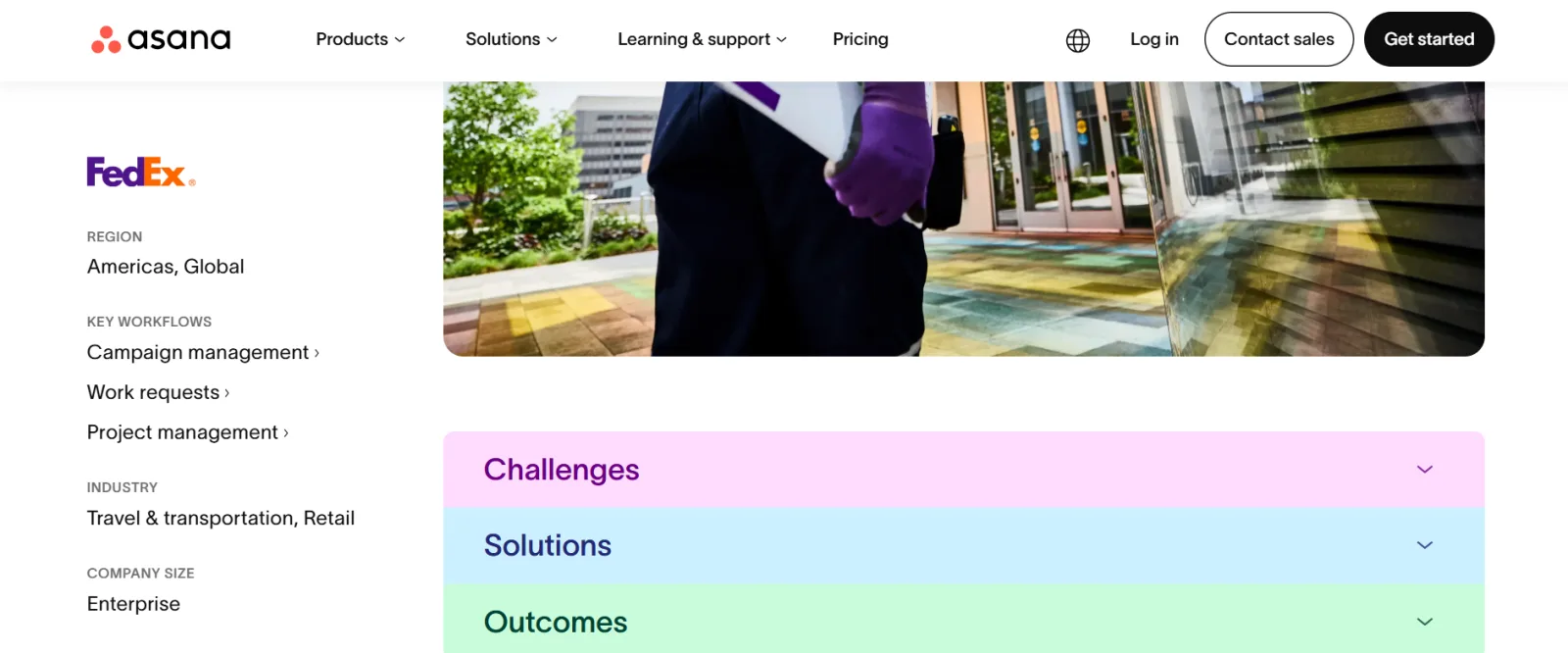
What to steal:
- Colorful drop-down functionality for the challenges, solution, and outcome before the case study story.
- Thin progress line that moves to the right as you scroll down from one header to another.
- The company profile is fixed on the left side of the screen on desktop.
Visual hierarchy: 4/5
They have a lot going for them in terms of visual hierarchy. The Header > summary > colorful and catchy challenge, solutions, outcome drop-down > company card > body copy are on point.
Results visibility: 2/5
Asana didn't display key stats above the fold on their case study pages, which is a big letdown for me. The short summary after the header is great, but it doesn't give you an instant payoff on the key results.
Scannability: 4/5
The page design is easy to look through and grab important information.
Branding and customer presence: 5/5
The company info section looks classy, and the integration logos make it more eye-catching.
Visual storytelling: 4/5
The narrative of the Asana case studies is cool. They used images and videos in some case studies to build engagement, and the page design complements their website branding.
CTA design: 3/5
Asana gave users two CTA options at the end of the page: contact sales and get started. But the two buttons are white and don't pop. They should have used a black “get started” button with white text and kept the white “contact sales” button. They also have a black “contact sales” button in the company profiles section.
Mobile experience: 5/5
The case study page looks and works perfectly on mobile.
8. Slack Case Study
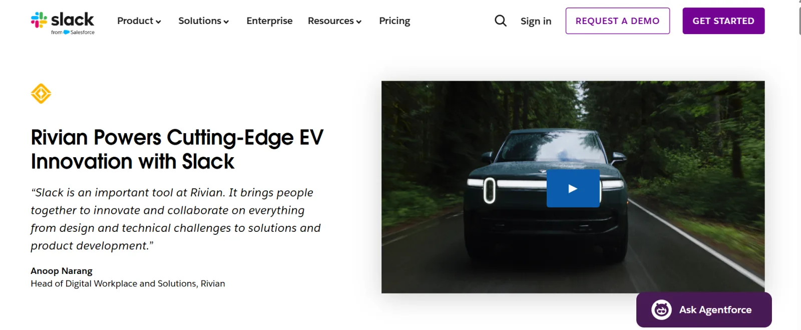
What to steal:
- Full-size client staff photos to make the case study personable.
Visual hierarchy: 4/5
The visual organization is spot on. I observed that they mostly used quote spotlights and client staff photos to break up the copy. But I didn't like placing the company profile summary card as the last piece in the case study.
Results visibility: 1/5
They left out the big stat visual, so it's a big downer for me. Customer spotlight testimonials are great, but B2B numbers would be better here.
Scannability: 4/5
The page design is easy to look through; the text is bold, and the quotes and images break things up.
Branding and customer presence: 5/5
Slack used original company staff photos and pull quotes judiciously on the case study page.
Visual storytelling: 4/5
They didn't rely on screenshots to pass information across, but the customer portraits, headers, page interface, and pull quotes work together to bring the story to life.
CTA design: 4/5
On mobile, Slack went for one huge CTA design at the bottom of the page to get users into the funnel. While they bolted a “request a demo” and “get started” button in the table of contents or “IN THIS STORY” on desktop.
Mobile experience: 5/5
The mobile experience is 100%, I would say.
9. Zendesk Case Study
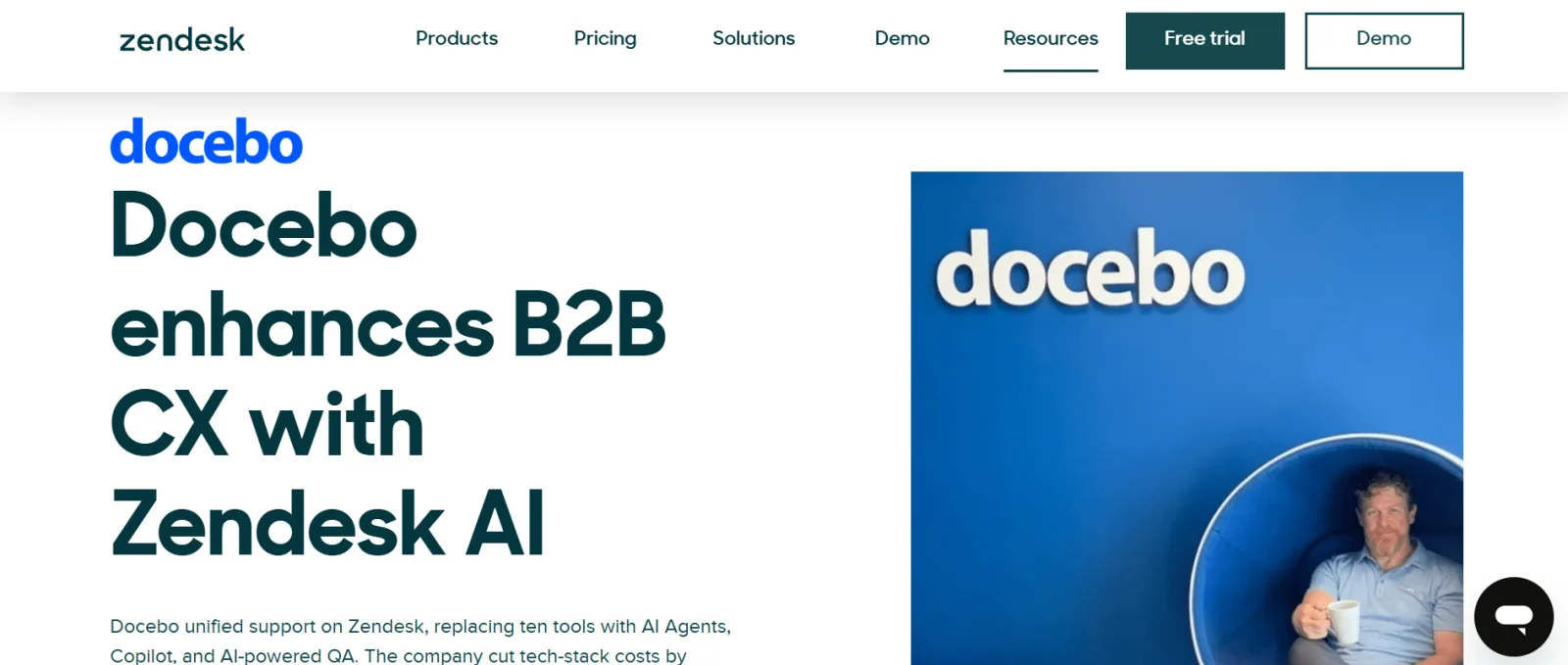
What to steal:
- Pull quotes immediately after the feature image.
- Social media sharing buttons like X (formerly Twitter), LinkedIn, and Facebook.
Visual hierarchy: 4/5
The page follows a logical case study flow. It opens with a header, summary, customer photo, pull quote, company profile, key stats, and so on.
Results visibility: 5/5
The case study page has key stats and customer quotes up front.
Scannability: 4/5
The case study page is easy to read.
Branding and customer presence: 3/5
The branding is cool. They used the customer logo before the header and added customer photos and a case study video on some pages as well.
Visual storytelling: 4/5
The customer photos, featured quotes, and company profile help to tell a story.
CTA design: 3/5
The CTA design is fine and visible as soon as the page loads, but it should have stronger copy; “Zendesk AI” doesn't tell me what to do next. They do have a newsletter form at the bottom of the page.
Mobile experience: 4/5
Zendesk case study pages are responsive and intuitive on mobile, but the CTA button is placed on top of the hero image.
10. Mailchimp Case Study
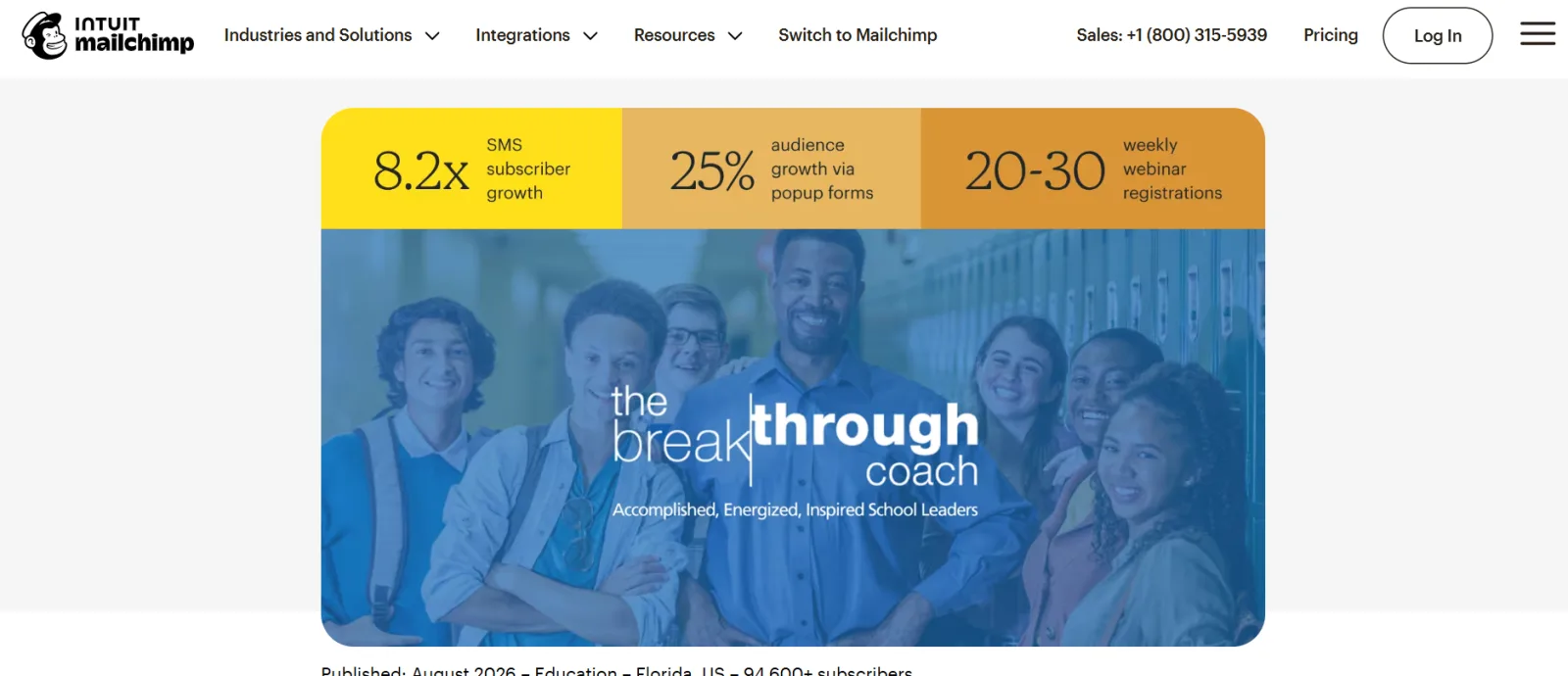
What to steal:
- Use different CTA copy to suit the primary tools customers used in the case study.
Visual hierarchy: 4/5
The visual structure is excellent. Each section guides you to the next all the way down to the CTA button.
Results visibility: 3/5
The key results appear in a color-coded metric bar at the top of the feature image, but it's not that visible. Mailchimp also reintroduced the key result metrics halfway through their case study pages.
Scannability: 5/5
Mailchimp's case study pages are skimmable and easy to browse in a few minutes.
Branding and customer presence: 1/5
They used limited customer branding. There is also no company about or profile card. You only have a feature image with key stats at the top.
Visual storytelling: 3/5
There aren't many visuals on the Mailchimp case study pages, but the featured pull quotes, key stats (in the middle of the page), and CTA design make the page appealing.
CTA design: 5/5
The CTA design and button contrast with the page, and the color palette is on brand. I noticed that they changed the CTA copy based on the major tool the company in the case study used. For example, case studies under marketing automation and email marketing had different CTA copy to fit the audience and use case.
Mobile experience: 5/5
Glitch-free mobile experience all through.
11. Stripe Case Study
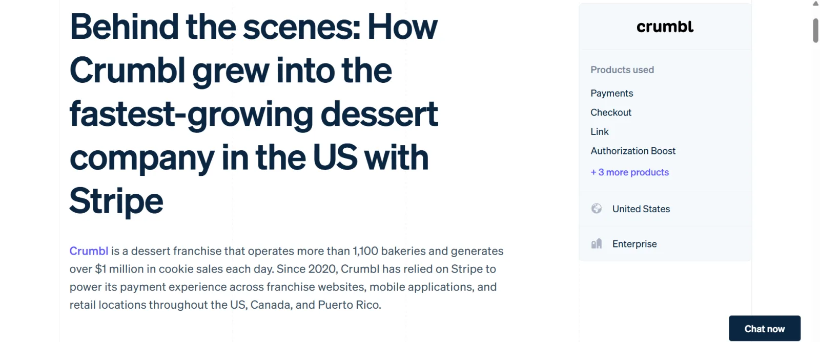
What to steal:
- Quote card with a product photo backdrop.
- Key stats that follow you around the page on desktop.
Visual hierarchy: 3/5
Stripe's design elements are well organized and structured, especially on desktop.
Results visibility: 3/5
The key results page is above the fold on desktop and stays pinned as you scroll down, with a CTA button. However, on mobile, it's at the bottom of the page and doesn't stay in view as you scroll.
Scannability: 5/5
The Stripe case study page is skimmable, just like most of the B2B SaaS case study examples on the list.
Branding and customer presence: 3/5
They used the customer's logo in the company overview and a branded product photo as the backdrop for the quote cards.
Visual storytelling: 3/5
Most of Stripe's case studies don't have a feature image. On the plus side, their pages are a quick read.
CTA design: 4/5
I love that they followed the rule of one, with a single CTA: “contact sales”.
Mobile experience: 3/5
The page doesn't have many issues on mobile except that the key stats block is stuck at the bottom of the page and the H1 looks too big.
Next Steps
I'm pretty sure you're brimming with B2B SaaS case study design ideas.
One last note. Use these examples as a source of inspiration. You don't have to copy or steal every part of the case study designs.
Do deep research on your target audience and figure out how you can make your case studies easy to consume and persuasive.
You can even start by interviewing a few customers and your sales team about what they want to see in a B2B SaaS case study.
There's more where these page designs came from. See more designs or check out our free design tools.
Summarize this article with AI:
 ChatGPT
 Perplexity
 Claude
 Grok

Written by
Felix OnyecheFelix is a B2B/B2C copywriter and content writer for SaaS, startups, and SMBs. He enjoys reading books and watching (a lot of) soccer. You can catch up with him on LinkedIn.