What if I told you that selfies have a place in your LinkedIn strategy and that clear, focused text-only posts can also get strong reach?
LinkedIn creators have come a long way from "LinkedIn is not Instagram" to selfies, lifestyle photos, and team photos being one of the most widely-used types of content formats for organic reach on LinkedIn
It’s obvious that visual content is now easier and faster to produce and distribute on LinkedIn. But that’s not all.
Organic reach for text posts is also harder to earn, AI slop is everywhere, and audiences have become more selective about what deserves their attention. Now, credibility, clarity, and intent on LinkedIn (not "pic for attention" / novelty) are essential to create visual content that captures and holds attention (for example infographics, carousels, etc.)
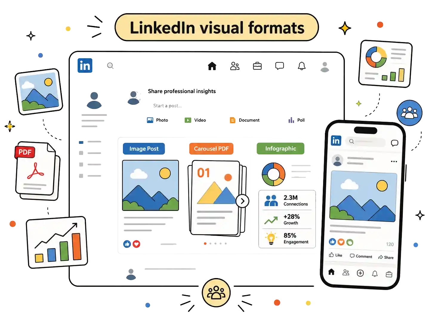
This guide explores every visual format on LinkedIn, how to create and use each one, and the visual standards behind them using design theory, graphic principles, and real-world examples.
- LinkedIn visuals help posts earn more reach, engagement, and dwell time.
- They also reinforce your personal brand through consistent, recognizable, and relevant design.
- The three key visual types are single images, infographics, and branded carousels.
- Single images work best for one clear idea, story, update, or personal moment.
- Infographics simplify complex information, while carousels tell stories slide by slide.
- Carousels work best when each slide adds context and keeps readers swiping.
- Text-only posts work when the writing has a strong hook and clear structure.
Types of LinkedIn visuals that stop the scroll
Sometimes you want to tell stories, and sometimes you want to simplify complex information. Before opening Canva, decide what exactly your audience needs to understand and map that to the visual format you will use. This first step is crucial to creating engaging and share-worthy LinkedIn visuals.
These are the options to consider:
- Single visual: simple graphic image, AI-generated images, and selfies
- Branded infographics (to communicate results or a process, or share report findings)
- Branded Carousels (to communicate more context alongside a story, a process, or a report)
Btw, if you feel that your post needs no image, don’t create visuals for the sake of posting with your text. Jump to the final section about making all-text posts work.
Static Images
Single-image posts are one of LinkedIn's most versatile visual formats. They work well for sharing personal stories, company updates, industry commentary, simple data, or a single key idea, especially when the message can be understood at a glance.
Consistently use colors and fonts from your brand identity
Consistent use of a clear, well-distinguished visual identity for the brand across your images, GIFs, and videos reinforces your company/personal brand in your audience’s minds. Your audience thus associates your brand with the value of the message every time they see your content.
For example, Mason's approach works well for a company brand because Scrappy ABM reinforces a consistent visual identity (orange and green as primary colors) across his posts. It makes his brand unmistakably unique.

Also, the owner of Scrappy ABM, Mason Cosby consistently posts raw, unedited pictures with people in his work and personal life and uses them to share his mini life stories which helps his brand stick in my mind.
Modify your images to reflect your unique brand story
When choosing images for your personal or company brand, keep relevance and consistency in mind. Before finalizing an image, ask yourself:
Does this image share visual similarities with my own recent LinkedIn posts?
Does it feel uniquely associated with ONLY my company/personal brand rather than someone else’s?
Does it contain anything my target audience may dislike or misinterpret?
Photos and single images for personal brands
Personal brands don't need the same level of design consistency on LinkedIn as Mason and Scrappy ABM’s brands described above. Instead: build recognition by writing about a small set of topics that you can confidently speak on consistently, use authentic (raw, unedited) photos from your own life (people, pets, community, plants, hobbies, etc), and
develop a natural voice rather than trying to turn every experience into a polished lesson.
Consistency builds familiarity, but authenticity builds trust.
You can use royalty-free visuals from sites like Unsplash, Flickr, or Pixabay and edit them to fit LinkedIn formats. However, keep them all based on a single theme.
If you can't find an image that suits your requirements, you can use tools like Gemini or Dall-E to generate the visuals you need or use templates from Canva.
Start by deciding a theme and a few of its keywords for your brand. Use these keywords to help you find royalty-free visuals on these sites that are consistently aligned with your visual brand on LinkedIn.
Canva templates can simplify this further since many are already designed around LinkedIn post types, reducing most resizing and layout work.
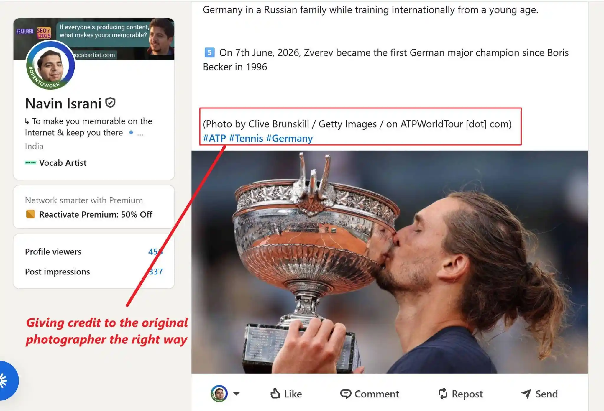
When you use someone else’s visuals, credit them as directly as possible. Reusing someone’s unique visuals, visual style, or writing without credit is considered unethical and it will damage your brand reputation too.
Furthermore, it can also lead to IP violations. While smaller creators tend to ignore it, major brands like Getty Images are known to aggressively pursue takedowns and licensing penalties.
Here’s how I credited a recent trophy image of German tennis player Alexander Zverev after his 2026 French Open title win.
Apply the rule of thirds to personal images
Below is an example of an image posted by Cody Lutz

Cody uses the rule of thirds by placing himself close to the lower-left intersection of the grid, naturally drawing the viewer's attention to him. The open space in front of him, the gym equipment, and the leading lines of the floor and ceiling balance the composition, making the image feel dynamic rather than centered or static.
It makes sense then that Cody was a professional photographer for almost a decade before he switched to coaching.
Balanced, intentional compositions like this can make your images truly attention grabbing.
The rule of thirds is a reliable composition principle in photography where you divide a background into a 3×3 grid using two vertical and two horizontal lines. Instead of perfectly centering important elements, you then place them along those lines or at the points where the lines intersect.
This placement naturally allows viewers to isolate the foreground from the background. It also supports visual hierarchy as designers can intentionally control what the viewers notice on an image and in what order.
Use the rule of thirds to:
- position headlines
- place people or objects in social graphics
- create cleaner negative space
- guide attention toward CTAs or key information
Rules for texts on images
Decide the text opacity and contrast you’ll use before you start.
Stick to clean sans-serif fonts such as Inter, Source Sans 3, IBM Plex Sans, Manrope, or Helvetica, which remain readable even at smaller sizes. Avoid decorative or script fonts for body text.
For accessibility, maintain a minimum 4.5:1 contrast ratio between text and background (or 3:1 for large text, as recommended by WCAG) so your content remains legible across devices and for readers with visual impairments
Branded Infographics
Infographics are the best way to keep the audiences engaged and cut through the noise by presenting results from complex data to convey messages quickly and simply.
LinkedIn's 2025 B2B Marketing Benchmark found that trust is a stronger driver of B2B growth than awareness alone. Well-designed infographics support this by making expertise easier to evaluate and faster to understand and evaluate, helping build trust with buyers.
Selecting the right infographic type for LinkedIn
Statistical infographics make data-heavy content approachable using bar charts, pie charts, line graphs, or heat maps. Use them for survey results, industry reports, or research findings.
Informational infographics explain complex topics in a structured layout combining visuals with concise text. Use them for educational content, step-by-step guides, company policies, and research breakdowns.
Timeline infographics showcase sequences of events in a logical flow. Use them to display historical data, project milestones, or a brand's growth story
Process infographics simplify complex workflows and operational steps. Use them to map out software tutorials, recipes, assembly instructions, or customer service steps.
Comparison infographics lay out features, benefits, or specifications side-by-side. Use them to evaluate two products, services, or differing sets of data to help viewers make choices.
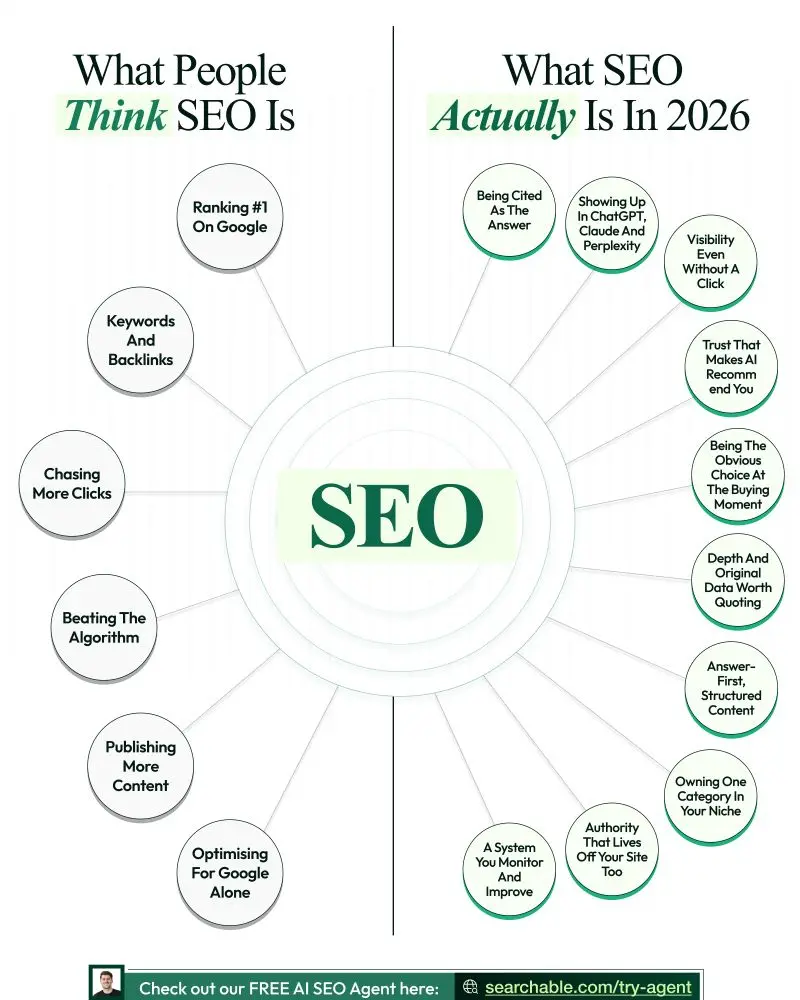
Chris Donnelly is one of my favorite creators who uses Infographics the right way. His infographics capture attention right away with step-by-step process infographics, industry resources infographics, and process infographics. Overall, his approach is unique because:
- He has a unique brand identity which he consistently uses
- He adds so much value in a single image, which are genuinely helpful and worth saving.
- His infographics capture instant attention with scroll-stopping titles and simple visual formats.
Here’s an example of one of his visuals:
How to modify your branded infographics for virality
Here's a revised version that captures the editor's points more faithfully while preserving your original structure and keeping each principle distinct:
Anchor the infographic to a single audience pain point and position the content as a clear solution. The title and subtitle should immediately identify the audience and communicate the value of reading further.
Give people a compelling reason to share it. The infographic should help readers signal expertise, express a belief, challenge a common misconception, or provide something they would love to share with their network.
Introduce novelty, contrast, or tension instead of simply presenting well-organized information. A clean design helps readability, but distinctive ideas are what capture attention.
Use a clean layout, purposeful color palette, and consistent branding to improve readability and reinforce brand recognition.
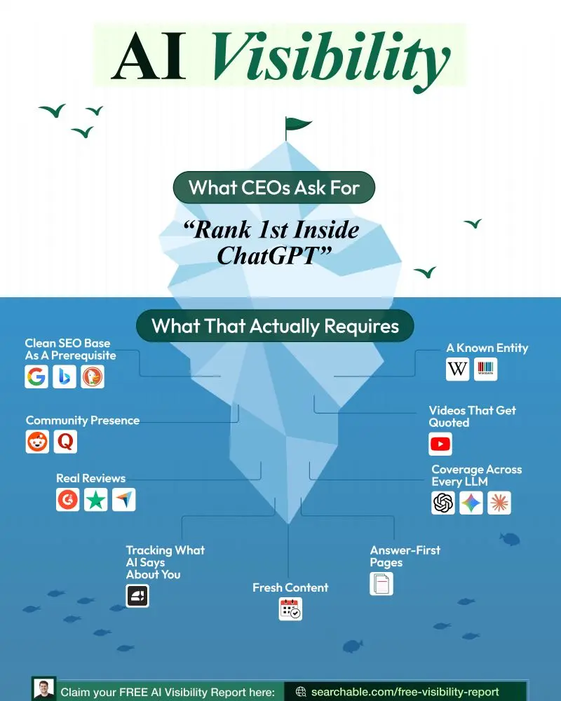
Structure information with simple visual metaphors or familiar frameworks (such as an iceberg, staircase, or decision tree) that make complex ideas easier to understand.
Use titles, labels, and annotations to provide immediate context and guide readers through the visual.
Start with a strong audience insight before designing. Finalize the message first, then translate it into a visual.
Design alone does not make an infographic go viral. Initial distribution, strategic seeding, and engagement from relevant networks also play a critical role in how widely and quickly it spreads.
For example, here’s an infographic from Chris Donnelly again. Here, he has used the iceberg shape to bridge the gap between ranking no. 1 on ChatGPT and the prerequisites it actually requires.
For a deep dive, watch this ~48 min episode of Marketers Do Coffee Podcast with Vincent Pierri:
Create branded infographics at scale with AI
For high-volume infographic production, you can design with one approved infographic, standardize the production with AI, and reuse the same commands every time.
I’ll show you how to do that with Gemini Gems.
Gems are custom AI assistants in Gemini that you can configure for specific design tasks with your brand guidelines, color palettes, stylistic preferences, and design templates. They use the Nano Banana Pro image generation model to these saved instructions to keep outputs more consistent.
Before automating branded graphics, create and refine your first infographic manually:
- Finalize the text and data in a document.
- Choose the infographic type based on the information you're presenting.
- Design the infographic using the branding and design principles covered above.
- Edit the graphic to reduce text while preserving context.
Once your first infographic is finalized, continue with the steps below.
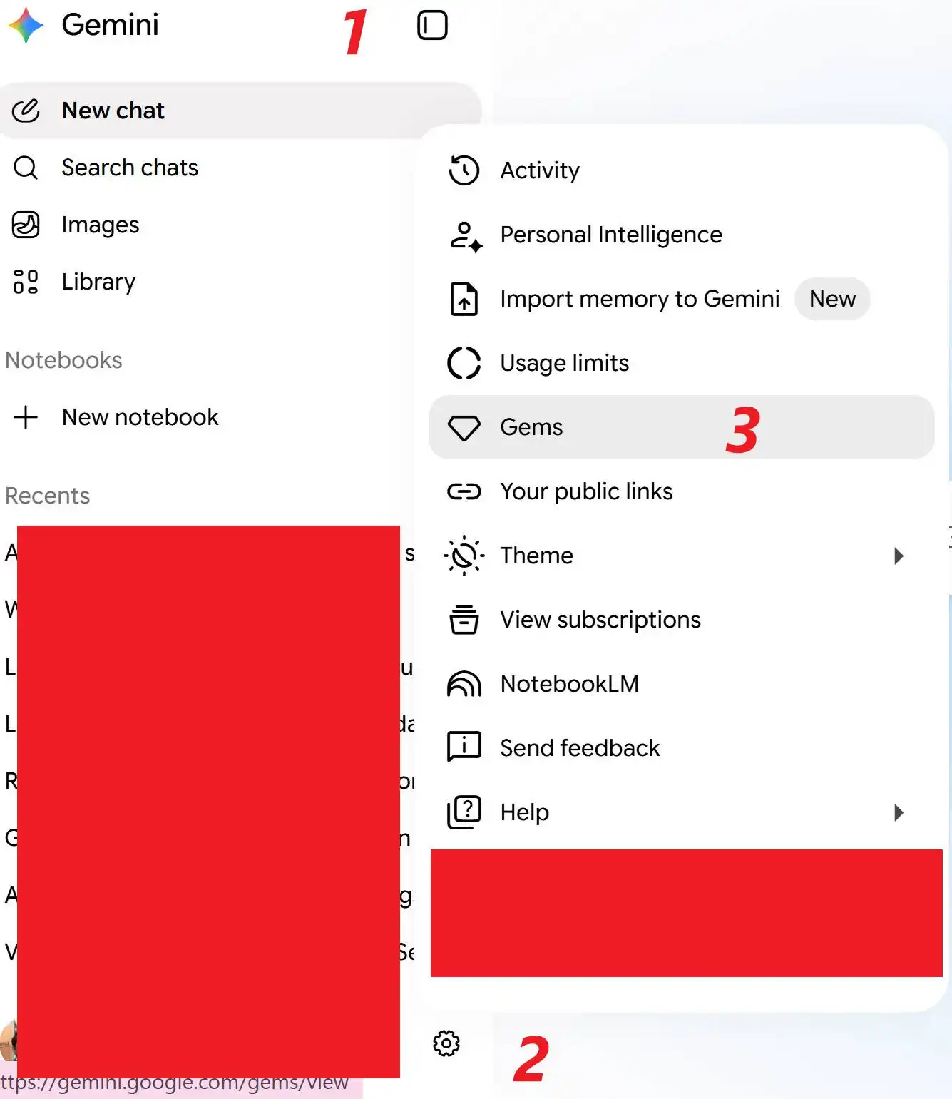
Step 1: Open the Gem Manager in Gemini
In Gemini, open the left sidebar in Gemini > Settings (“gear” icon) > Gems> Scroll down and click the + Create Gem button. Note that Gemini's UI flow and menu names may vary with future updates.
Step 2: Configure Gem as Per Your Style
Give your Gem a clear name (like "Infographic Format Designer") and add a brief description.
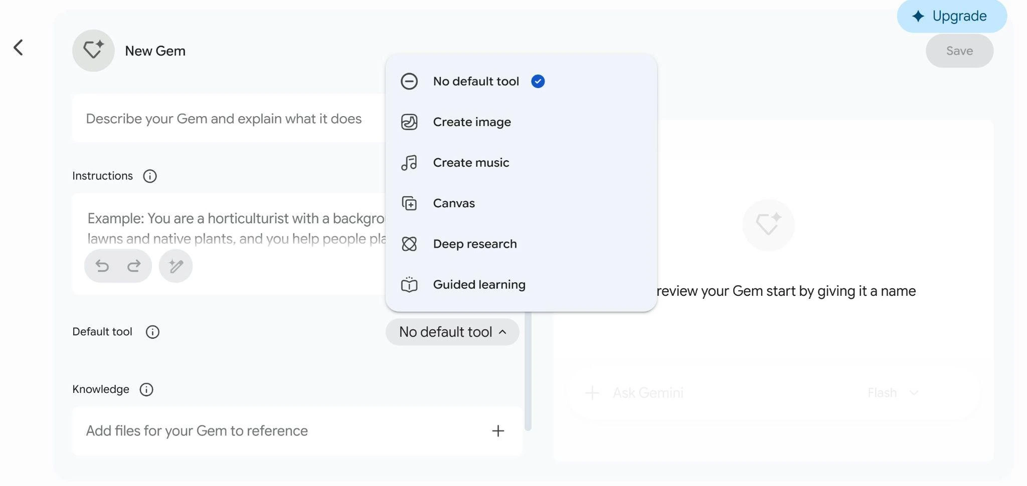
Scroll to the Knowledge screen. Upload the final design files or screenshots of your existing infographic layout along with your documented brand aesthetics and style guidelines. Gemini uses these files as a permanent reference anchor.
Step 3: Add core instructions
In the Instructions box, tell the Gem to:
Treat your reference infographic as the structural template for all future outputs. Map new data to the same layout logic, sections, and content hierarchy as the template.
Match your natural, direct tone and avoid generic marketing language and filler.
Format new copy to fit the original layout and text density.
Flag data that doesn't fit the template and suggest structural adjustments.
Step 4: Test and save the Gem
Use the preview panel to test your Gem. Paste in new copy or data and generate an output. Check that it follows your original template, revise until you are satisfied, and then save the output. Your Gem will be pinned to the sidebar for quick reuse.
Step 5: Reuse the Gem for new infographics
When you need a new infographic, open your saved Gem, paste in your new text and data, and generate the output. The Gem will structure the content to match your design template.
Mix things up instead of recycling the same layout. Build 3-5 distinct infographic templates tailored to your core content types. Make individual gems to replicate their design at scale; this gives you a plug-and-play visual graphics toolkit for every stage of your marketing funnel.
For a larger infographic design course for your graphics team, check out this 1.5 hour-long Infographic Design Theory course on LinkedIn Learning by Amy Balliett.
Branded Carousels
Unlike text posts or static infographics, PDF carousels turn complex processes into visual stories that readers can absorb one slide at a time.
From an algorithm point of view, every single swipe counts as a micro-interaction and increases users’ dwell time on the post. This increased dwell time signals the algorithm to push your content into even more feeds.
For a designer, this means you aren't just chasing a split-second scroll; you are engineering the graphics to build a sequence of moments that will keep people swiping.
1. Start with one outcome
Every carousel should help the reader achieve one thing: learn a new framework, avoid common mistakes in doing specific tasks, reframe the problem to enable mindset shift, etc.
Your first slide isn't the place for long explanations. Keep the text short, and make the headline easy to scan. The faster someone understands the value, the more likely they are to keep swiping.
For a graphic designer who supports a marketing team, it is crucial to coordinate with their content person/team to get the final text before starting any design work.
For example, here is a clear and well-focused carousel which doesn’t cram everything about online visibility, only focuses on takeaways from a webinar about online visibility.
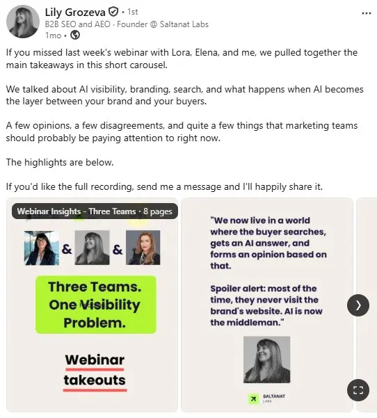
Instead of reading webinar takeaways in a long article, Lily's audience gets the key insights in a short visual carousel. Grouping multiple quotes into slides reduces cognitive load, while large typography, generous whitespace, and a high-contrast title make each takeaway easy to notice, scan, and remember. The title also creates instant curiosity and defines the exact problem without fluff.
2. Give people a reason to swipe past the first slide
The first slide only has to make the viewer scroll to the next slide. If slide 1 doesn't create that curiosity, even your best points located somewhere in the carousel don't matter.
Use the steps mentioned in the previous section to create your hook slide designs for carousels. Use high contrast, large text, and enough whitespace to guide the eye.
3. Create a consistent visual flow
Use consistent typography, layout patterns, and recurring design elements so readers always know where to look. Limit yourself to two or three fonts, maintain a clear hierarchy with larger headlines and smaller supporting text, and keep font sizes consistent across slides. Use familiar visual elements such as shapes, dividers, icons, or color treatments to create continuity without making every slide look identical.
Guide readers from one slide to the next with arrows, progress bars, slide numbers, or subtle "swipe for more" prompts. Combined with low text density, generous whitespace, and easy-to-read fonts, these cues reduce cognitive load, make each slide easier to scan, and encourage readers to complete the carousel.
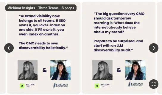
The same carousel from Lily Grozeva that we saw before is also a great example of consistent font choice. Lily adapts to LinkedIn's larger carousel format to improve readability with larger typography, making each slide easier to scan:
4. Optimize the order of your slides like a storyteller
Problem-solution frameworks, step-by-step tutorials, myth-versus-fact breakdowns, transformations, and data-driven stories all work great in carousels when they create momentum on each slide.
The best carousels don't feel like a collection of slides; they feel like a journey.
To achieve that, each slide must either
- answer a question,
- add context,
- challenge an assumption, or
- move the story forward.
Don’t repeat the same point(s) in different ways on many slides; it drives people away because it doesn’t add value and wastes their time.
Similarly, a carousel with several slides can help increase completion rates, but only if every slide adds something new. Focus on telling the complete story in no more slides than required.
For example, this carousel from Amy Woods ticks all the right boxes when it comes to storytelling.
- Uses exactly one topic and one outcome in the carousel with crystal clear headline about that topic
- Only one slide per message (no repetition), efficient message communication.
- Moves the story in a simple, clear, and logical flow:
- defines vanity metrics > challenges assumption > demonstrates why these metrics are not suitable to measure growth > presents the alternative > explains the alternative > provides a single question (the takeaway) to find the alternative (value metrics)
- Uses the right callouts to highlight the key takeaways in each slide
- Uses consistent font, brand colors, and symbols to guide scrolling across the carousel
6. Don't place CTAs casually
Most creators treat the last slide as the CTA, but many LinkedIn users never make it that far.
Every slide is a potential exit point, so match the CTA to where the reader is in the carousel. The best CTAs feel like a natural next step, making people more likely to act. Sometimes that's another swipe; other times it's a save, comment, share, or click.
Map LinkedIn visuals to your content type
The best-performing LinkedIn posts don't just have good copy, they pair the right message with the right visual. The combinations below reduce cognitive load, reinforce your core idea, and encourage readers to spend more time with your post.
| Ideal visual | Use it when.. | It works because... | Effect is.. |
| PDF carousels | Explaining a framework, process, or methodology step by step. | The cover captures attention; each slide reveals the next step. | Swiping sustains curiosity resulting in higher engagement rates. |
| Authentic photos | Sharing achievements, setbacks, career pivots, or team moments. | Real, imperfect photos feel credible and emotionally relatable. | Authenticity translates into more trust, comments, and stronger audience connection. |
| Annotated screenshots | Commenting on breaking news, reports, or product updates. | Screenshots provide context and verify your source instantly. | Greater credibility, faster comprehension of the product/news. |
| Graphics or high-contrast quote blocks (minimal text) | Sharing a strong opinion or challenging conventional thinking (thought leadership). | One prominent idea reduces cognitive load and increases brand recall. | Increased message salience results in deeper discussion, increased shares, and memorable insights. |
| Annotated and simplified data charts or highly scannable tables | Supporting an argument or strategy with research or performance data. | Simplified visuals highlight the key takeaway, not force users to interpret the dataset. | Readers absorb the main insight quickly, increasing credibility, post saves, and brand recall. |
| Snappy video or feature GIF | Demonstrating a feature, workflow, or product launch/improvement. | Motion shows value immediately and reduces uncertainty. | People dwell on the post longer which increases watch time, feature recall, and CTR clicks from better fit audiences |
Optimize LinkedIn visuals for mobile and desktop
Most people consume LinkedIn content on a smartphone. At the same time, many people want to use LinkedIn only at work so they check the site only on their work computers.
Regardless of the device, if they have to zoom in, squint, or work to understand your visuals, they'll keep scrolling. So make all visual elements on your slides visually optimized for a smartphone and a desktop-sized screen.
Refer to Jan van Musscher’s 2026 linkedin image size guide for size guidance on featured images of long-form articles (external or native to LI), LI event banners, carousel (document) slides, and thumbnails of native LinkedIn videos.
Text-only posts on LinkedIn: When no image is the right choice
A visual should make the idea clearer, more useful, or more memorable. A weak visual that doesn't add any additional value to the post competes with the message of your post and distracts from it.
Many creators often rely on visuals as a hack to guarantee organic reach. They add random lifestyle photos or AI-generated images that have little or no connection to the post. This hacky approach produces unclear, unappealing and distracting visuals.
Your audience quickly picks up on this and they slowly begin disengaging from your brand and scrolling past your content. Over time, weak visuals can make your content feel less
intentional, which reduces attention and trust.
The mistake is assuming text-only posts cannot perform well. They can, but they need to be written with a strong hook, clear structure, and a reason for the reader to keep going.
This post shows how a text-only post with a strong hook, simple writing, and practical advice can capture and retain attention through curiosity and clear storytelling:
This post maximizes the audience's curiosity with a hook that subverts a common industry belief. Its short, punchy sentences keeps the reader scrolling, which increases dwell time and tells the algorithm to show it to more people.
The post also addresses a broad B2B audience with actionable advice that turns complex enterprise strategy into simple and effective experience-based insights. This helps his lead generation efforts by attracting attention from C-level executives who are closer to buying from him.
If an image doesn't clarify, reinforce, or add context to what you're saying, use a text-only post.
The bigger picture of LinkedIn visuals
LinkedIn visuals are most effective when they reinforce your message instead of competing with it. As AI-generated content continues to flood the platform, relevant and intentional visuals become a stronger signal of credibility and make your content easier to recognize and remember.
Rather than creating every post from scratch, build a small library of reusable visual assets for your most common content formats. Start with one or two templates, use them consistently, and refine them based on what your audience responds to.
Summarize this article with AI:
 ChatGPT
 Perplexity
 Claude
 Grok
Grok

Written by
Navin IsraniB2B SaaS Content Strategist
Navin Israni is a B2B SaaS Content Strategist and Writer obsessed with why people buy and how better communication makes that decision easier. He pulls apart messy ideas and turns complex SaaS products into content that actually influences people’s buying journeys. When not dissecting messaging, he's putting productivity tools through their paces to see which ones actually deliver.