On this page
The best homepage designs right now belong to Linear, Notion, and Stripe. All three do the same thing well: they say what the product is in one short headline, then prove it inside the first screen with real product UI or real customer logos. No mystery, no scroll required.
We captured 20 live homepages on November 6, 2026 and broke down each one. You'll see what works, what to steal, and the patterns that show up again and again.
- 10 of our 20 homepages mention AI, agents, or "agentic" in the main headline. Plain value claims now stand out more.
- 7 of 20 show real product UI in the first screen. It's the fastest way to prove a claim without extra copy.
- All 6 dark-themed homepages belong to developer or website-builder tools: Linear, Vercel, Cursor, Raycast, Framer, and Webflow.
- Only 4 of 20 put a signup field or Google sign-in inside the hero. It works best for free, self-serve products.
- Keep the headline under 10 words. Use the subhead for the detail, as Notion, Canva, and Calendly do.
The Best Homepage Designs at a Glance
Use this table to jump to the pattern that fits your product. Each example below has a screenshot, a breakdown, and one idea to steal.
| Homepage | Pattern | What works |
|---|---|---|
| Linear | Product-first | Full product UI under a 7-word headline |
| Attio | Product-first | Live-looking AI prompt inside the product |
| Notion | Product-first | Highlighted keyword plus a logo wall |
| Slack | Product-first | Personalized workspace mock-up |
| Cursor | Product-first | Agent at work, set on a painted backdrop |
| Vercel | Minimal | Two-word headline and a glowing logo |
| Raycast | Minimal | One line, one button, lots of black |
| Stripe | Minimal | Live GDP counter plus a logo strip |
| Figma | Minimal | Big type next to stacked artwork |
| Asana | Signup in hero | Google, Microsoft, and email signup in the hero |
| Calendly | Signup in hero | Sign up with Google or Microsoft in one click |
| Intercom | Signup in hero | Email field, free trial note, and review proof |
| Mercury | Signup in hero | Email field over a calm landscape photo |
| Canva | Brand-led | One friendly question and one button |
| Duolingo | Brand-led | Mascot illustration and two clear paths |
| HubSpot | Brand-led | Two CTAs and real people photography |
| Patagonia | Brand-led | Seasonal campaign in a full-bleed photo |
| Shopify | Brand-led | Full-bleed portrait and a seasonal launch |
| Framer | Builder demo | The product builds a site on the homepage |
| Webflow | Builder demo | Results cards and an audience picker |
How We Picked These Homepages
We started with 30 well-known homepages and kept the 20 that showed a clear design idea in the first screen. We dropped pages that loaded a full-screen modal, showed a region-specific version, or failed to load.
Every screenshot is a desktop capture at 1440 by 900 pixels, taken on November 6, 2026. We removed cookie banners where we could. Homepages change often, so treat each one as a snapshot of a pattern, not a permanent layout.
We judged each page on three questions. Can you tell what the product does in five seconds? Is there one obvious next step? Does the first screen prove the claim with UI, logos, or reviews?
If you're designing a page with a single conversion goal instead, our landing page design guide covers that brief.
Product-First Homepages
Product-first homepages put the real interface right under the headline. They work best when your UI is clean enough to sell itself.
Linear
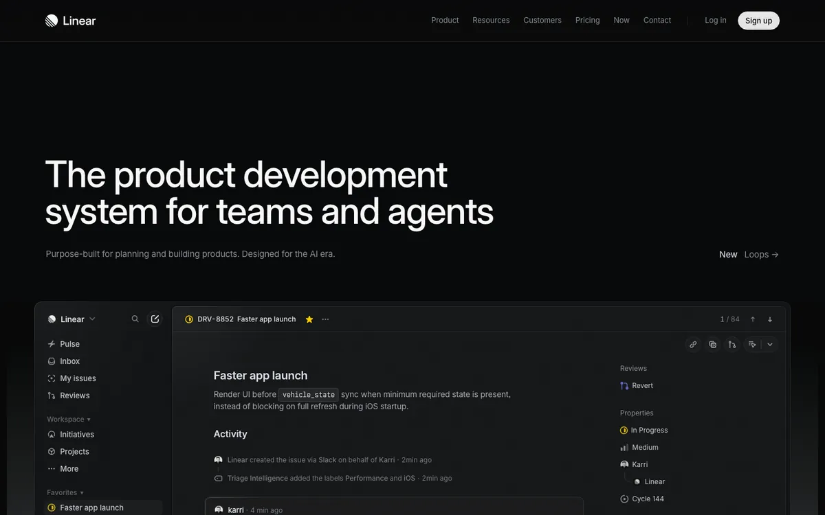
Linear's headline reads "The product development system for teams and agents." Directly below sits a near full-width view of the app, showing an issue, its activity feed, and properties. There's no hero button at all. The "Sign up" button lives in the navigation.
The page trusts the product to do the selling. You see a real issue, real labels, and an AI triage note before you scroll.
Steal this: If your UI is your best argument, cut the hero CTA and let a large product shot carry the first screen.
Attio
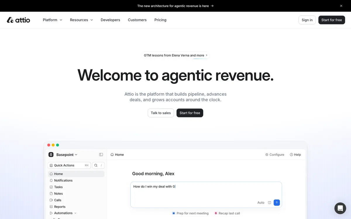
Attio's hero opens with "Welcome to agentic revenue." The subhead explains the product in one sentence. Below the two buttons, a product window shows a greeting and a prompt being typed: "How do I win my deal with..."
The typing prompt makes the AI feature feel live, not promised. It also tells you how you'd use the product on day one.
Steal this: Show the first action a new user takes, mid-motion, instead of a finished dashboard.
Notion
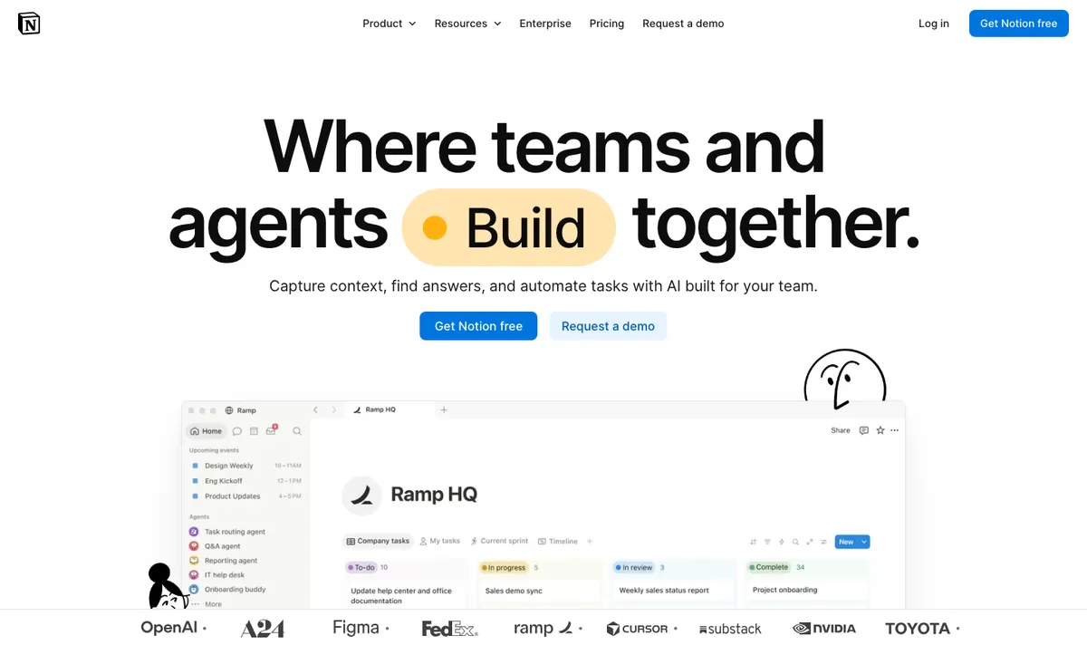
Notion's headline, "Where teams and agents Build together," wraps one word in a yellow pill. Two buttons follow: "Get Notion free" and "Request a demo." A product window and a row of customer logos, including OpenAI, Figma, and Toyota, fill the bottom of the first screen.
The pill gives your eye a single landing spot in a large headline. The logo row answers "who uses this?" before you ask.
Steal this: Highlight one word in your headline, the one that carries the promise, with a shape or color block.
Slack
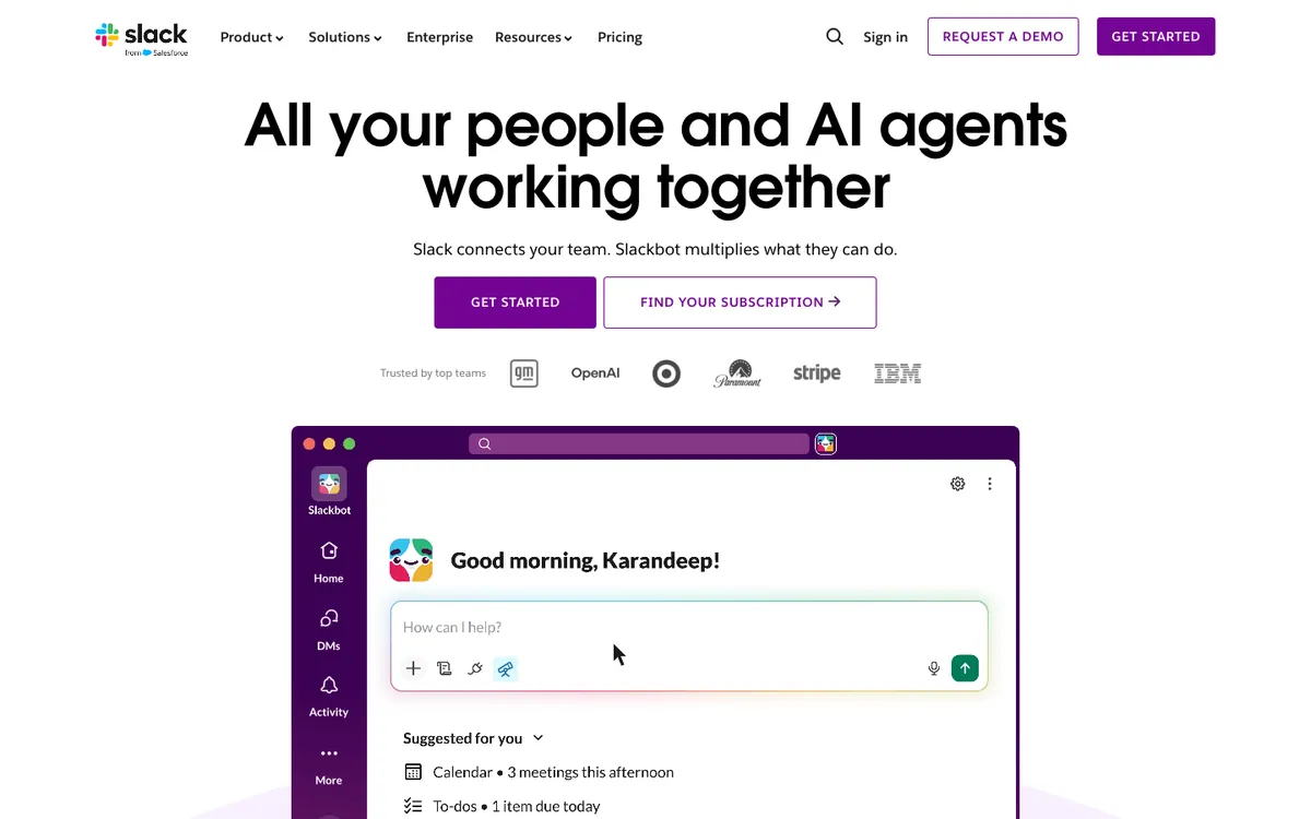
Slack's hero says "All your people and AI agents working together." Below the buttons, a short logo row leads into a purple Slack window with a morning greeting and a "How can I help?" prompt.
The mock-up looks like your own workspace on a normal morning. That makes the AI assistant feel familiar instead of abstract.
Steal this: Stage your product shot as a real user's view, with a greeting, a task list, or a calendar note.
Cursor
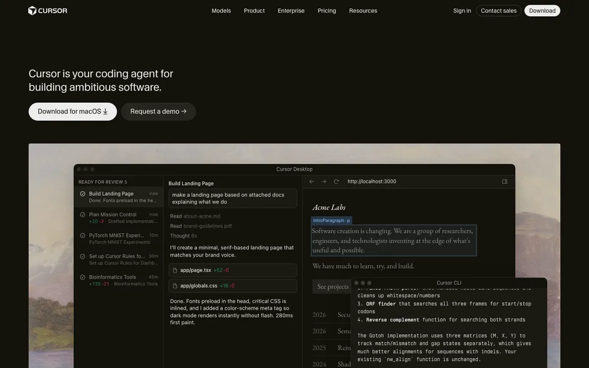
Cursor's headline is one plain sentence: "Cursor is your coding agent for building ambitious software." On our Mac capture, the primary button read "Download for macOS." The app window sits on top of a painted landscape, mid-task, building a landing page.
The painting softens a dense, technical screenshot. Naming the operating system in the button removes one decision for the visitor.
Steal this: If you ship a desktop app, detect the visitor's OS and name it in the main button.
Minimal, Type-Led Homepages
Minimal homepages lean on one strong line and a lot of empty space. They work when your brand is already known or your audience prefers fewer words.
Vercel
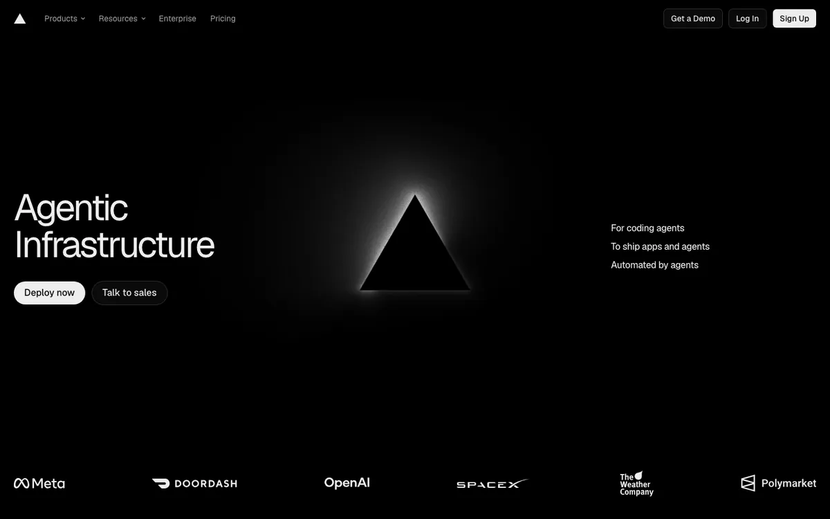
Vercel's hero is two words: "Agentic Infrastructure." A glowing triangle, the company's logo, sits in the center. A short list on the right names three use cases, and a row of customer logos, including Meta, OpenAI, and SpaceX, anchors the bottom.
The page is mostly black space. That makes the two words and the logo impossible to miss.
Steal this: Pair a two-word category claim with three short use-case lines so the minimal headline still explains itself.
Raycast
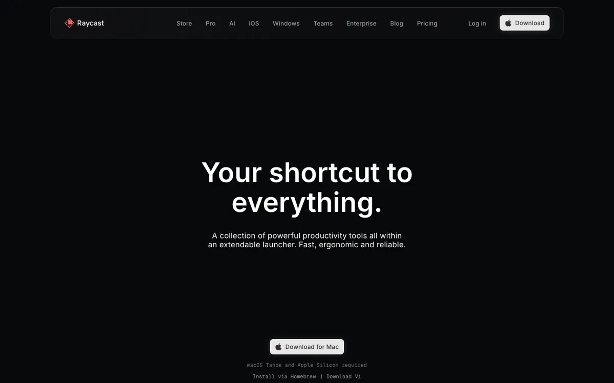
Raycast's hero reads "Your shortcut to everything." A one-sentence subhead and a single "Download for Mac" button follow. Small text below lists the system requirements and a Homebrew install option.
It's the most restrained page in this list. The technical footnote is a nice touch for its audience, who want install details before they click.
Steal this: Put the one requirement your buyer checks first, such as OS or install method, right under the button.
Stripe
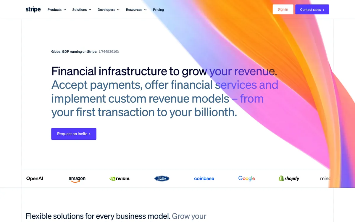
Stripe's headline starts "Financial infrastructure to grow your revenue," then runs into a longer gray sentence that explains the product. Above it, a small live counter shows the share of global GDP running on Stripe. A gradient ribbon sweeps across the right side, and a logo strip with OpenAI, Amazon, Nvidia, and Ford closes the first screen.
The counter is the clever part. It's proof and motion in one line of text.
Steal this: Turn your biggest proof point into a live or animated number above the headline.
Figma
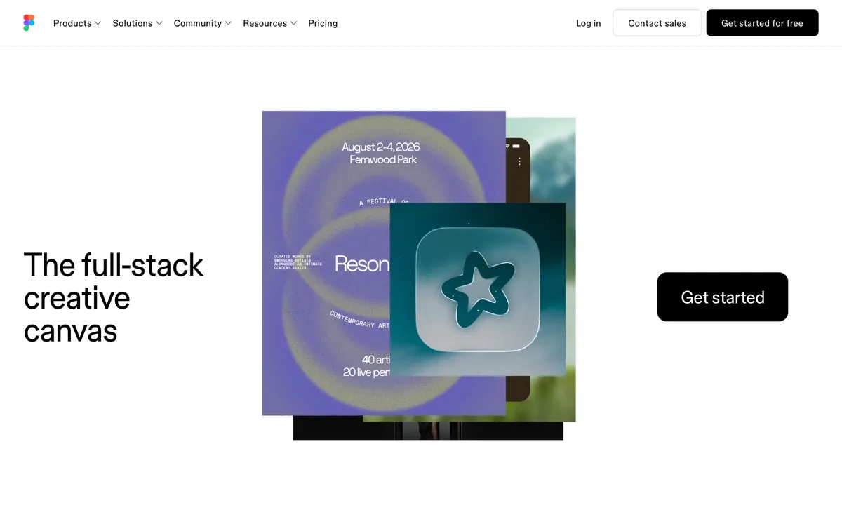
Figma's hero says "The full-stack creative canvas" in big type. A stack of real design work, an event poster and an app icon in our capture, fills the center. A large black "Get started" button sits on the right.
The artwork changes between visits, which keeps the page fresh for repeat visitors. It also shows the range of work you can make without listing features.
Steal this: Rotate a set of real customer or community work samples in the hero instead of one static mock-up.
Homepages With Signup in the Hero
These homepages let you start without leaving the first screen. They suit free or self-serve products where signup is the main goal.
Asana
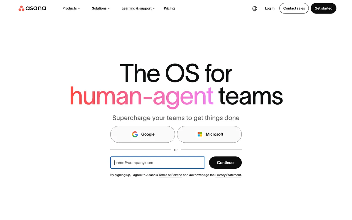
Asana's headline reads "The OS for human-agent teams," with "human-agent" in a coral gradient. Below the subhead, you get Google and Microsoft sign-in buttons, an email field, and a "Continue" button.
The hero is basically a signup form with a headline on top. That's bold for a product this large, and it removes the trip to a separate signup page.
Steal this: Add single sign-on buttons above your email field so most visitors can sign up in one click.
Calendly
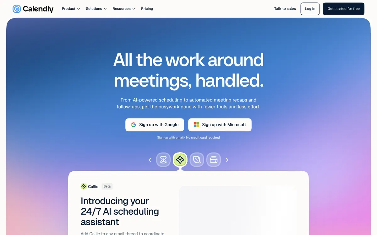
Calendly's hero sits inside a rounded blue gradient card: "All the work around meetings, handled." Two sign-up buttons, Google and Microsoft, sit under the subhead. A small line below offers email signup and says no credit card is required.
The icon carousel under the buttons previews the main features without a wall of text.
Steal this: Put "no credit card required" in small text right under your signup buttons.
Intercom
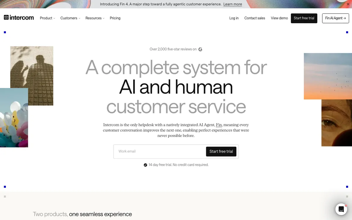
Intercom's hero opens with a review line above the headline: "Over 2,000 five-star reviews on G2." The headline, "A complete system for AI and human customer service," mixes gray and black type. An email field and a "Start free trial" button follow, with a note about a 14-day trial.
Photo collages at both edges give the page an editorial feel. Most software homepages don't try that.
Steal this: Put your review count above the headline, where it frames everything you say next.
Mercury
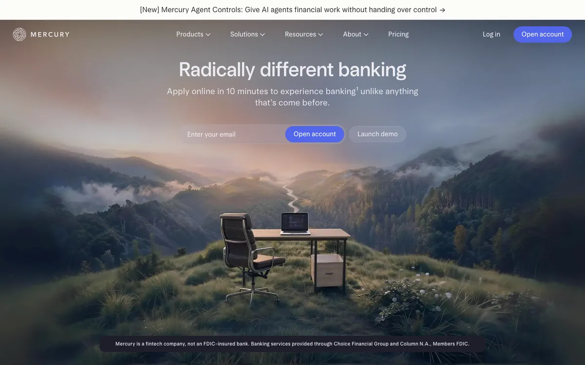
Mercury's hero says "Radically different banking" over a photo of a desk and chair on a misty hilltop. The subhead says you can apply online in 10 minutes. An email field, an "Open account" button, and a "Launch demo" button sit in the middle.
The landscape sells calm, which is what a banking buyer wants. A required disclosure line at the bottom stays readable without fighting the image.
Steal this: Offer an interactive demo next to the signup button for visitors who aren't ready to commit.
Brand-Led and Visual Homepages
Brand-led homepages lead with color, illustration, or photography. They work when the audience is broad and the feeling matters as much as the feature list.
Canva
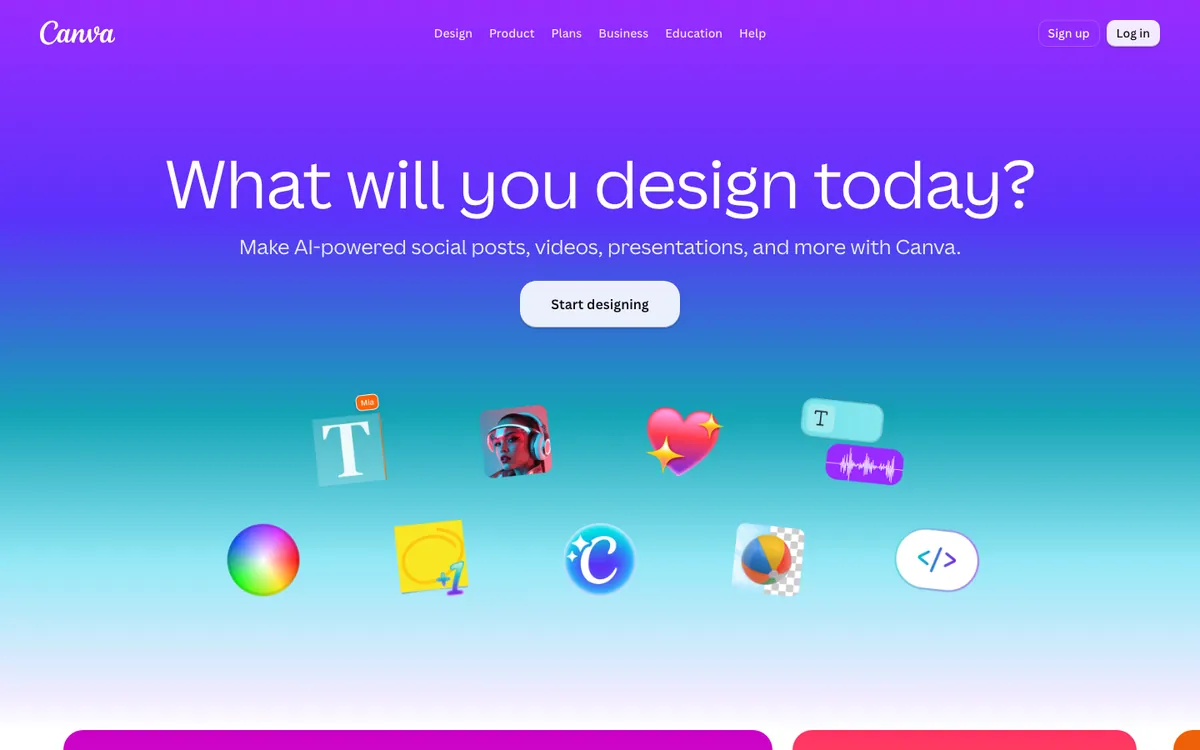
Canva's hero asks one question: "What will you design today?" It sits on a purple-to-blue gradient with one button, "Start designing," and a row of playful 3D icons.
A question headline works here because the audience already knows what Canva does. It invites action instead of explaining.
Steal this: If your brand is well known, try a question headline that starts the user's task.
Duolingo
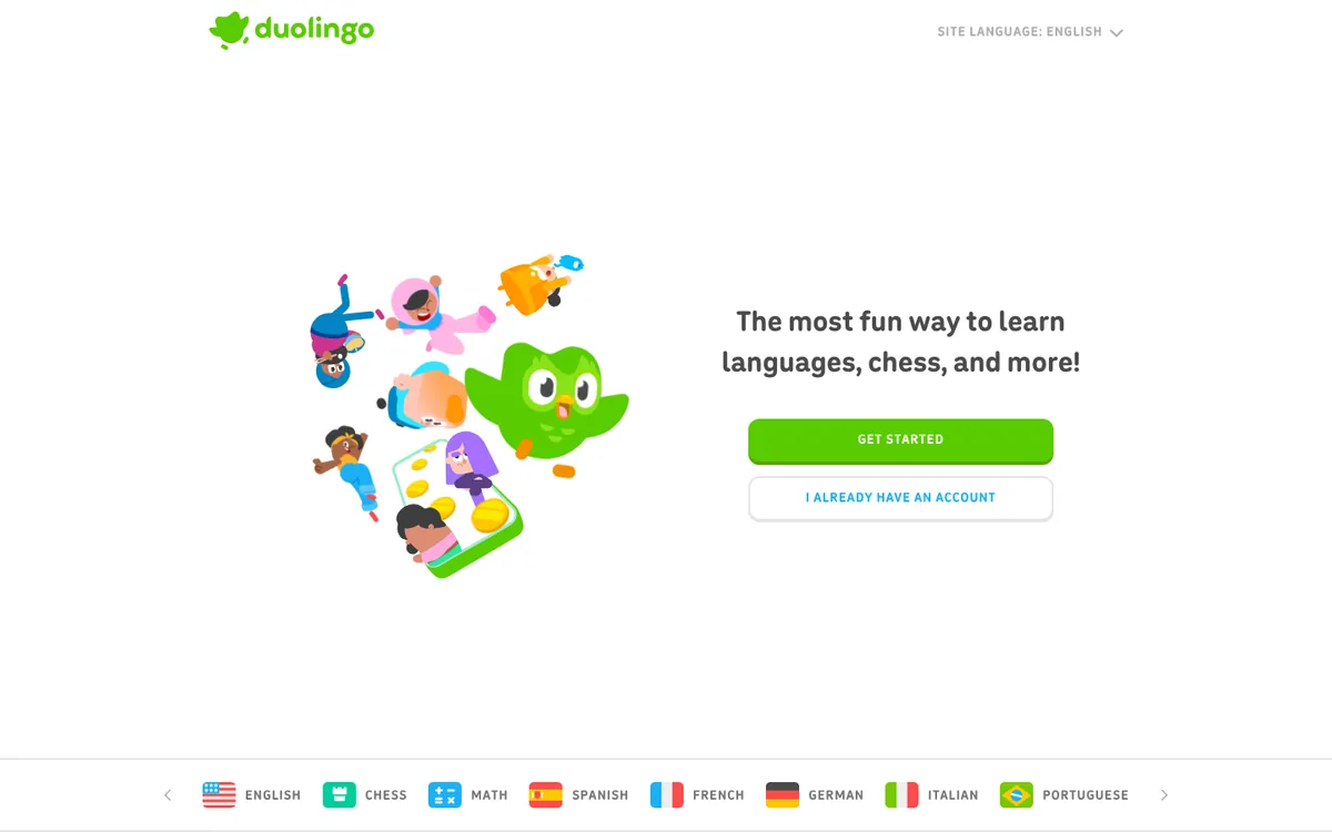
Duolingo's hero is a cluster of illustrated characters around the green owl mascot. The headline says it's "The most fun way to learn languages, chess, and more!" Two buttons split new and returning users. A strip of course flags runs along the bottom.
The illustration says "fun" before you read a word. The two-button split stops returning users from hunting for a login link.
Steal this: Give returning users their own button in the hero if a large share of your traffic is existing customers.
HubSpot
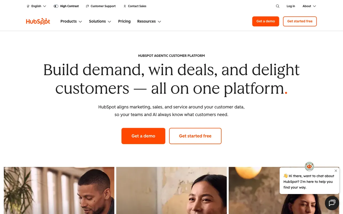
HubSpot's hero starts with a small "HubSpot Agentic Customer Platform" label, then a serif headline: "Build demand, win deals, and delight customers," all on one platform. Two orange buttons follow, one filled and one outlined. A row of warm photos of people sits below.
The serif type and real faces make a large software suite feel human. The filled and outlined buttons make the primary action clear.
Steal this: Style your secondary CTA as an outline so the primary one wins at a glance.
Patagonia
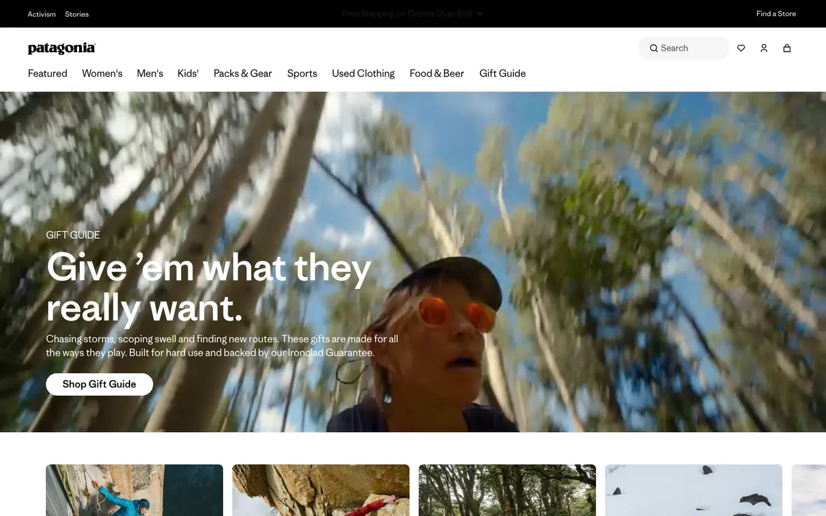
Patagonia's hero was a seasonal gift guide on capture day. A full-width outdoor photo carries the headline "Give 'em what they really want" and a single "Shop Gift Guide" button.
The homepage acts as a campaign page. It changes with the season and points every visitor to one timely action.
Steal this: Treat your homepage hero as a rotating slot for your most timely campaign.
Shopify
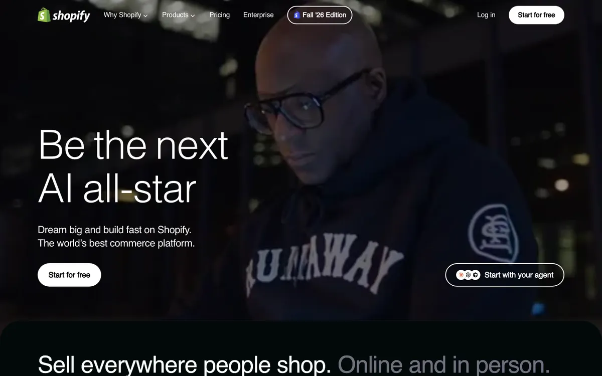
Shopify's hero is a full-bleed portrait of a man working late at night, with the headline "Be the next AI all-star." Two buttons offer a free start or a start with your agent. A "Fall '26 Edition" pill in the nav points to its latest product release.
The portrait puts a person, not the software, at the center. The next section starts peeking up from the bottom, which nudges you to scroll.
Steal this: Feature a real person in the hero image, and let the next section peek above the fold.
Website Builders That Turn the Homepage Into a Demo
Website builders have a unique advantage: the homepage is the product. These two use that to show, not tell.
Framer
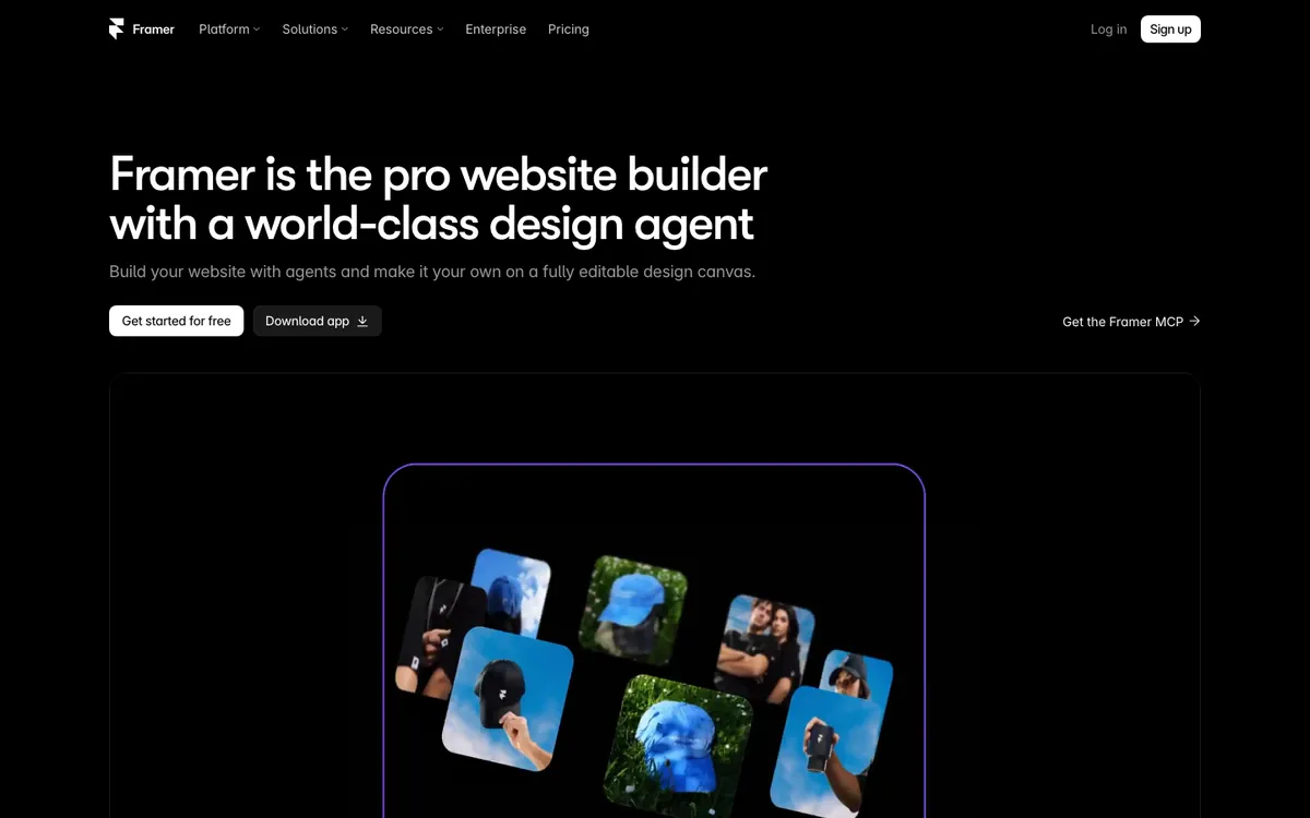
Framer's headline says it's "the pro website builder with a world-class design agent." Below the buttons, a large canvas shows the agent at work on a page. A small "Get the Framer MCP" link on the right speaks to developers.
The demo answers the obvious question, "what does the agent actually do?", before you scroll.
Steal this: If your product makes things, show it making something in the hero.
Webflow
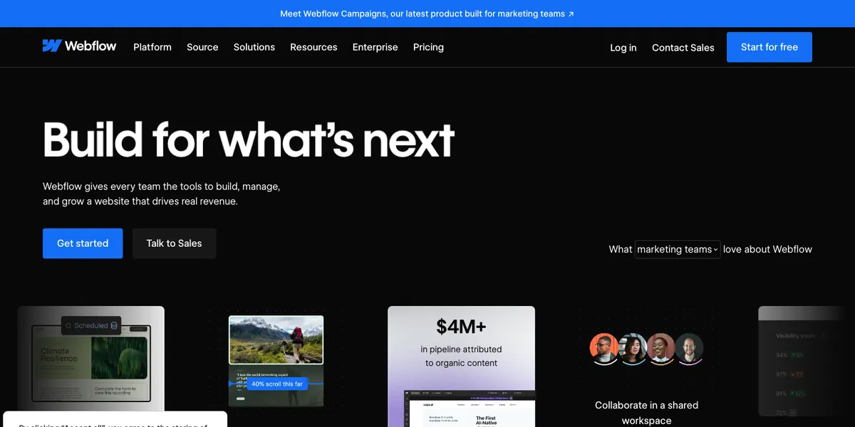
Webflow's hero reads "Build for what's next." To the right, a dropdown lets you pick your role, set to "marketing teams" by default. A row of cards below shows outcomes, including a customer result card about pipeline from organic content.
The audience picker is the standout. It lets one homepage speak to marketers, designers, and developers without three separate heroes.
Steal this: Add a simple audience selector that swaps the proof cards for each role.
What the Best Homepages Have in Common
Across all 20 pages, five patterns repeat. Use them as a checklist for your next homepage.
- A short headline that names the category. Most headlines in this list run under 10 words. The longer ones, like Stripe's, split into a short claim and a lighter explainer sentence.
- One primary action. Even pages with two buttons make one visually dominant, through fill color or size.
- Proof in the first screen. About half the pages show product UI, customer logos, a review count, or a live number before the scroll.
- A visual that matches the buyer. Developer tools go dark and technical. Consumer brands go colorful or photographic.
- Copy written for skimmers. Subheads stay at one or two sentences, and every page here puts its full feature list below the fold.
The AI wave shows up clearly too. Half of these headlines mention AI or agents, so a plain, specific promise like Mercury's or Raycast's now stands out.
How to Design a Homepage That Works
Use these steps to turn the patterns above into your own page. They work for SaaS, ecommerce, and service businesses.
- Write the headline last. List what you sell, who it's for, and the outcome. Then compress that into fewer than 10 words.
- Pick your proof. Choose one: product UI, customer logos, review count, or a live metric. Put it in the first screen.
- Choose one primary CTA. Make it a filled button. Style any second option as an outline or text link.
- Match the visual style to your buyer. Look at the homepages your buyers already use daily, and borrow their level of polish and density.
- Plan the scroll. Below the hero, add features, deeper proof, pricing cues, and a final CTA. Our SaaS landing page design guide breaks down that section order.
- Build and test. Ship the page in a tool your team can edit fast. Compare options in our roundup of free and paid SaaS landing page builders.
FAQ
What makes a good homepage design?
A good homepage tells visitors what you do in one short headline, shows one clear next step, and proves the claim in the first screen. Linear, Notion, and Stripe all do this with product UI or customer logos.
What should a homepage include?
Include a clear headline, a short subhead, one primary CTA, and proof such as product screenshots, customer logos, or reviews. Below the fold, add features, deeper social proof, and a closing CTA.
What is the difference between a homepage and a landing page?
A homepage serves every visitor and links to the whole site. A landing page has one goal, such as a signup or demo request, and usually comes from a specific ad, email, or campaign.
Where can I find homepage design inspiration?
Start with the live homepages of products your buyers already use, like the 20 in this list. Design galleries help too, but check the live site, since homepages change often.
Should I put a signup form on my homepage?
Yes, if you offer a free plan or trial and signup is your main goal. Asana, Calendly, Intercom, and Mercury all do it. Sales-led products usually do better with a demo button.
Should my homepage use a dark theme?
Use dark only if it suits your buyers. In our sample, all six dark homepages belonged to developer or website-builder tools. Broad consumer and business brands mostly stayed light or photographic.
Summarize this article with AI:
 ChatGPT
 Perplexity
 Claude
 Grok

Written by
Taher BatterywalaFounder & Chief Curator
Taher Batterywala is a creative marketer who loves to write & design content that organically drives conversions. He is the creator of Pineable, the world's first content marketing design inspiration hub. He regularly shares his thoughts about content design, SEO, and marketing. As a true cinephile, he admires movies above anything else.