On this page
A landing page is a standalone web page built around one decision: sign up, buy, book, or download. Visitors usually arrive from a specific ad, email, or link, and the page continues that promise with no detours. Unlike a homepage, it serves one audience, one offer, and one call to action.
That's the definition. The useful part is understanding why the format works, how it differs from the pages around it, and when you don't need one at all. This article covers the concept. For layout, copy, and build steps, see our landing page design guide.
Here are the key facts at a glance:
| Question | Answer |
|---|---|
| Purpose | Get one action: a sign-up, purchase, download, or booking |
| Typical length | One page, from a single screen to a long scroll |
| Where visitors come from | Ads, emails, social posts, partner links, search results, and QR codes |
| Main elements | A promise, proof, one offer, and one call to action (CTA) |
| Success metric | Conversion rate: the share of visitors who take the action |
- A landing page exists to finish a conversation that started somewhere else, like an ad or an email. Its headline should repeat the promise that earned the click.
- Homepages introduce a whole business to many kinds of visitors. Landing pages serve one visitor with one job, which is why they usually drop the main menu.
- The common types are click-through pages, lead generation pages, sales pages, program or offer pages, waitlist pages, and thank-you pages.
- Not every campaign needs one. Visitors who want to compare plans or explore a catalog are better served by a pricing page or a hub page.
- In Google Analytics, "landing page" means the first page of a session, so the same term describes two different things.
What Is a Landing Page, Really?
Think of a landing page as the second half of a sentence. The ad, email, or post says "Here's a free trial" or "Here's a guide to pricing your product." The landing page finishes the thought: here it is, here's why it's worth it, and here's the one thing to do next.
That framing explains most of the rules people repeat about landing pages. They remove navigation because a menu reopens questions the visitor didn't come to answer. They lead with the offer because the visitor already decided to look at it. They keep one button because a second option splits a decision that was nearly made.
The term also has a second, technical meaning. In Google Analytics, the landing page dimension is the page path of the first page view in a session. By that definition, any page can be a landing page, including your homepage or a blog post. When someone on your team says "our top landing pages," ask which meaning they intend.
Why Do Landing Pages Exist?
Landing pages exist because one page can't answer every visitor well. A person who clicked an ad for a 14-day trial wants that trial. A person who typed your brand name wants to look around. Sending both to the same page serves neither.
Three practical reasons keep the format alive:
- Message match. When the page repeats the ad's promise in its headline, visitors know they're in the right place. A mismatch makes them leave.
- Ad performance. Google Ads includes a landing page experience rating in how it judges ad quality. A page that isn't relevant to the people who click can drag down the ad.
- Clean measurement. One page, one action, and one traffic source make results easy to read. Change the headline and you can see whether sign-ups move.
Landing Page vs Homepage vs Product Page
The quickest way to understand a landing page is to compare it with the pages around it. Each has a different visitor and a different job.
| Page | Who arrives | Main job | Navigation |
|---|---|---|---|
| Landing page | One audience from one source, like an ad or email | Get one action | None or minimal |
| Homepage | Everyone, from first-time visitors to existing customers | Orient visitors and route them onward | Full menu and footer |
| Product page | Shoppers comparing a specific item or feature | Explain one product in depth | Full menu, often with related products |
| Pricing page | Visitors close to a decision | Help them pick a plan | Full menu, plan comparison |
| Campaign hub | A returning audience with varied needs | Present several related offers | Partial, organized around the campaign |
Shopify shows the homepage and landing page split clearly. Its homepage carries a full menu, with Why Shopify, Products, Pricing, and Enterprise, plus a login link. Its free trial page strips all of that away and keeps the logo, a headline, and one email field.
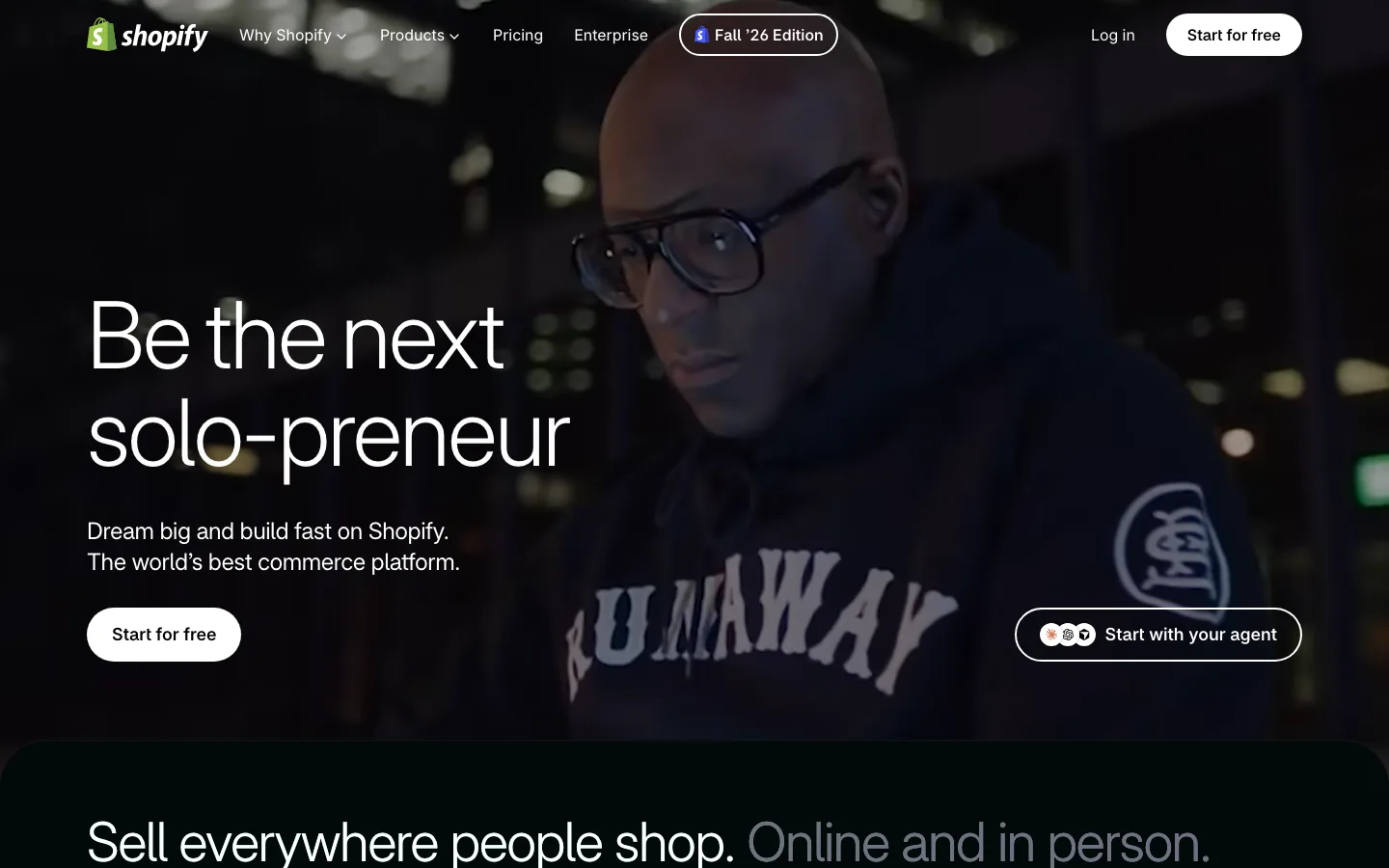
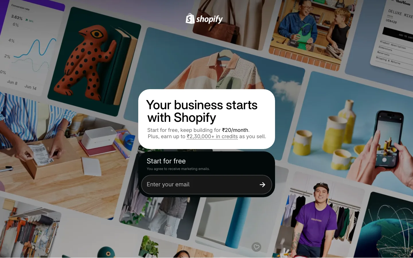
A homepage has to work for strangers and customers at once, so it carries a menu and several paths. The trial page knows exactly who's arriving and what they came for, so it carries almost nothing else.
Types of Landing Pages, With Real Examples
Landing pages are grouped by what they ask the visitor to do. Here are the six you'll see most:
| Type | What it asks for | Typical use |
|---|---|---|
| Click-through page | A click to the next step, such as signup or checkout | Free trials and ecommerce offers |
| Lead generation page | Contact details in exchange for something useful | Ebooks, webinars, demos, gated research |
| Sales page | A purchase, usually after a long run of proof | Courses, books, and higher-priced products |
| Program or offer page | An application or claim for a special deal | Startup programs, partner offers, discounts |
| Waitlist page | An email address before launch | New products and private betas |
| Thank-you page | A next step after a conversion | Confirming a signup and suggesting what to do next |
The examples below mix a household name with smaller brands, because the craft shows up at every size.
Notion for Startups: A Program Page With One Offer
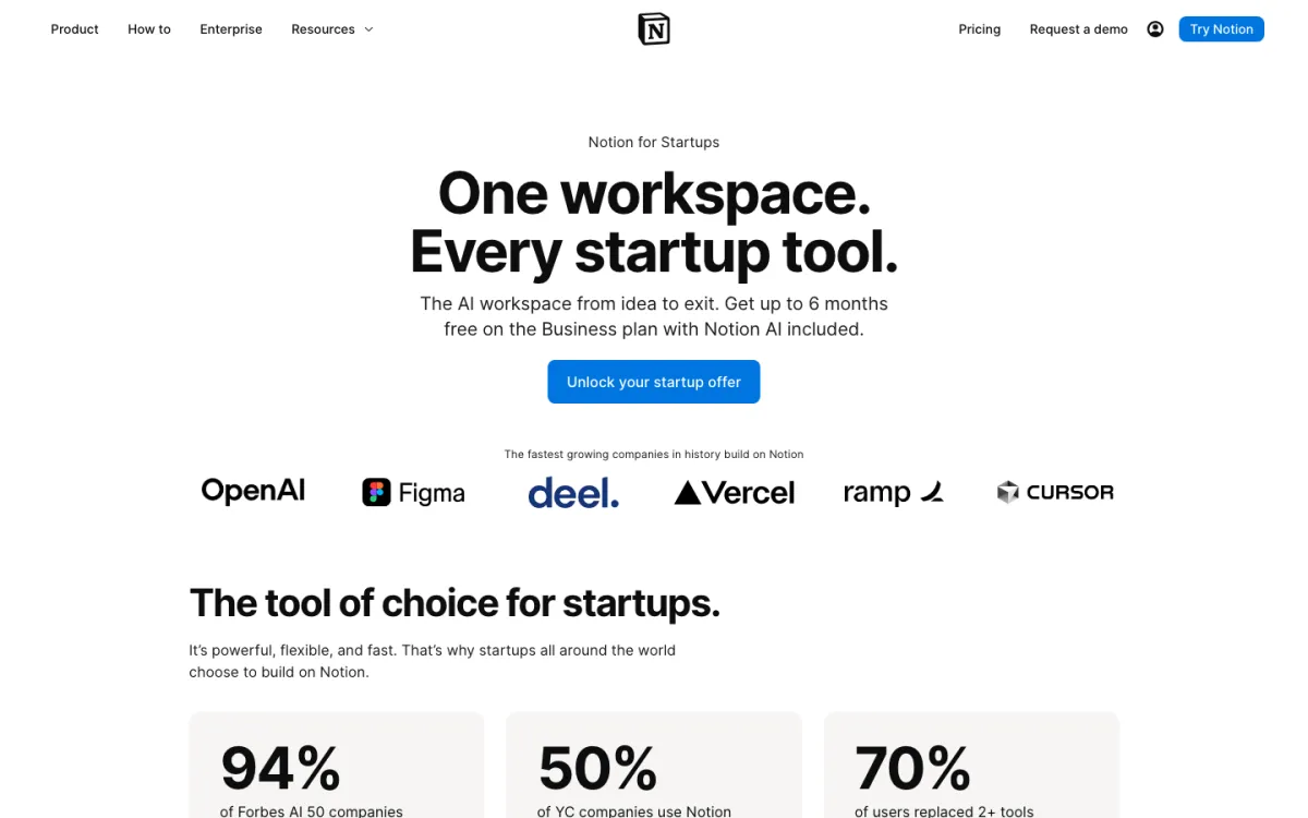
Notion's startup page makes one offer: up to six months free on the Business plan, with Notion AI included. A single blue button, "Unlock your startup offer," repeats further down the page. Customer logos sit directly under the button, so the proof arrives before the visitor has to scroll.
The detail worth studying is the eligibility section. Notion spells out three tiers: six months for non-paying customers under 100 employees who come through one of its startup partners, three months for those with a business website and a company email address, and one month for very small teams or incomplete applications. That's objection handling. The question most visitors have ("Do I qualify?") gets answered on the page instead of in a support ticket.
Refactoring UI: A Sales Page With a Lead Magnet Built In
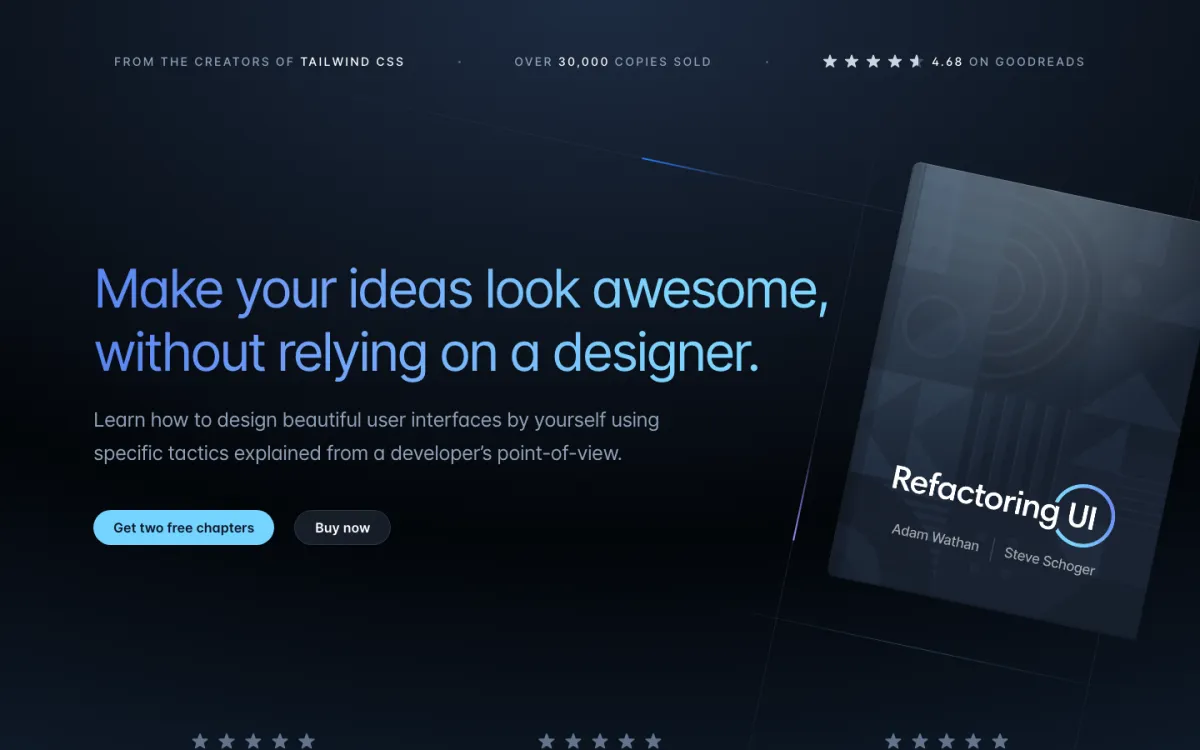
Refactoring UI is a design book for developers by Adam Wathan and Steve Schoger. Its page opens with three proof points in a thin strip above the headline: "From the creators of Tailwind CSS," "Over 30,000 copies sold," and "4.68 stars on Goodreads." The headline names the reader's problem in their own terms: make your ideas look good without relying on a designer.
It breaks the "one button" rule on purpose. "Get two free chapters" sits beside "Buy now." The free chapters catch visitors who aren't ready to spend $99 or $149 yet, and turn them into email subscribers. When a product needs trust before money, a small lead magnet next to the main offer is a fair trade.
Smashing Online Workshops: When a Hub Beats a Landing Page
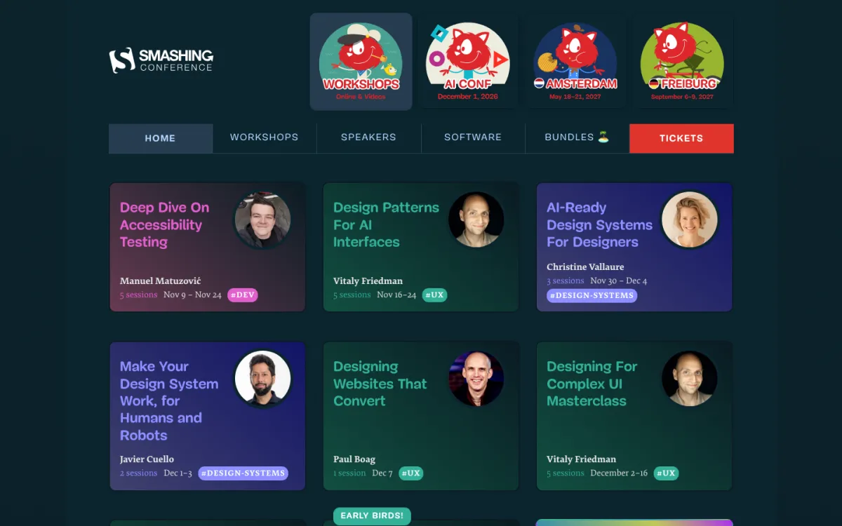
Smashing's workshops page is a useful counterexample. It lists many workshops, each with a speaker, a number of live sessions, and dates, plus bundle pricing for buying several tickets. That's a catalog, not a single-offer landing page.
That format works when visitors already know Smashing and arrive to pick a topic. For that visitor, a menu of options is the offer. If Smashing were running an ad for one specific workshop, the ad should point to that workshop's own page, not to the grid. Match the page to how decided the visitor already is.
What Makes Up a Landing Page?
Every effective landing page answers the same five questions in roughly the same order. The elements are just the answers.
| The visitor's question | The element that answers it | Seen in |
|---|---|---|
| Am I in the right place? | A headline that repeats the promise from the ad or email | Shopify's trial page |
| What exactly do I get? | A clear statement of the offer | Notion's six-month offer |
| Why should I believe it? | Proof: logos, reviews, ratings, or numbers | Refactoring UI's proof strip |
| What's the catch? | Objection handling, like eligibility, pricing, or an FAQ | Notion's eligibility answers |
| What do I do now? | One call to action with as little friction as possible | Shopify's single email field |
Pages fail when they skip a question or answer them out of order. A form above any proof asks for trust before earning it. A page with no objection handling sends visitors back to search for the catch.
Keep the page easy to scan, too. In Nielsen Norman Group research from 1997, 79 percent of test users scanned a new page and only 16 percent read word by word. The study is old, but the habit hasn't changed: short sections and clear subheads help.
When Do You Need a Landing Page, and When Don't You?
You need a landing page when traffic arrives with a specific expectation. You don't need one when visitors arrive to explore.
Build one when:
- You're paying for clicks. Every ad deserves a page that continues its exact promise.
- You have one offer for one audience, like a trial, a webinar, or a partner discount.
- You want to test a message. A dedicated page isolates the result from everything else on your site.
- A partner is sending traffic. Their audience expects the offer they were told about.
Skip it when:
- Visitors need to compare options. A pricing page or product catalog does that job better.
- Traffic is mostly people browsing from search or social, with no single promise behind the click.
- You don't have a traffic source yet. A landing page with no visitors teaches you nothing.
How Do You Know a Landing Page Is Working?
Start with conversion rate, the share of visitors who take the action. Then look past it, because a high rate can hide a weak page.
- Compare against your own history. Industry averages vary too much by offer and traffic source to judge a single page.
- Check the quality of conversions. A free ebook page that converts at a high rate but never produces a sales call may be attracting the wrong people.
- Segment by source. The same page often converts very differently for ad traffic, email traffic, and partner traffic.
- Watch ad quality signals. In Google Ads, a weak landing page experience rating is a sign the page isn't matching the ad.
Ready to build one? Our landing page design guide walks through structure, copy, and testing, and our list of free and paid SaaS landing page builders compares the main tools.
What is a landing page in simple terms?
A landing page is a web page made for one purpose, like getting a sign-up or a sale. Visitors usually arrive from an ad, email, or social post. The page continues the promise that earned the click and asks for one action.
What is the difference between a landing page and a homepage?
A homepage introduces your whole business to every kind of visitor and links to many pages. A landing page serves one audience with one offer and one action, so it usually has little or no navigation.
What are the types of landing pages?
The common types are click-through pages, lead generation pages, sales pages, program or offer pages, waitlist pages, and thank-you pages. They differ in what they ask the visitor to do.
Is a homepage a landing page?
Sometimes. In marketing, a landing page is a dedicated page for one campaign. In Google Analytics, a landing page is the first page of a session, so your homepage counts when visitors enter there.
Can a landing page have more than one call to action?
It can, if the second option serves visitors who aren't ready yet. Refactoring UI pairs Buy now with Get two free chapters. Two unrelated offers on one page usually split the decision instead.
Do I need a landing page if I have a website?
Yes, if you run ads, emails, or partner campaigns with a specific offer. Your website serves people who want to explore. A landing page serves people who already know what they came for.
Summarize this article with AI:
 ChatGPT
 Perplexity
 Claude
 Grok

Written by
Taher BatterywalaFounder & Chief Curator
Taher Batterywala is a creative marketer who loves to write & design content that organically drives conversions. He is the creator of Pineable, the world's first content marketing design inspiration hub. He regularly shares his thoughts about content design, SEO, and marketing. As a true cinephile, he admires movies above anything else.