A LinkedIn visual with crowded layouts, weak hierarchy, and mismatched formats can bury the message before someone gets to the point.
But you don't need to become a visual designer to fix that. A few principles from visual psychology can help you spot what builds credibility, what hurts it, and whether a graphic is doing its job at a glance.
This brief guide gives you a practical checklist for reviewing LinkedIn visuals and a quick reference for matching common post types with formats that support them, from carousels and infographics to screenshots, quote graphics, and photos.
How LinkedIn Visuals Can Build Credibility or Hurt Authority
Audiences don't consciously analyze every part of a layout; they experience the visual as a whole. Well-designed B2B visuals on LinkedIn can guide attention and make your message easier to absorb before someone reads the copy.
That means a scroll-stopping graphic or carousel slide isn't just decoration. It can reduce the visual effort needed to understand your message.
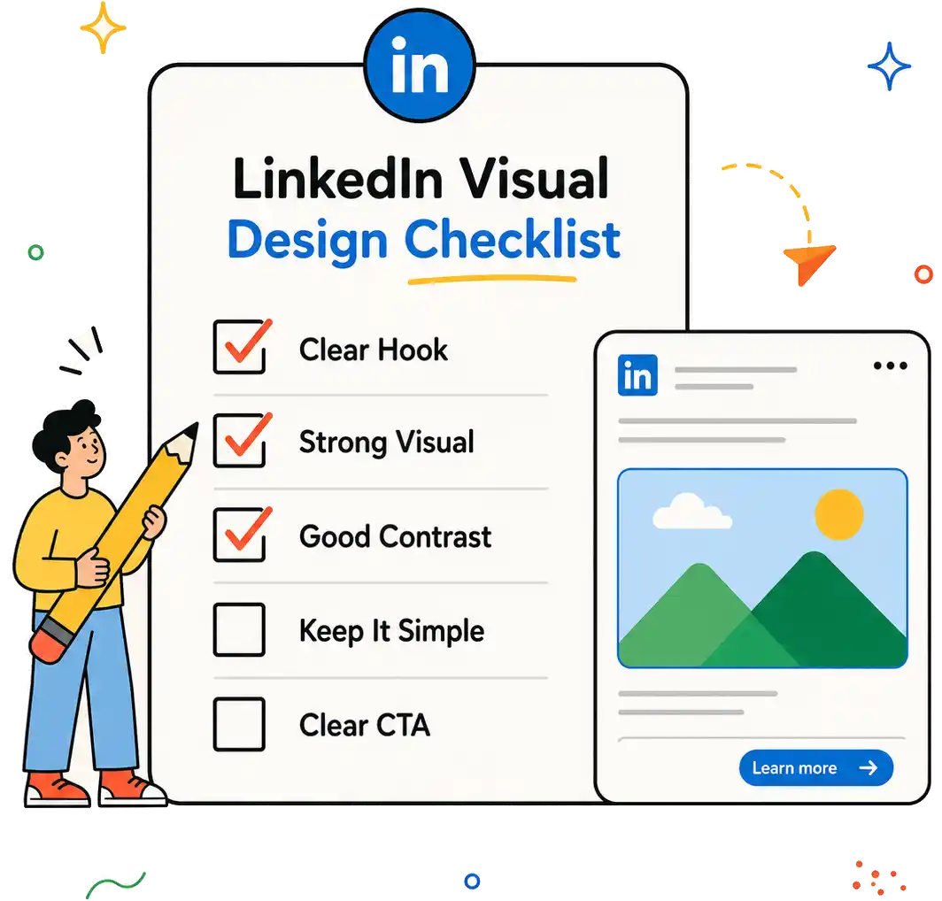
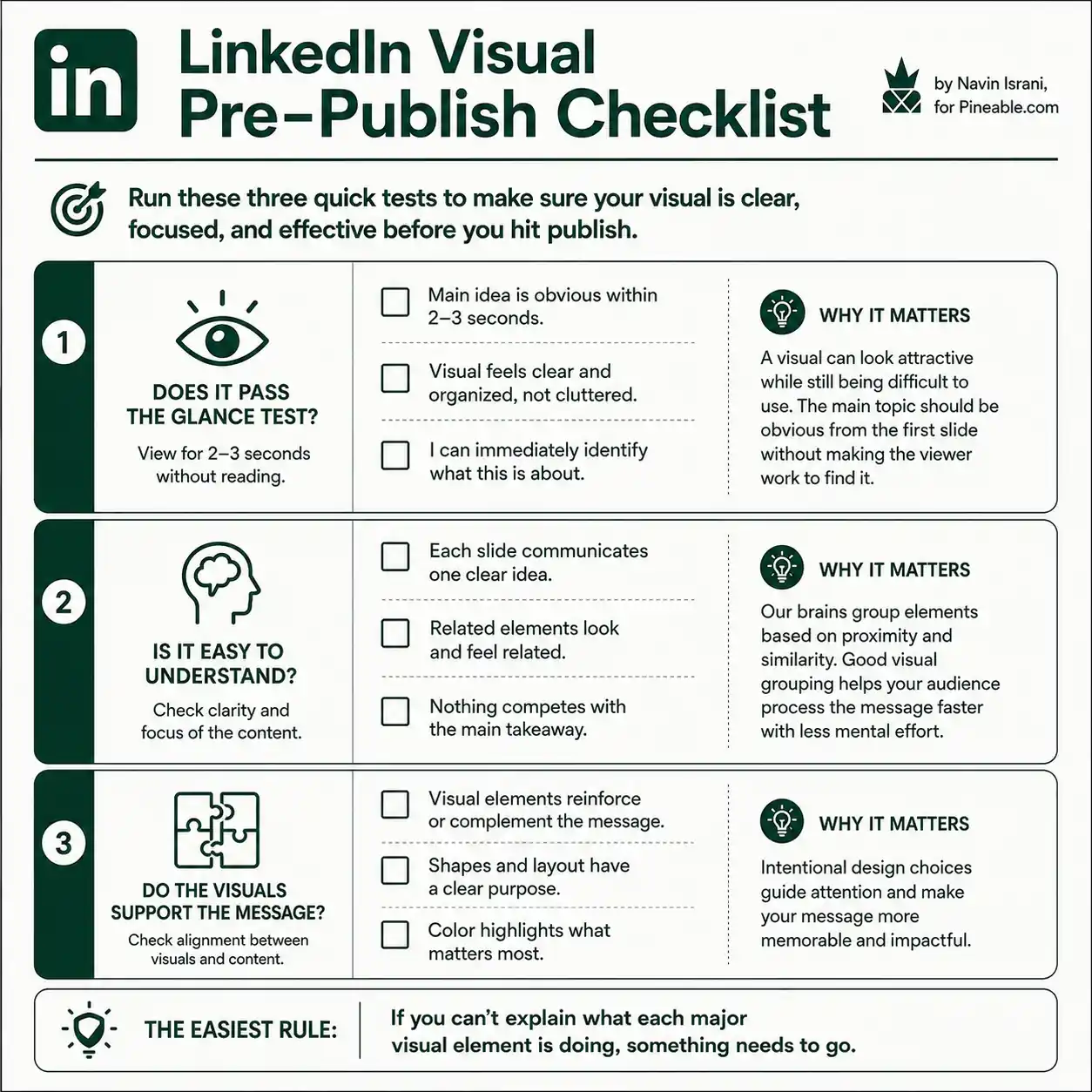
Use this practical checklist to turn visual psychology into specific design decisions before you publish.
The same design choice can either strengthen or weaken how your content comes across. Here’s what separates the two:
|
Graphic element |
When it hurts authority |
When it builds credibility |
|
Spacing & whitespace |
Crowding leaves no clear focal point or visual breathing room. |
Generous spacing isolates key elements and clarifies relationships among them. |
|
Typography |
Competing fonts and weights make text harder to scan. |
Consistent, readable typography creates a clear scanning path. |
|
Color & visual effects |
Too many colors, shadows, or borders compete with the message. |
A restrained palette and subtle effects keep focus on the message. |
|
Information hierarchy |
Similar-sized elements make the main point hard to find. |
Clear scale and sequencing show what order to notice elements in. |
|
Branding & imagery |
Generic imagery or changing styles make content feel disconnected. |
Familiar brand cues build recognition while layouts adapt to context. |
LinkedIn Visuals Pairing Guide For Your Posts
When visuals match the content, they reduce friction, reinforce the message, and give people more reason to keep reading. It also tells the LinkedIn algorithm to push your post to more feeds.
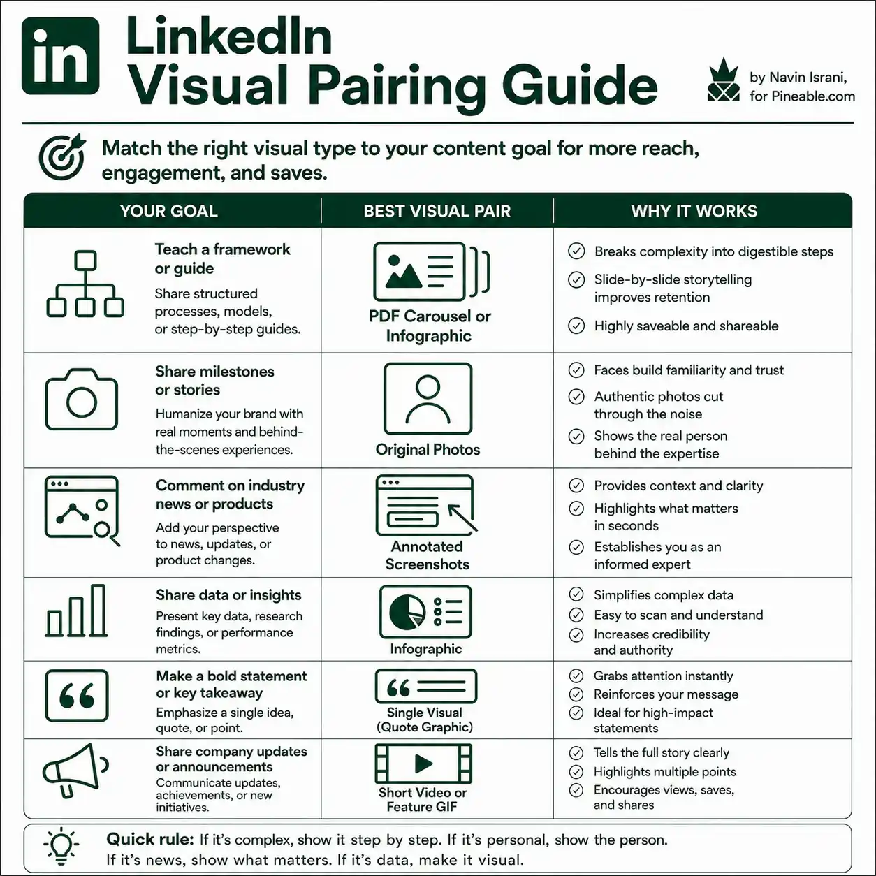
For step-by-step guides, use PDF carousels or infographics
The common principle for both carousels and infographics is simple:
Don't make the audience hold the whole framework in their head. Let the visual structure hold some of it for them.
But posting a carousel or infographic on LinkedIn has the same basic elements as any LinkedIn post:
The text hook (in the caption) acts as the textual hook of the post and the caption text can act as the summary (although it doesn’t have to). The title slide of the carousel or headline/subheadline combo of the infographic acts as the visual hook.
Why this works
Complex frameworks are difficult to absorb when they're presented as one large block of text. A LinkedIn PDF carousel gives you a simplified structure to organize the ideas and simplify that complexity.
When sharing a step-by-step guide or framework, instead of forcing the reader to process the entire framework at once, each carousel slide can carry one idea, one step, or one part of the model.
Then the sequence makes absorbing the idea easier: slide 1 introduces the idea, the next slides build it piece by piece, and the final slide brings it together. This matches how step-by-step guides and frameworks are meant to be understood: sequentially, not all at once.
The format also suits the way people use professional content on LinkedIn. The audience gets something they can learn from in the moment and they can save the post and return to it later to use it as a reference. That makes frameworks and practical guides particularly well suited to PDF carousels.
Use an infographic when the framework can be understood as a single visual system: a model, map, matrix, checklist, or set of connected ideas. Use a PDF carousel when the reader needs to move through the logic one step at a time.
Here’s a great example of a carousel from Jay Clouse, Founder of Creator Science.
Jay first puts the entire conversation about holiday content into context by sharing undeniable facts and minor changes to expect. This initial sequence primes the readers to be ready for holiday season posting strategies, then he moves into describing two key strategies.
What I love about Jay’s carousel here is that he has used large fonts and has not gone overboard with adding too much text. Although this carousel is 2+ years old, these large fonts are now standard on LinkedIn because the platform has recalibrated the viewport size (aspect ratio) on mobile recently. Critically, the carousel has only 10 slides which suits his audience who are busy but often distracted creators.
To learn how to build PDF carousels, check how to create the right type of visual for your LinkedIn posts.
For milestones & stories, use original photos
Repeatedly seeing the same face gives people a visual cue they can recognize and connect with your ideas.
Personal imagery closes that distance between an abstract professional identity and an actual human being. It helps turn an otherwise interchangeable stream of posts into something attached to a specific person.
And that matters in an AI-polluted content ecosystem.
The more AI-generated content fills LinkedIn, the more valuable it becomes to show that there is an actual person behind what you publish.
This is critical because AI cannot give your audience the accumulated familiarity of seeing you: at your desk, on stage, with your team, celebrating a win, attending an event, or simply talking about something you experienced.
Additionally, humans are naturally tuned to recognize faces. Research from Harvard found that our ability to learn and recognize unfamiliar faces continues developing through adulthood, peaking in our early 30s.
That makes your face more than a profile-picture accessory. A good selfie can cut through that noise and stop the scroll because faces naturally attract attention.
A personal photo makes your personal stories stronger when the experience has been thought through and connected to something useful for the audience. It adds context, personality, and evidence that there is a real person behind the expertise. Likewise, a photograph of the people behind a company gives them a more abstract sense of what the company feels like.
Here’s an example from Alex Hormozi who celebrated breaking a Guinness World Record by posting a photo with his wife Leila Hormozi:
Key to notice here is that he adds his wife to the photo and does not post his solo photo. It highlights the partnership aspect of creating his book.
But there are a few caveats you need to keep in mind when using personal photos on LinkedIn.
-
A raw, personal story paired with a fake, AI-slop-like image or a “fake candid” photo will break user trust instantly. Likewise, an authentic photo with a pretentious sounding story will repel serious fans.
-
Don’t over-edit or add polished filters to your photos; People on LinkedIn expect reality, not a polished lifestyle. LinkedIn really isn’t Instagram in that sense.
-
Don’t overuse the same style of personal photos, try to give your audience something unique each time.
-
Make sure you use only relevant images where we can notice and read key elements clearly. For example, the quality of Alex’s image in the example above is quite low and you cannot clearly read the book title (even though the book title may be clear to his loyal followers from implicit context).
For industry news, use annotated screenshots
Posting about a major industry news or product update in the period following the event (while it is still active in public discussions) almost guarantees that your audience will notice it.
And we also know that LinkedIn prioritizes visual content that naturally produces high engagement.
Posting annotated screenshots is a great way to combine both - latest news in a visual.
If you are reacting to an industry update, a viral tweet, or a software release/product feature, pair your text with a direct screenshot of the source material with your thoughts in annotated text. It instantly proves your commentary is grounded in real-time events. It also gives immediate context without forcing the user to click an external link, which would break their scrolling flow.
The annotated text acts like text on a YouTube thumbnail; it complements the image content and draws viewer curiosity which makes them stop the scroll.
-
The caveat: The screenshot must still focus on a single topic and use enough whitespace to bring the intended message in focus. They may require a little more editing to make it shareable on LinkedIn.
For more tips on taking great screenshots, check out this LinkedIn pulse article on screenshot best practices by Claire Lagerwall (a learning & development specialist).
For thought leadership, use opinion quote cards
Your strongest insight can become instantly scannable on mobile, increasing the chances that people stop their scroll, remember the idea, and share or quote the post. If you want to spark discussion or challenge conventional thinking, put your strongest idea in the visual instead of burying it in the caption.
An opinion quote card is an image that shares your strongest insight in a single bold statement which is surrounded by generous whitespace. This design minimizes cognitive load and creates a clear visual stopping cue. Viewers don’t have to actively focus their attention; ample whitespace on the quote cards guides their focus directly on to the quote.
Some people have mistaken this format to be just repurposed tweets. While the format may have started that way, today the most effective use for it is to share a clear, original, and bold take in a quote.
Whether that quote comes from a recognized industry voice or your own original thinking, this is one of the easiest infographic formats to create. So make sure your quote has a direct & interpreted lesson and do not overuse this visual format.
-
The caveat: A quote card graphic that can backfire if: a) the quote is flat, generic, and adds no new value to your audience, and b). It represents just an observation not a takeaway lesson. This can happen if you tend to put every observation/thought/tweets into a quote card (without distilling a lesson). In both cases, your regular audience will get used to it quickly and the engagement will plateau out.
This quote card visual by Jamie Shields is the perfect example of this format:
If you add clean presentation and consistent branding to it – as Jamie did in this quote card, it can even become one of your most consistently reshared formats.
For data & strategy, use annotated charts or infographics
MIT neuroscientists found that the human brain can identify images in as little as 13 milliseconds of looking at them. However, NYU linguistics and psychology researchers found in a study we take at least 130 milliseconds to distinguish a three-word sentence from a list of three random words.
Because people process visuals SO MUCH faster than text, the audience on LinkedIn also prefer quick, power-packed insights that say a lot in just a glance; they function like office presentations. Infographics and charts deliver exactly that.
Readers can grasp the main insight within seconds, making the argument (and thus your brand) more credible. The graphic also becomes easier to save and share as a quick reference.
Additionally, LinkedIn’s algorithm tends to favor content that naturally attracts engagement and visuals are among the most shared content formats on social media.
Brent Dykes, Author of “Effective Data Storytelling”, gave a great visual summary of how to use annotations to make your charts worth looking at in this post below:
Everybody can create the same chart in their own way, but charts made for social media need to be self explanatory with engaging labels. Brent’s post provides different types of annotations you can use with examples.
While he is talking about data storytelling in general, the same tips can be applied to LinkedIn charts as well.
The value of infographics goes beyond making information easier to understand. They can also create an emotional connection. If done well, elements like color, typography, and imagery can trigger strong emotional responses in the viewer.
Brent also talked about different types of labels to use on charts to make your core message more engaging in this post:
So, keep these points in mind when creating charts and infographics that do well on LinkedIn?:
-
Simplify strategy into bite-sized structures or to one key trend or highlight key stats that support the goal of the study. When using numbers to prove a point, skip the complex dashboard.
-
Use minimal font, color, and shape variations reduce visual noise and help viewers narrow their focus on the message.
-
Use whitespace liberally to make the message instantly obvious and more impactful.
-
For charts, highlight key stats to give a concise picture of your data report or study.
-
Add clear annotations and labels in these infographics/charts to guide viewers to key takeaways.
To learn how to design infographics, check out Pineable’s step-by-step guide to design infographics.
For product launches, use mini feature videos or GIFs
Launching a product/feature on LinkedIn is a great way to build strong initial interest and a decent-sized waiting list. But, in 2026, text-only launch announcement posts don’t get enough reach and even ProductHunt launches require you to spam your PH link into people’s inboxes.
Executing a launch at such a big scale is thus incredibly difficult. Product GIFs / short videos on Linkedin bridge this exact gap. They let you immediately communicate your product/feature value natively on LinkedIn.
People also understand the product's value before they leave the feed, leading to higher watch time, stronger feature recall, and more clicks from genuinely interested prospects.
You can use videos/GIFs to show how a feature solves a real problem. This format lowers uncertainty and builds confidence faster than static visuals. It also naturally captures attention on social media and drives engagement on social media and allows your brand to stay on top of your audiences’ minds.
To create a short product video / feature GIF, keep these points in mind:
-
Own the script within your company and write it in consultation with people involved in planning, designing, and making that feature/product.
-
Don't tell people what the product/feature does; set up the problem and show them exactly how the new feature solves it.
Here is a great example of a product hunt launch video of Clipto MCP:
As a copywriter, this is one of the best video scripts I’ve come across in a long time. The video isn’t just about the product and its features. The script first sets up the pain points with impactful copy which are then combined with highly engaging visuals. Then they introduce the product as a solution.
Combining such GIF/video(s) with a hype-building LinkedIn launch posts sequence can help your brand can genuinely connect with your audience and gather qualified interest for the product/feature.
-
Caveat: Beware of video agencies selling you a product GIF or video package for only a short, soulless “thin video” that only mentions what your product/feature does in 1-2 jargon-filled sentences. Even with AI, most video agencies are still just video makers; they don’t have expertise in marketing your product.
Validate your LinkedIn visuals with a checklist
Before publishing, run these three quick psychological validation tests on your visual:
The easiest rule: If you can't explain what each major visual element is doing, something probably needs to go.
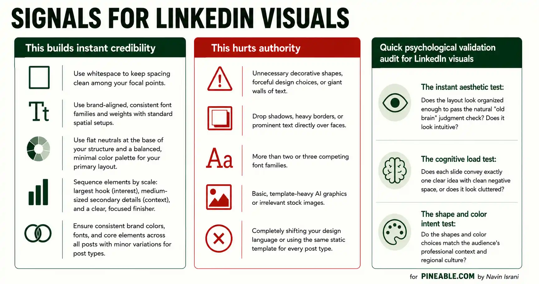
As a final check, look at the visual for 2–3 seconds without reading the text.
If anything feels difficult to understand or out of place, revisit the design. A visual can be attractive without being easy to use, as shown in this research on visual usability and aesthetics.
Also check that elements meant to be read together are visually grouped, since research on proximity and similarity shows how these cues shape what viewers perceive as belonging together.
Apply these principles to your LinkedIn visuals
Great LinkedIn visuals don't just grab attention; they guide it. The strongest designs make your message easier to scan, understand, trust, and remember by using hierarchy, whitespace, color, shape, imagery, and familiar brand cues with intent.
Before publishing your next graphic, check whether the visual makes the main idea obvious instantly and its format suits the content. Simplify the design if the main idea disappears when you test the visual at thumbnail size and on mobile.
You don't need one visual style for every post. Use these principles as a starting point, then experiment with layouts that fit your message and audience.
Ready to test your ideas? Design your next LinkedIn visual using one principle from this guide, then explore Pineable's social media creative designs for more formats and examples.
Summarize this article with AI:
 ChatGPT
 Perplexity
 Claude
 Grok
Grok

Written by
Navin IsraniB2B SaaS Content Strategist
Navin Israni is a B2B SaaS Content Strategist and Writer obsessed with why people buy and how better communication makes that decision easier. He pulls apart messy ideas and turns complex SaaS products into content that actually influences people’s buying journeys. When not dissecting messaging, he's putting productivity tools through their paces to see which ones actually deliver.